How to make a pie chart in Google Forms

In various fields, simplifying complex data is key to comprehension. Pie charts stand out as valuable tools for this purpose. They effectively display the composition of a whole by depicting its individual parts. This guide will outline how to craft pie charts to articulate data effectively using Google Forms.
What is a pie chart and why should you use it
A pie chart, also known as a pie graph, donut chart, or doughnut chart, is a circular graph that represents parts of a whole.
The name “pie chart” comes from the round shape and the slices that resemble pieces of a pie.
Pie charts are primarily used to represent percentages, but not every percentage is best displayed in this format. They are ideal for showing parts of a whole when the percentages are distinct and add up to 100%.
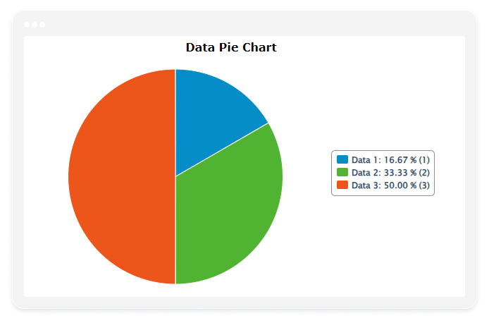
An example of good data for a pie chart would be one where all the slices add up to 100%, none of the segments are too small to see, and the percentages are varied enough to make the visualization useful.
How to make a pie chart in Google Forms
Google Forms is straightforward and user-friendly, which also makes it easy to represent collected data with pie charts. However, this simplicity can also lead to certain drawbacks. What are these disadvantages? We’ll explore them shortly, but first, let’s take a look at how to create a pie chart in Google Forms:
- To begin creating a pie chart using data from a Google Form, first, you’ll need to access Google Forms and select the form that contains the data you want to visualize. If you don’t have a form yet, you’ll need to create one and gather some responses.
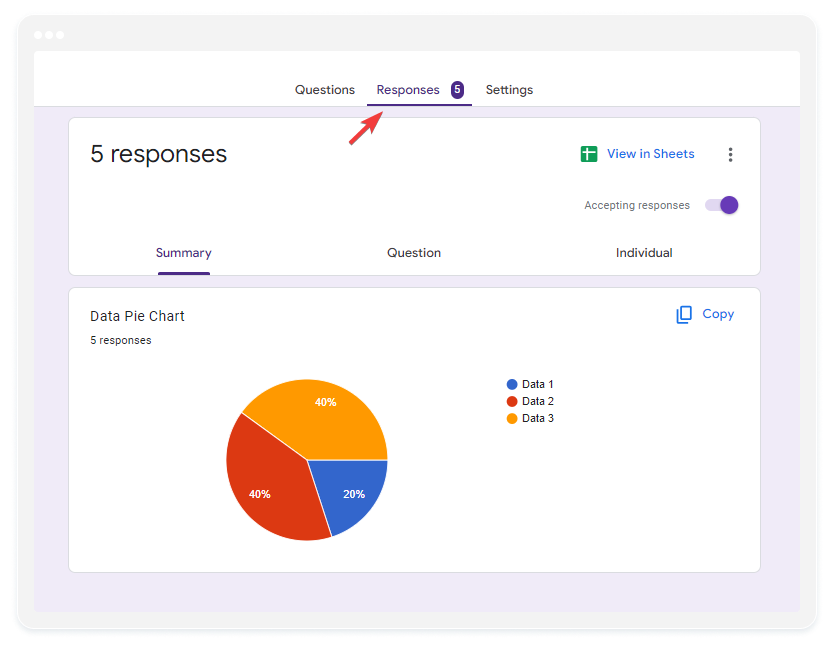
- Once you’re in the “Responses” tab of your Google Form, you’ll notice that a default pie chart is already generated, representing the collected data.
Now, you may wonder how to further customize this chart, add filters, or make any other adjustments. Well, Google Forms is designed for simplicity, and with simplicity comes limited features. This brings us to the next step:
Customizing Google Forms pie charts using Google Sheets
If you’re looking to sort your pie chart data, add filters, or change colors, these options are not directly available in Google Forms. Instead, you’ll need to use an additional tool called Google Sheets to do so. Here’s a simple guide on customizing pie charts using Google Sheets:
- Create a Linked Spreadsheet: In the “Responses” tab of your form, click the Google Sheets icon to create a linked spreadsheet that will collect form responses.

2. Open or Create Spreadsheet: Click “Create” to open a new spreadsheet or select an existing one where you’ve stored the form responses.
3. Select Data for Chart: In the spreadsheet, highlight the data in the column you want to display as a pie chart, including the column label and the data below it.
4. Insert a Chart: Click on the “Insert” menu at the top and select “Chart”.
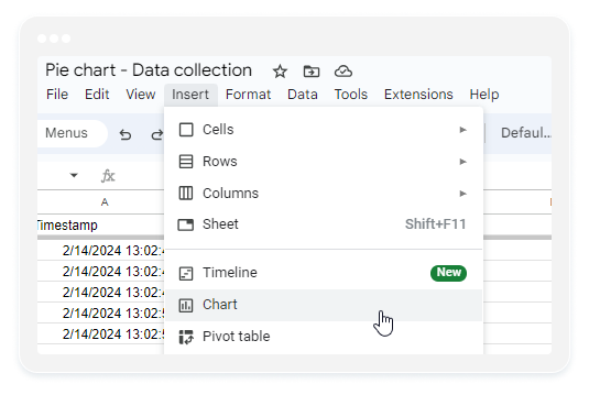
5. Choose Pie Chart: In the chart editor, select “Pie chart” as the chart type.
6. Customize Appearance: Customize the appearance and labels of the chart using the options available in the chart editor.
Even though this process is relatively straightforward, it does require using two separate tools and transferring data between them, which can be a bit inconvenient.
The easiest way: Collect and present data in one place with 123FormBuilder
Google Forms are easy to use, but what if you need more advanced features, like custom pie charts? Sure, you could transfer data to Google Sheets, then generate and customize a chart, but that’s cumbersome. 123FormBuilder is a tool that can simplify your life. It lets you store and display data, add filters, customize charts, and export them as a PDF, all in one place.
Creating Pie Charts with 123FormBuilder
- Access your form’s Results page and then click on the Reports tab
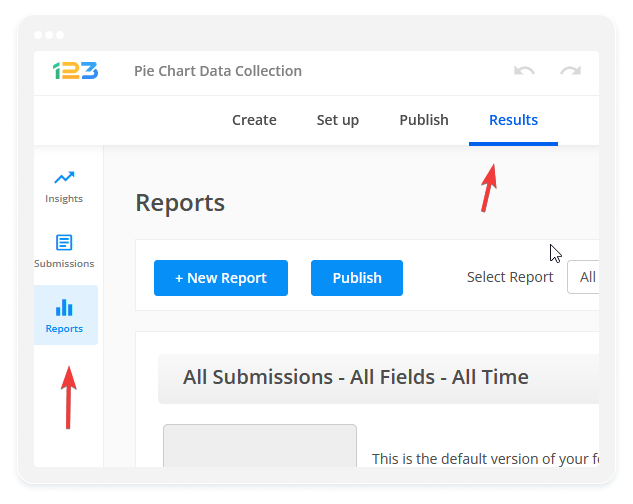
2. When you access the Results page of your form, you’ll find that there’s already a Pie Chart available for you. Isn’t that easy? But if you want to create a more personalized chart, just click on the “New Report” button, name it, and you’ll be taken to the report dashboard.

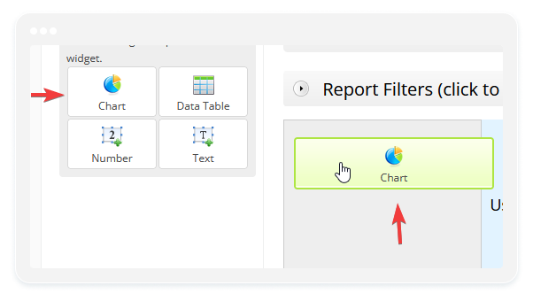
3. You can now add a variety of widgets, like charts, tables, or numeric ones. Click on the chart widget, or simply drag and drop it onto the dashboard.
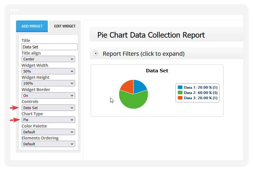
4. After creating the widget, you can customize it by using the “Edit widget” menu on the left side. Choose the data you want to display from the “Control” dropdown and select “Pie” as the chart type. That’s it! You now have your customized pie chart that can be fully adjusted at any time.
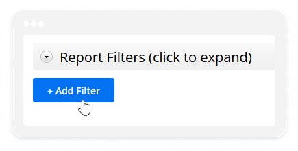
5. If you want to filter this data, just expand the “Report Filters” menu. From there, you can add as many filters as you need.
As you can see, using 123FormBuilder for collecting and displaying data offers several advantages over Google Forms. We provide a variety of options that can be accessed from one place alongside your data. Plus, we offer comprehensive documentation that you can access whenever needed.