123FormBuilder Knowledge Base
Search our documentation platform for answers, service specifications and 3rd-party integrations.
Knowledge Base
You can use your own CSS to customize the look of your form. Styling forms with CSS is a great opportunity to add your company’s brand on the form, not to mention it offers a lot of flexibility during creation.
All you have to do is to go to Design → Add custom CSS and paste the code or enter the URL to the CSS file.
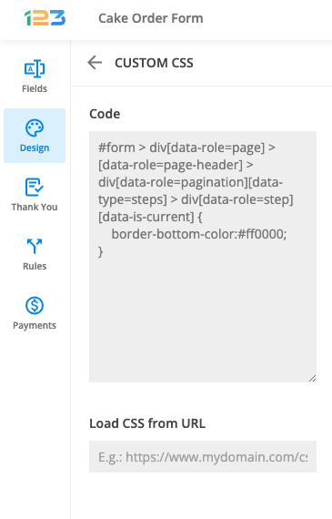
The changes will automatically take effect on your form. Hit the View icon to see the results.
Learn about Full CSS Form Customization.
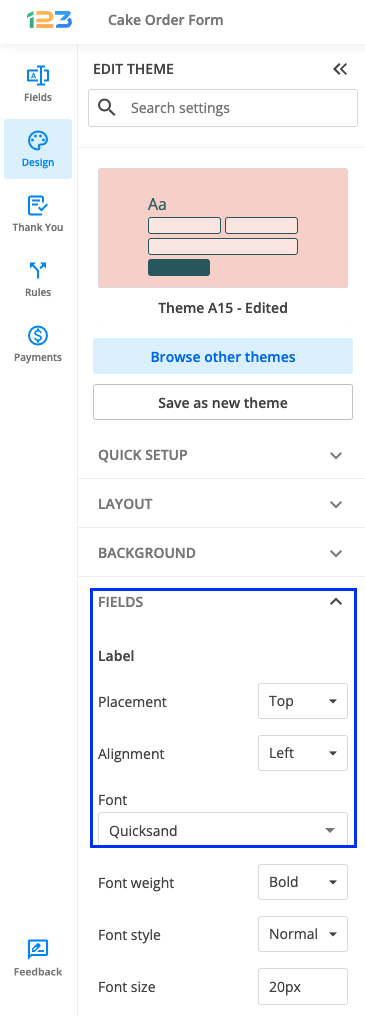
With 123FormBuilder, you can customize everything about your web forms. To change the font of your online form, access your form builder account, and open the Form Editor. From the sidebar menu, click on the Design icon.
Under Quick setup section, you will find Font setting – from here you can quickly change the font of your form (question text/label/instructions, but also the input font provided by your respondents.
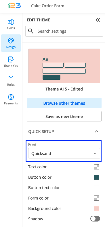
If you want to change only the font of your form and have a different font for your respondents’ input, then all you have to do is scroll down to Fields section and change the Font setting.
Related articles
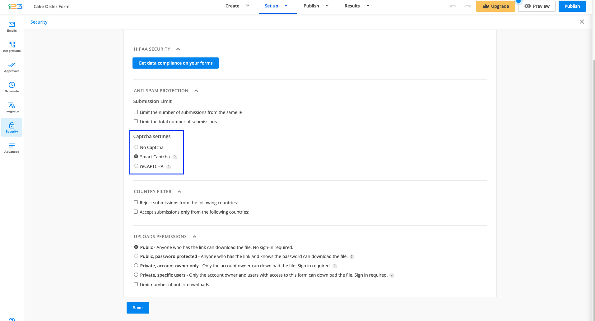
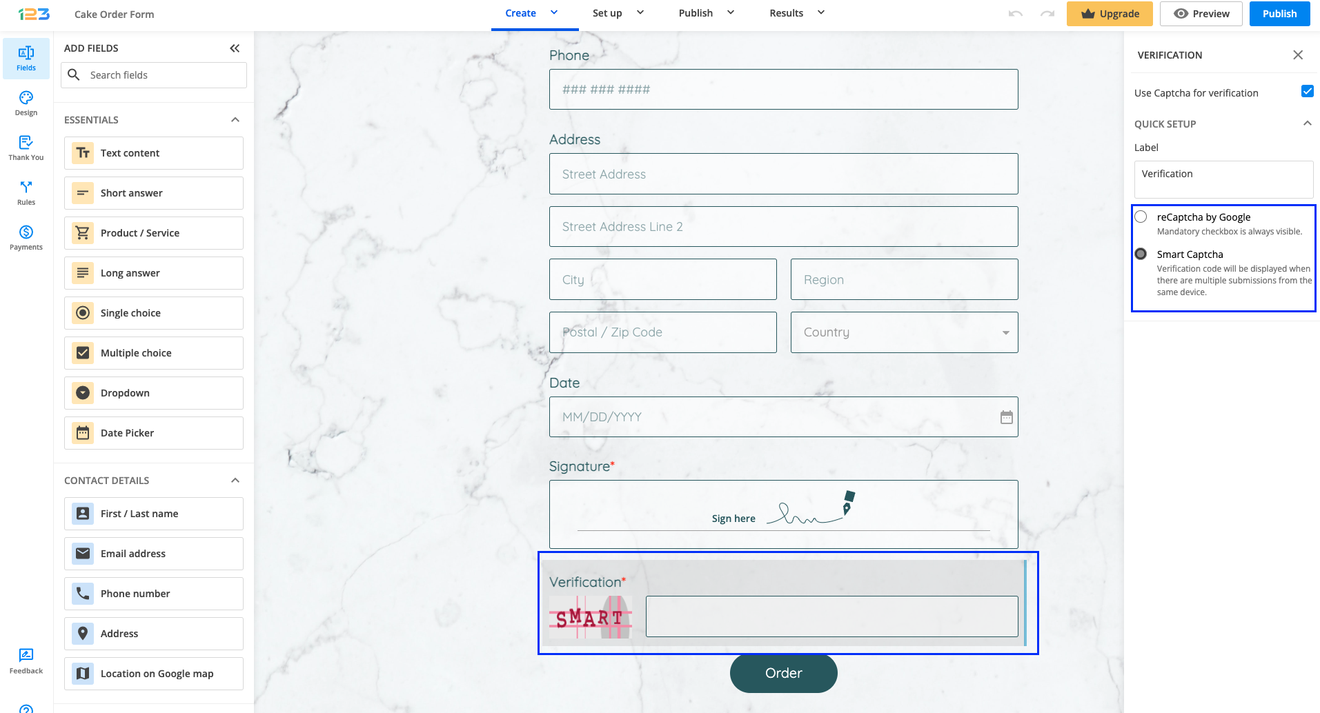
Captcha images are the colorful letters and numbers displayed at the end of your form. They are also referred to as a verification number or verification code. Users have to type those characters in a box, to confirm that they are persons, not robots (robots can not read them). Smart Captcha is the code that shows only if your form is being abused (e.g. multiple submissions from the same IP). Smart Captcha will appear only after the second attempt coming from the same IP address.
You will find the Smart Captcha option in the Security section of your form, under Captcha settings within the form builder. To add captcha to the form, select any of the available Captcha options, as shown below:
- No Captcha. Tick this option if you want to remove Captcha completely from your online form.
- Smart Captcha. This option is set by default when creating an online form. The Captcha verification numbers will appear only after the second attempt coming from the same IP address. A different code will be generated each time the form is being accessed.
- reCAPTCHA. This option generates the reCaptcha from Google, where the form user needs to tick a checkbox. It appears from the start.
You can also find the Smart Captcha feature in the Form Editor. Just click on the Verification field that appears above the submit button.
You will be able to disable Captcha by unchecking Use Captcha for verification, even though we strongly recommend use it. The label can also be changed and you can opt from reCaptcha and Smart Captcha.

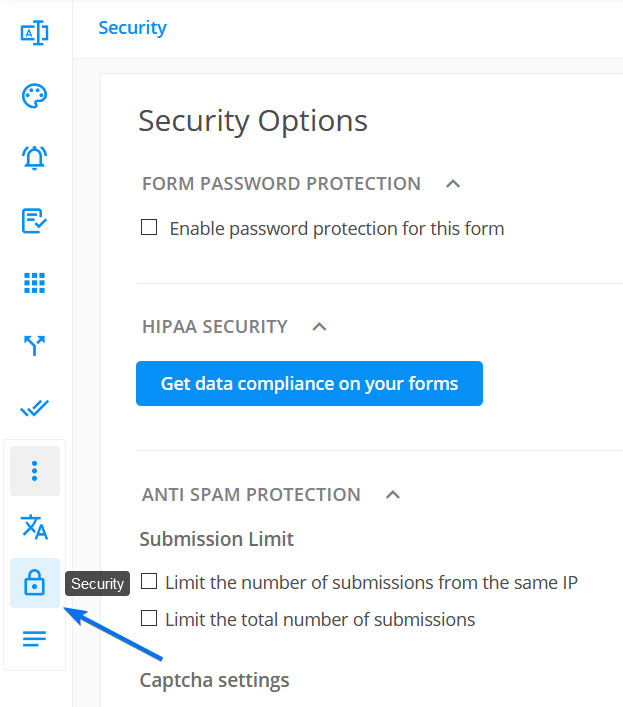
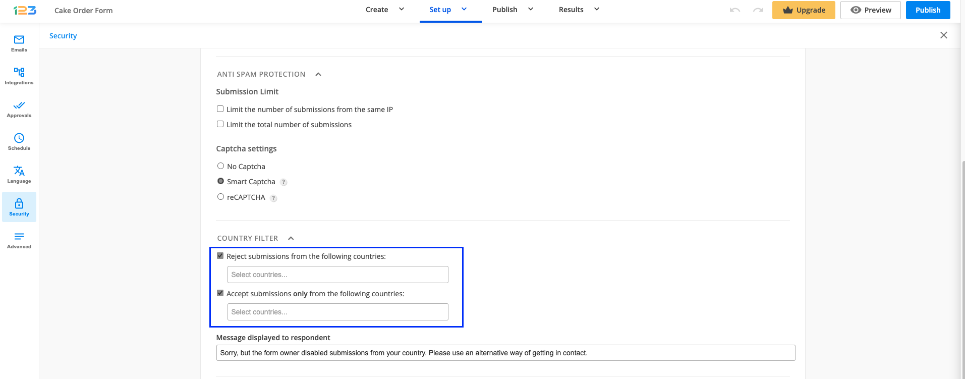
Security options give you the possibility of rejecting submissions coming from specific countries.
In Security → Country Filter, tick the option Reject submissions from the following countries, click in the textbox and select countries from the dropdown list.
You can also use the opposite feature – Accept submissions only from the following countries. In this case, all submissions will be restricted, except for those coming from the countries you specify.
Whenever one of the options is ticked, you can customize the message that is going to be displayed for respondents that are accessing the form outside of the rules you’ve set.
123FormBuilder offers a variety of antispam protection measures for your web forms.
Captcha
Captcha images certify that your submitter is a real person and not a robot. You may choose to always show a Captcha image at the bottom of your form, to show a daily changed image, or to use Smart Captcha – this will only appear when your form is abused (for example, when multiple submissions come from the same IP).
To enable captcha, go to your Form Editor and click on the Verification field.
In the left-side panel you can choose one of the following:
- reCAPTCHA. This option generates the reCaptcha from Google, where the form user needs to tick a checkbox. It appears from the start.
- Smart Captcha. This option is set by default when creating an online form. The Captcha verification numbers will appear only after the second attempt coming from the same IP address. A different code will be generated each time the form is being accessed.
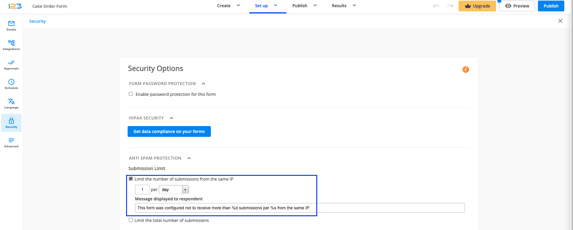
Limit number of submissions
The number of submissions made from the same IP can be limited to a certain number per hour, day, week, month, year, and eternity. You can also limit the total number of submissions received through the online form.
If you want a field to be displayed only when there is some sort of input in another field, you can set this up using a rule in your form.
Let’s take an example: we have a form where respondents have to provide their email address. If the email address contains some sort of input, then we also want to show the phone number field.
If Email address is not empty then show Phone number. Do not type in empty – simply leave that text box blank.

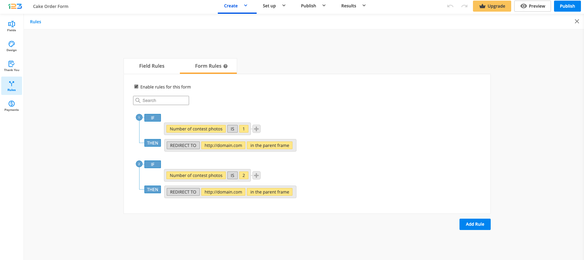
Use Form Rules if you want to redirect your users to different web pages based on their input. Go to the Rules section → Form Rules tab and click on Add Rule. Do not forget to tick Enable rules for this form in order for your form rules to take effect.
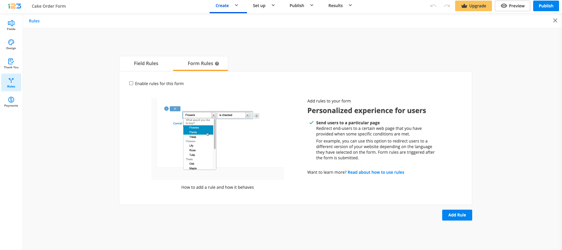
Afterward, establish your conditions and then paste the URL. Establishing the conditions works exactly as for Field rules. You can check the entire flow here.
You can add as many redirect possibilities as necessary. You can also redirect users to a certain webpage based on the language they have selected on the form (if the multi-language feature is enabled). You’ll find the enabled languages included in the condition’s dropdown list of your rule. To learn more about Translations, follow our documentation here.
Form Rules will have priority over the Thank You page redirect or the redirect to the payment summary page if you have payments enabled on the form.
Important Note
For the redirect to work properly, we highly recommend using a secured URL (starting with HTTPS, instead of HTTP).Related articles
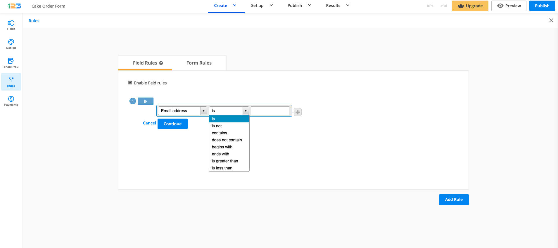
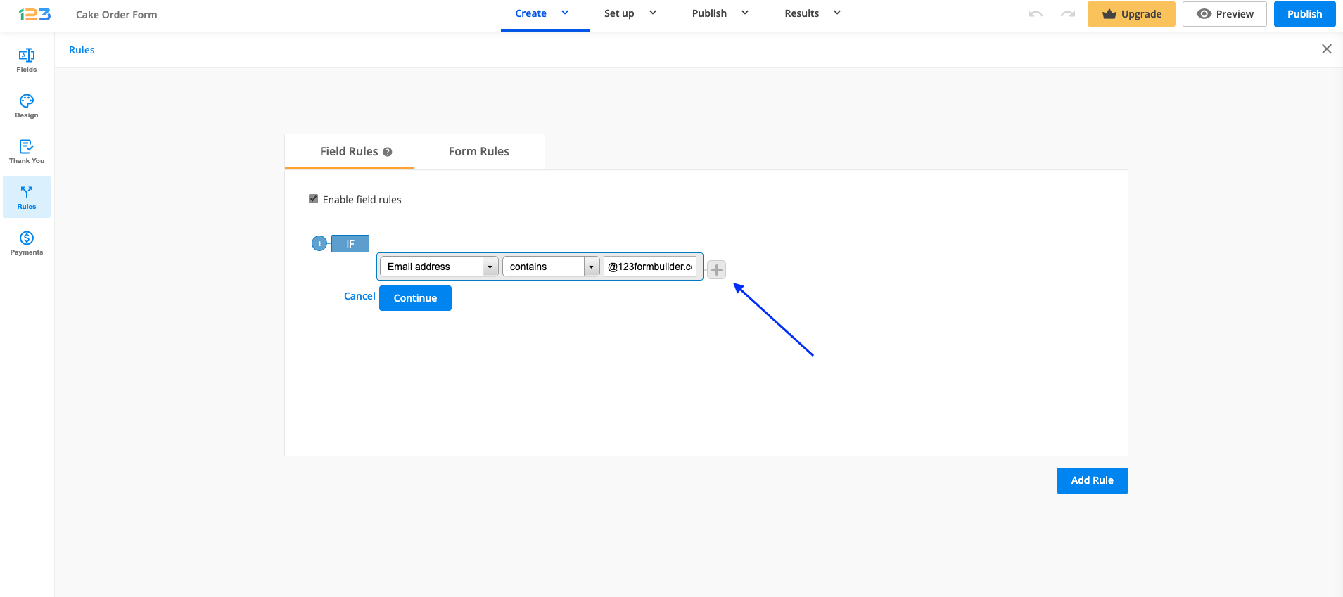
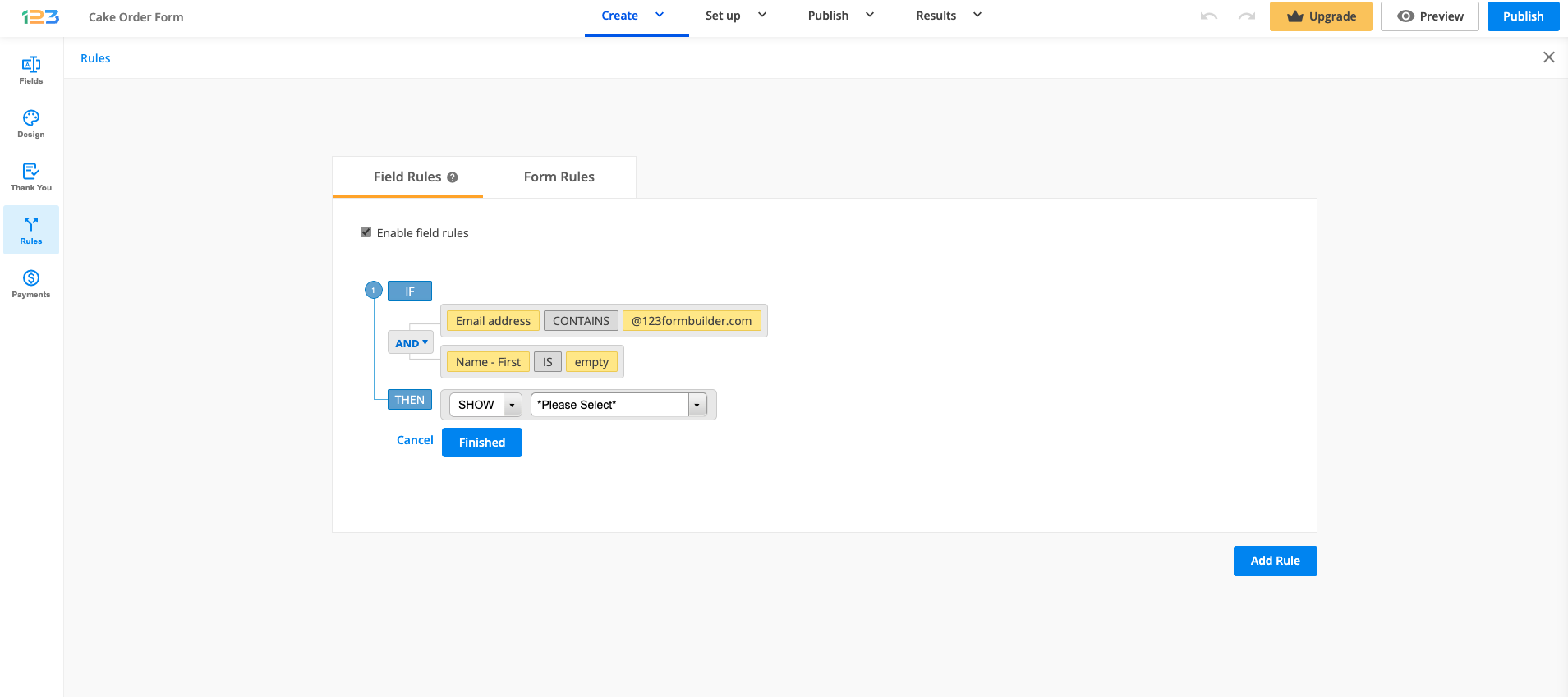
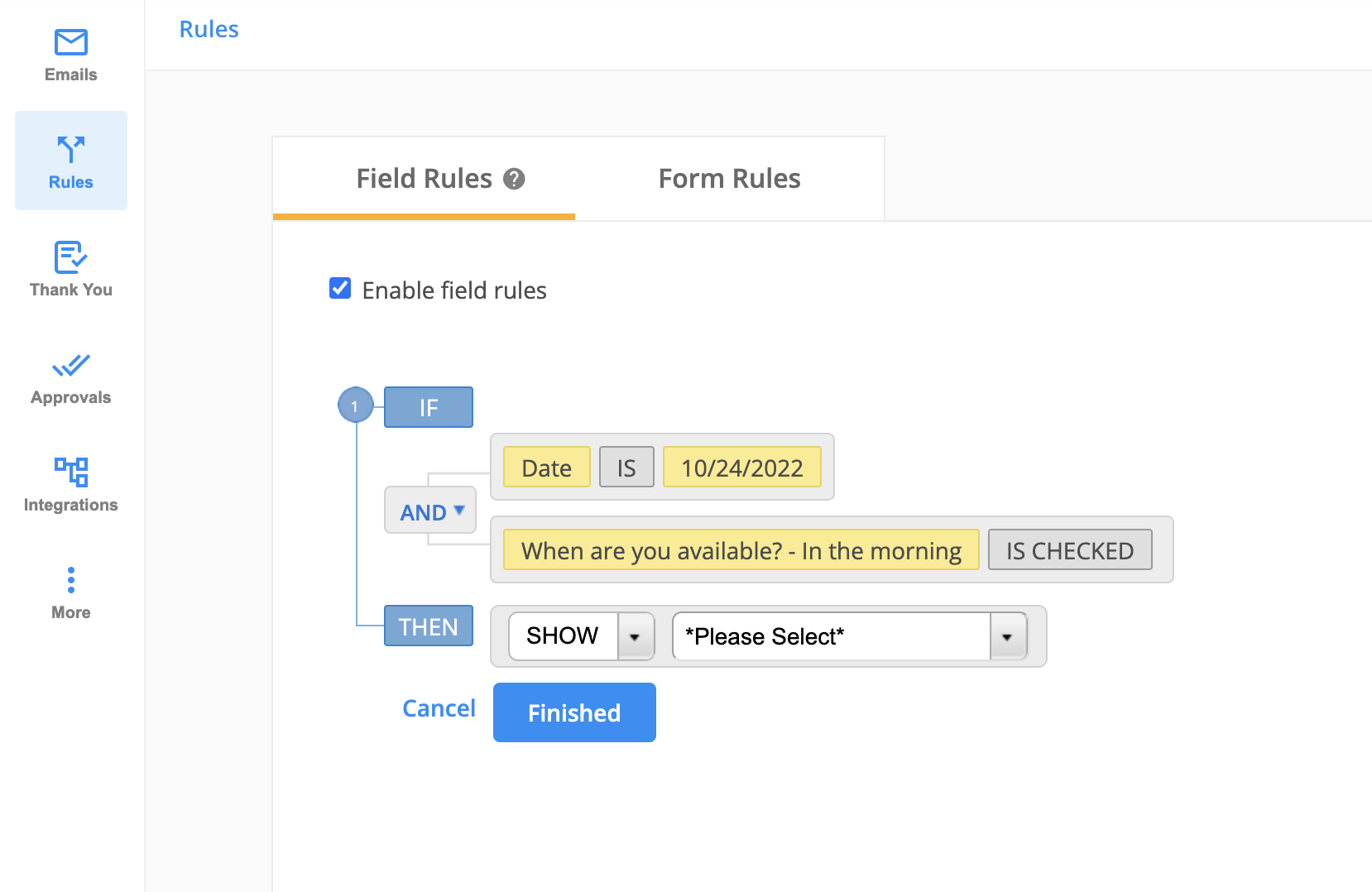
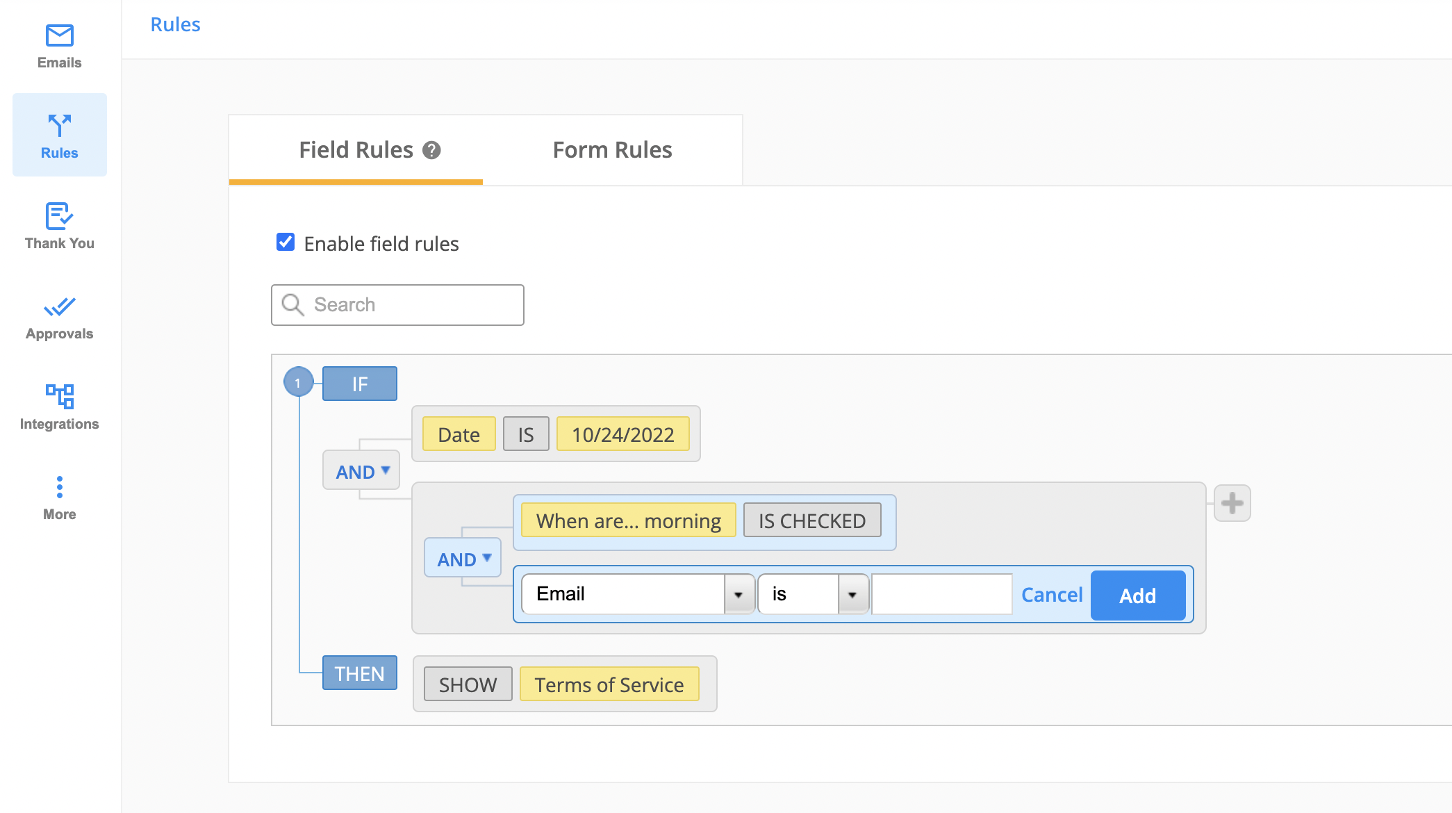
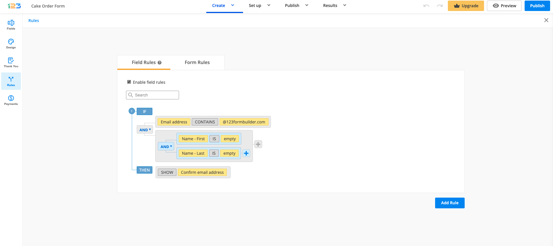
With 123FormBuilder, form branching and conditional logic are very easy to set up. Go to the Rules section → Field Rules tab and click on Add Rule.
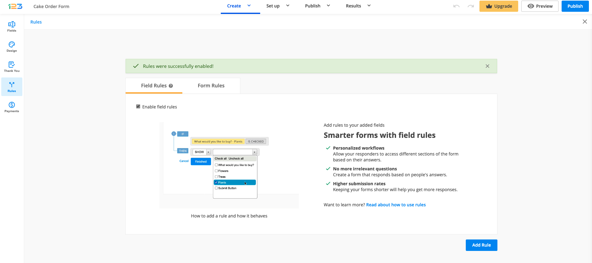
In the first dropdown list, choose the field that will affect your form’s behavior. Here you will find all your form fields.
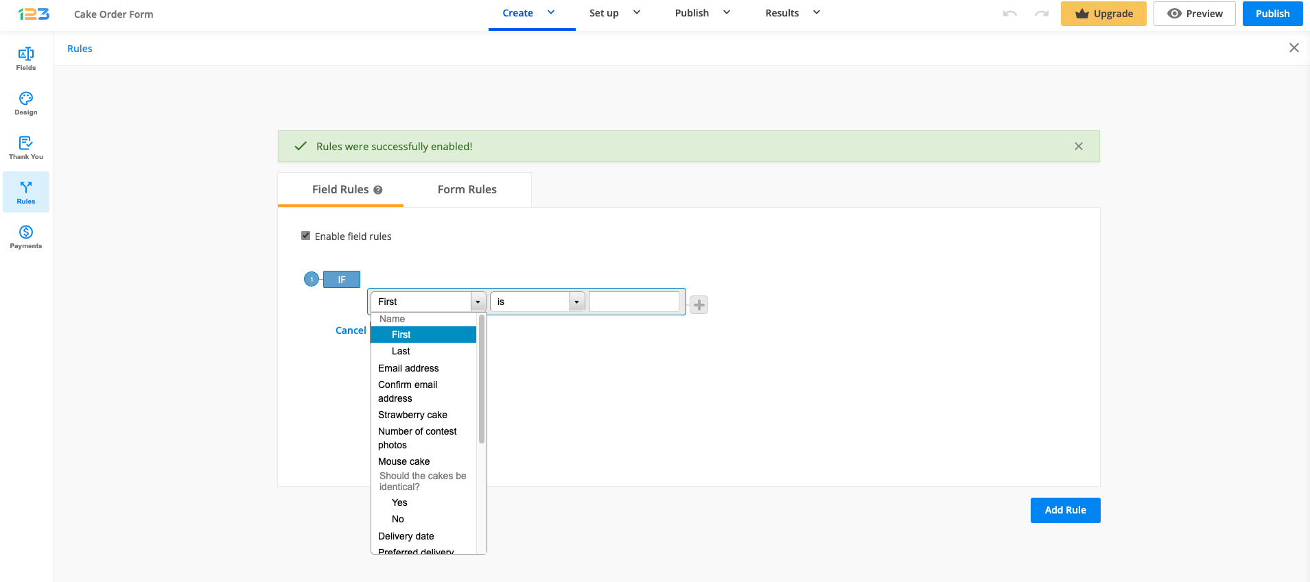
Then specify the criteria it needs to meet to trigger changes and decide if it is going to show or hide another field (that will be designated in the last dropdown list).
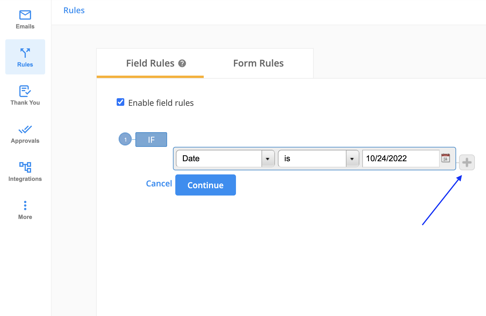
Depending on the field type selected previously, there are different conditions. For Email field, for example, you have various conditions: is not, contains, does not contain, etc. Another example could be related to age restriction: If age is less than 21, then don’t show the list of alcoholic beverages on the form.
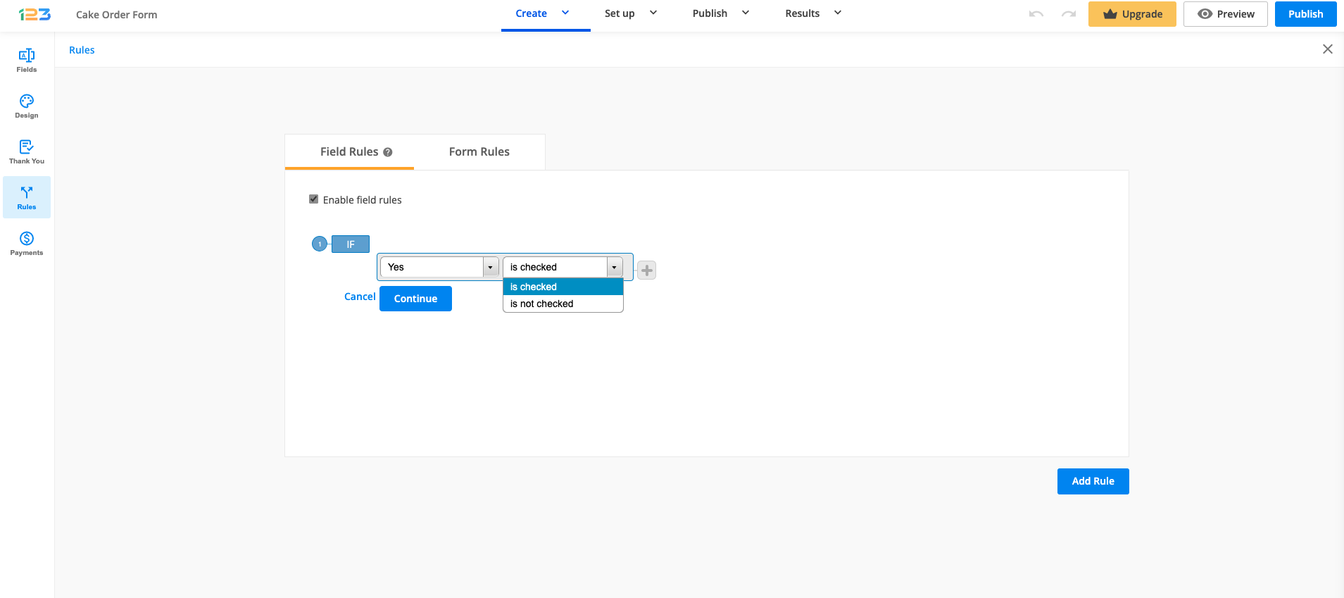
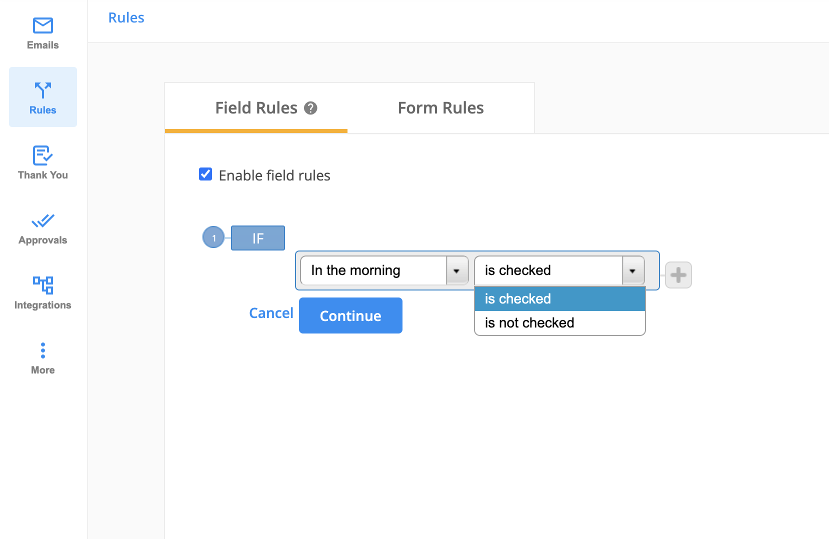
For choice fields, you can use the conditions is checked or is not checked.
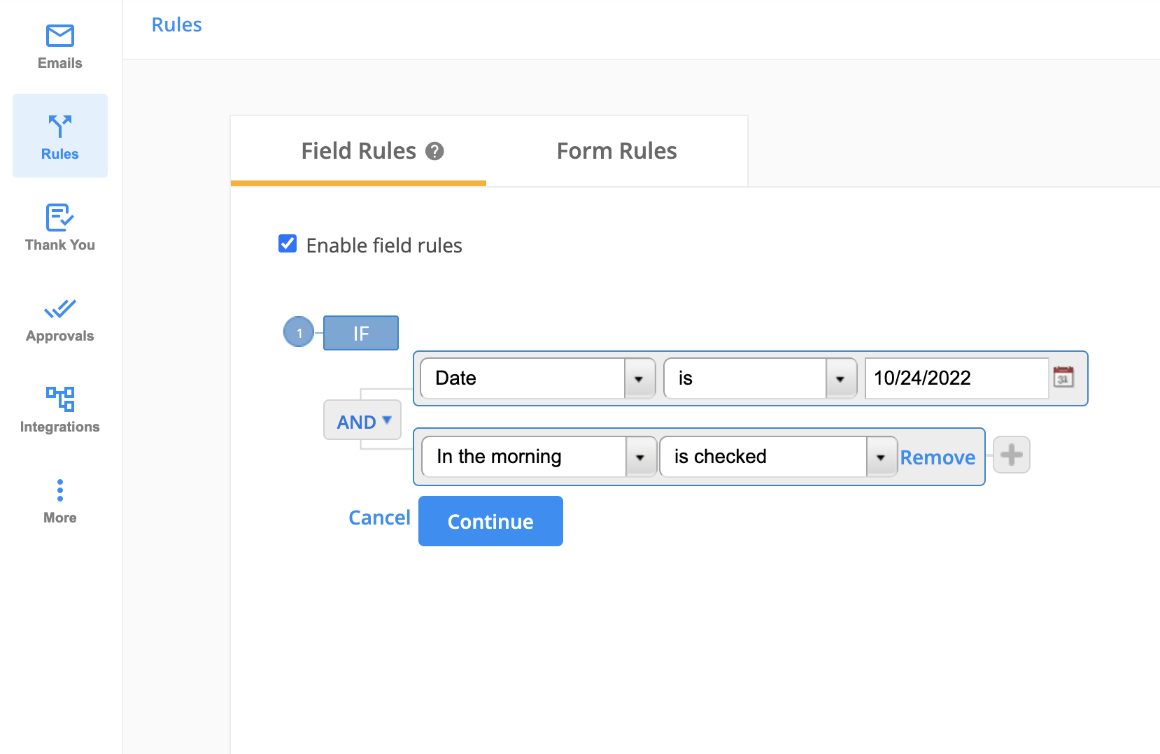
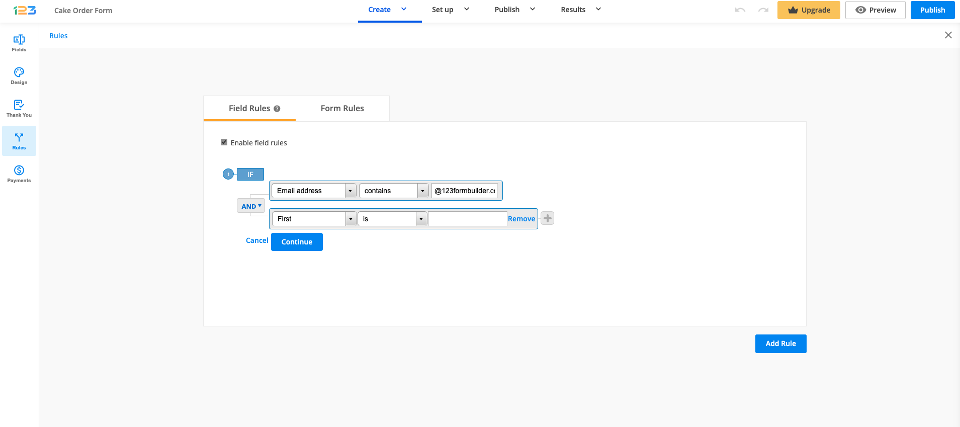
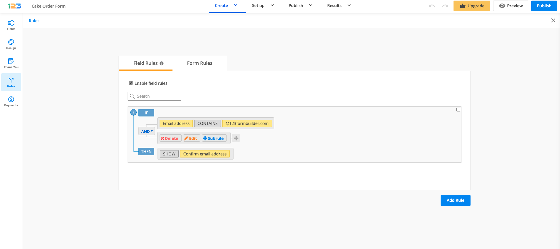
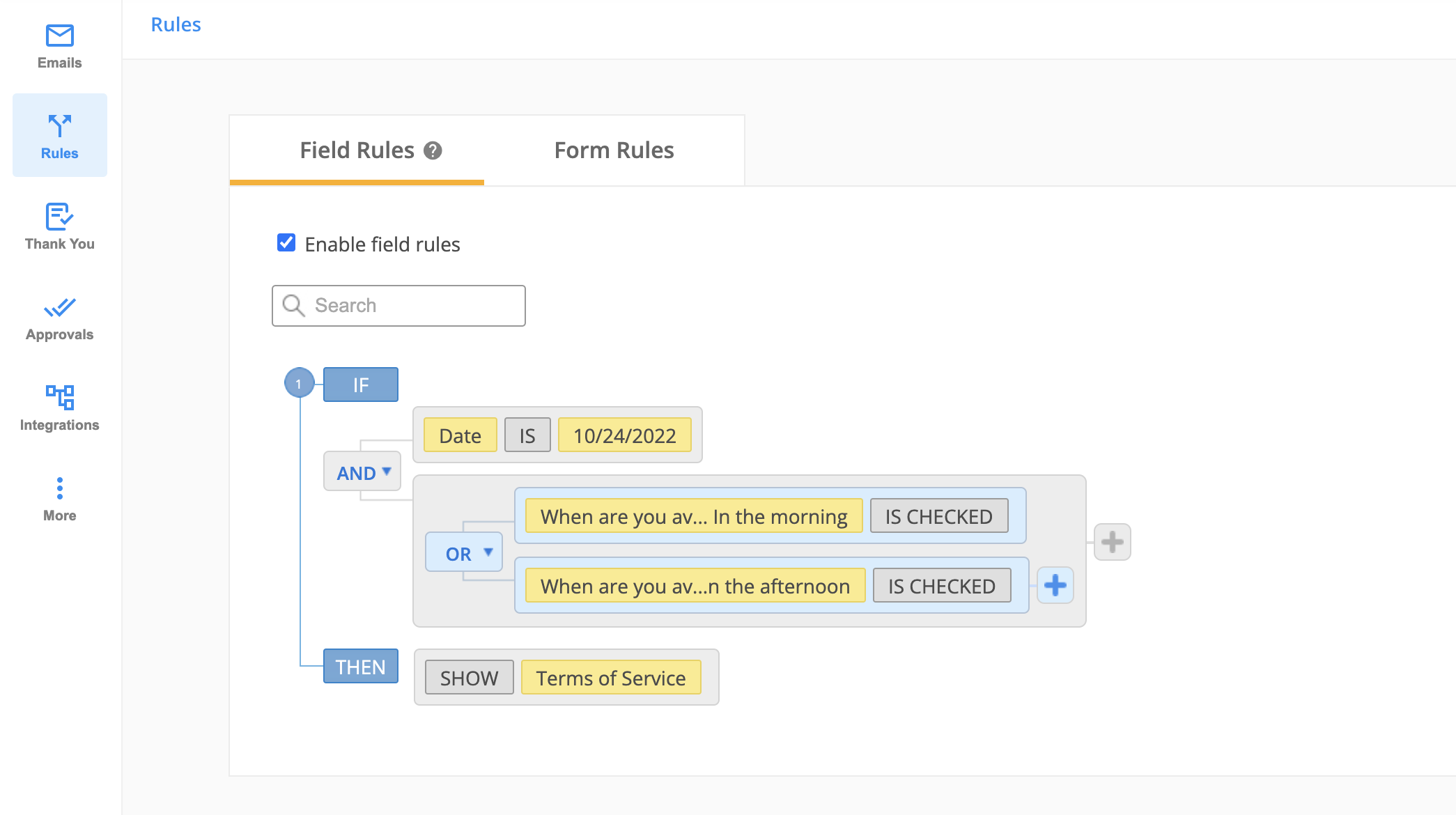
If you want to create multiple rules, click on the grey plus sign to create a new condition. It is connected to the previous condition with one of the available connectors: OR and AND.
It is connected to the previous condition with one of the available connectors: OR and AND. Use this button if you want to set multiple conditions within the same rule. You can always remove the second condition by clicking on the Remove button.
Next, hit Continue and select one of the two existing actions: Show or Hide. In the end, select the field or fields you want to show or hide after the condition has been met on the form.
If you wish to Show or Hide the Multiply field group field, please select the Multiply field group element and all the fields included in it. Otherwise, your rule will not work as expected.
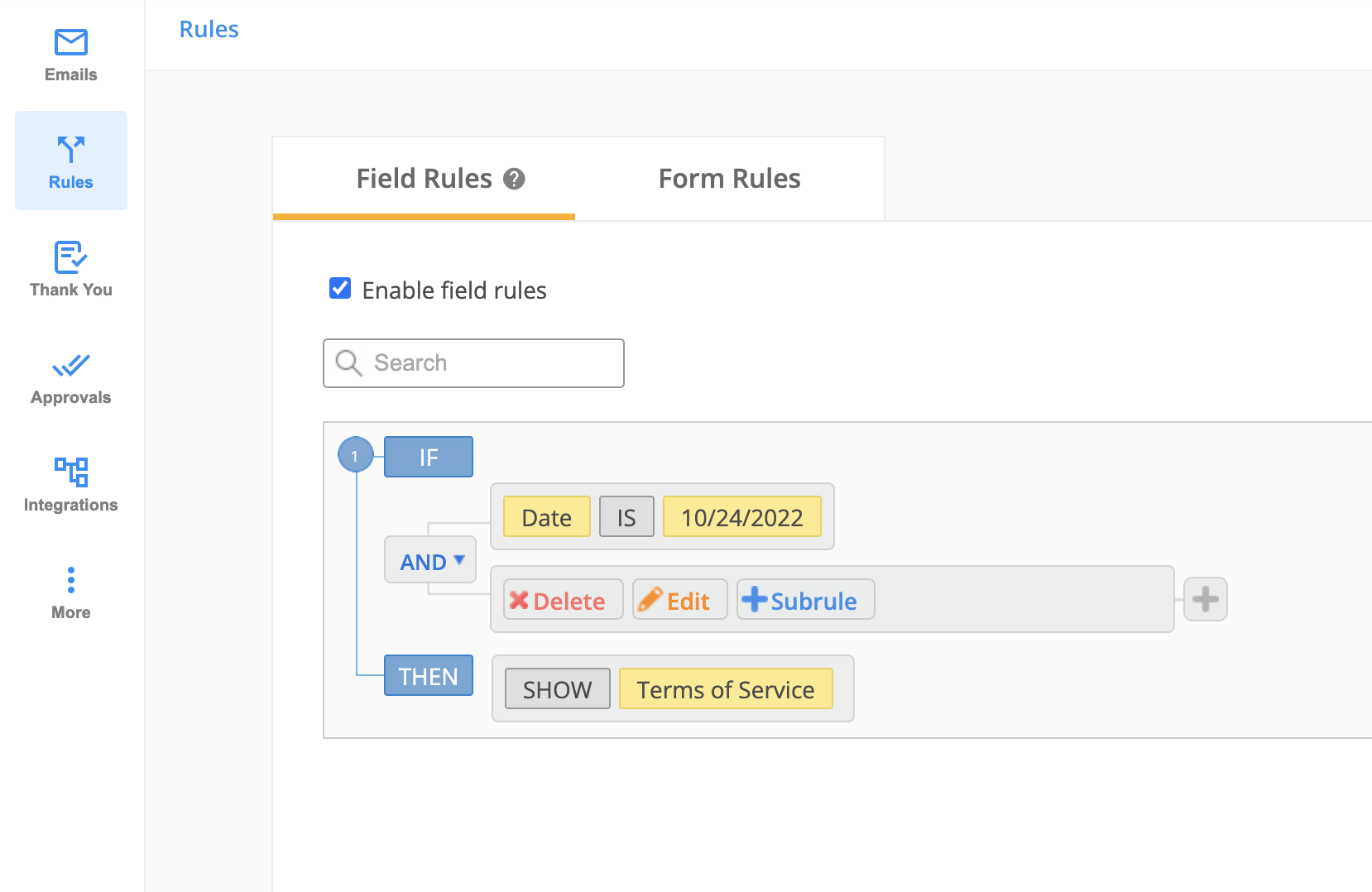
When hovering over the conditions, you will notice some additional options: Delete, Edit, Subrule. You can edit or delete a condition by clicking on the appropriate buttons.
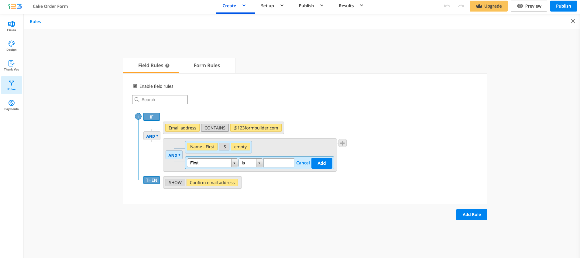
If you want to add a subrule (an additional layer of rule), click on Subrule button. In the below case, for the second condition, we have added an additional rule with a conditional operator: AND/OR.
Once the subrule has been added, it will look like below:
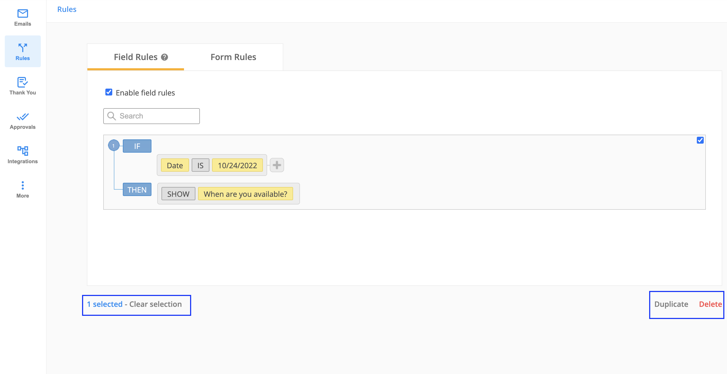
Preview your form at all times and delete the rules that you don’t want to use anymore. You can do this by hovering over the rule and selecting it. From there you can Delete the rule or even Duplicate the rule.
How to set up rules that affect multiple fields?
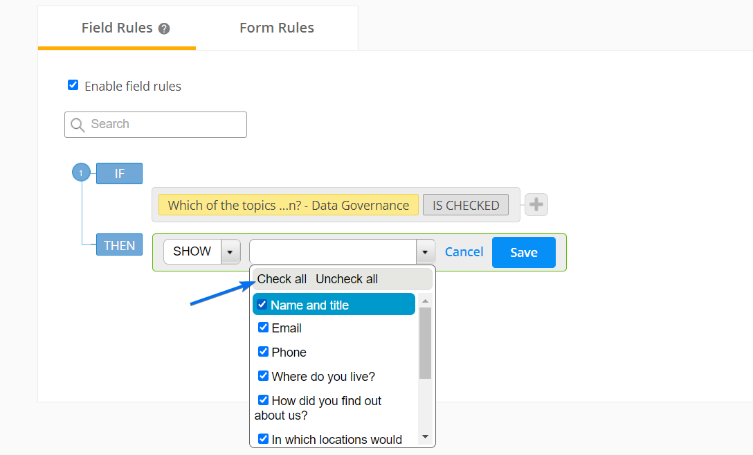
Each field rule can have multiple conditions and show/hide multiple fields. By setting up a single rule that affects multiple fields instead of repeating that rule for each affected field, you save a lot of time.
The first half of the rule represents the condition. By selecting the plus button on the right, you can add a new condition linked to the previous one. Use the connectors AND or OR to link the two conditions.
The second half of the rule represents the result. Check the fields that will respond to the conditions set or use the option Check all to select all fields. Finish setting up the rule by clicking Save.
What field types can I show or hide?
You can use any field type within rules, including languages for multiple language forms, or even form buttons (Submit, Calculate, Next Page). Add any field on your form and set the rules you want for it, according to your needs. Feel free to get creative with the conditional logic feature and make your online form look as professional as you want.
Important Note
You cannot Show/Hide the same fields in multiple rules. This will create a conflict and your rules will no longer work properly. You can duplicate your existing fields to show or hide them in multiple rules.How can field rules ease the use of online forms for your visitors?
Too many form fields could decrease the conversion of your online form. Having field rules set up the right way could avoid this problem by giving your form users a dynamic form to submit. Field rules are the perfect solution for complex order forms, photo contest forms, event registration forms, and many more.
Some options may be irrelevant for your form users if they have selected others instead. Take for example a food delivery order form. If a customer selects macaroni and cheese, two radio buttons will appear under the field with the options ‘more macaroni’ and ‘more cheese’. If the same customer selects another menu, then the two options will no longer be displayed on the form. Less content might just prove to be more engaging.
Related articles
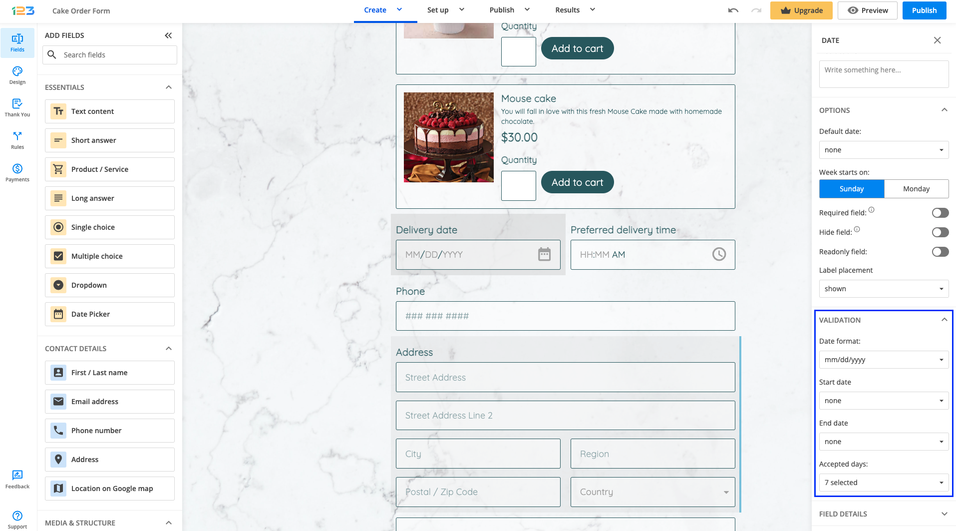
Once your Date field has been added on the form, in the left side panel you will see different customizations that you can bring to your field. Under Validation, you can:
a) set up conditions from when you accept a date and until when
b) set up accepted days
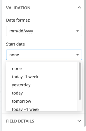
Setting up conditions: by default, will be set on none, but you can modify them to today-1 week, yesterday, today and so on. Using the custom date option, you can also specify the number of days, weeks, years. This can be accomplished by typing the number and followed by d (days), w (weeks), m (months), y (years) in the custom date box (e.g: +5d, +3m +1w, +2y)
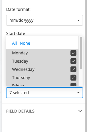
Accepted days: by default, all of them are selected. You can unselect the days that you do not accept.
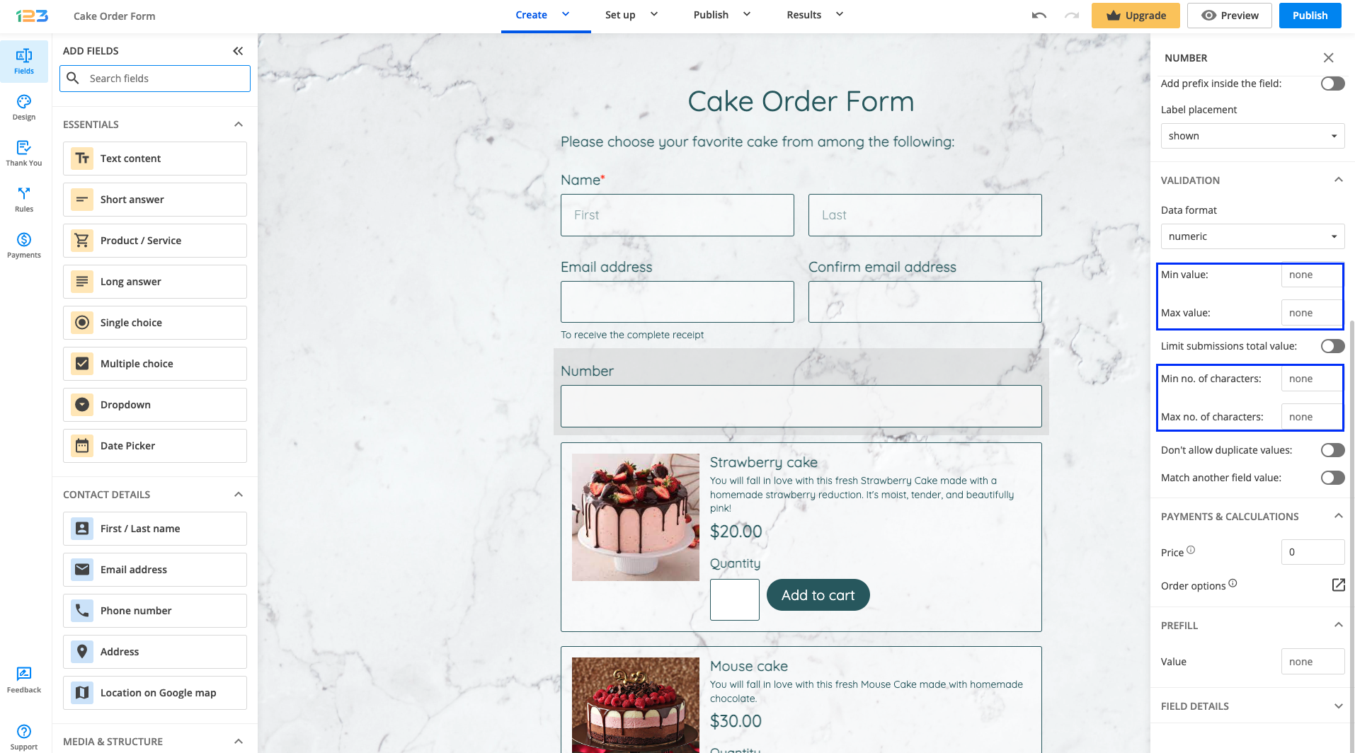
Yes. You can accept input no higher or no lower than a specified value. In your form builder account, go to the Form Editor. Next, click on the Number field to open its Edit Field panel.
Below the Validation section, specify a Minimum Value and/or a Maximum Value.
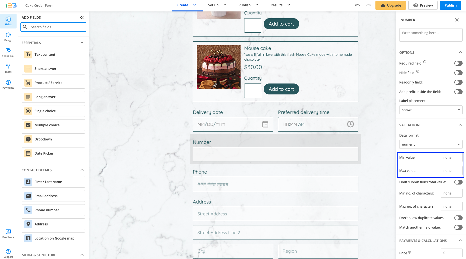
If form users enter values higher or lower than the specified value, they will get an error message.
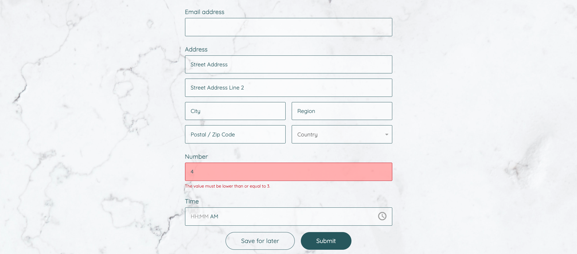
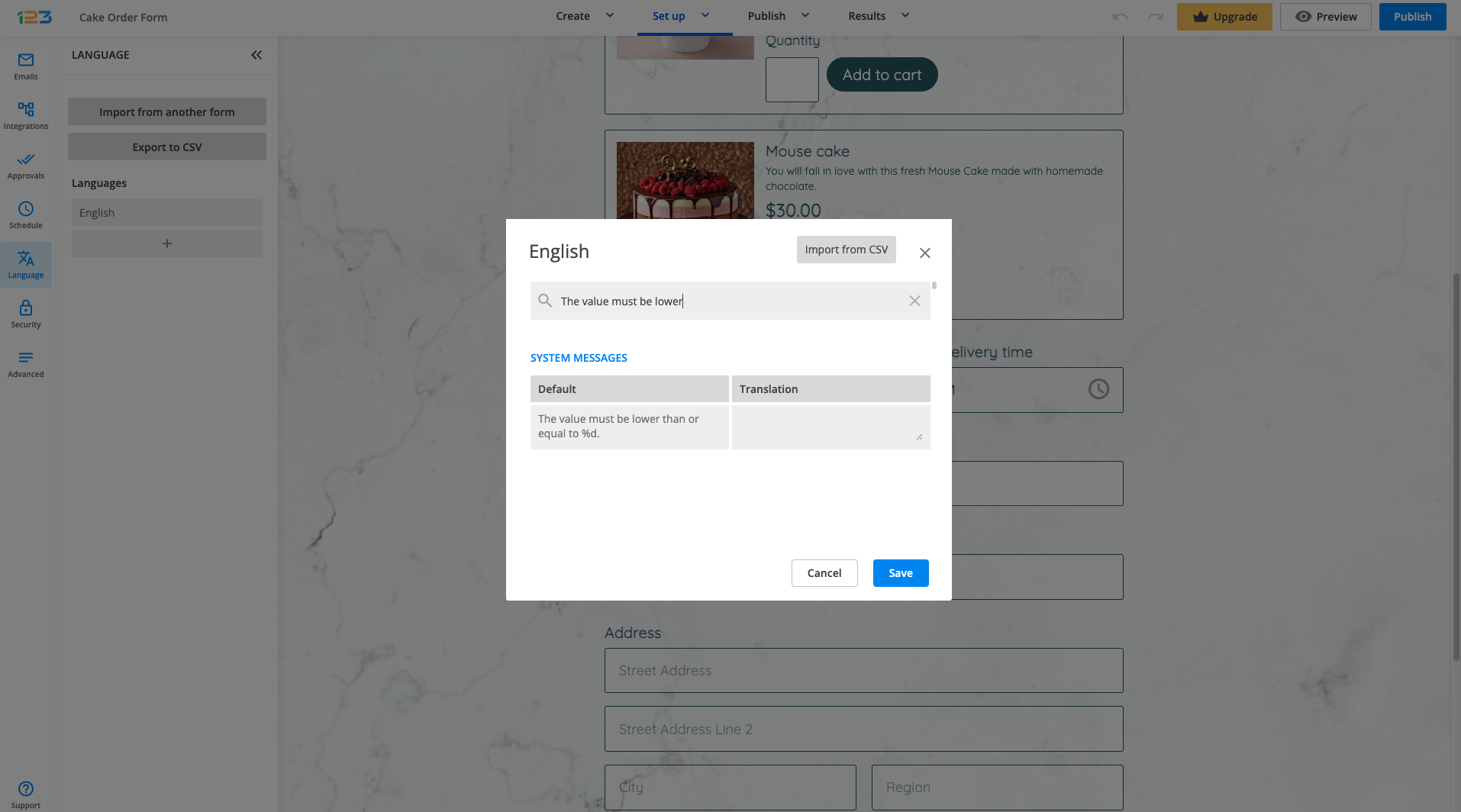
By default, the message says: The value must be higher/lower than X. This message can be changed in Languages. All you have to do is click on English language and search for the message you are interested in editing. For example, if you want to edit the error message related to lower values, search for “lower” word and you’ll find the error message to be edited.
Related articles:
We have different limitations in place that you can set up for the following fields:
a) for Short answer, Long answer, Email, Link, Number, Formula → Minimum and Maximum number of characters
b) for Number, Formula → Minimum and Maximum value
The minimum and maximum number of characters can be found under the Validation section. The maximum number of characters will have to exceed the minimum number of characters, otherwise you will receive an error.

For the Number field, you can set both a minimum and a maximum number of characters, but also a minimum value and a maximum value.
Case scenario: You’re organizing an event, perhaps a birthday party, and you’ve created a contact form where people could sign up and attend your event. You can use the Maximum Value on a Number field to limit the number of guests to your event if you have limited seats.
Most Popular
Frequently Asked Questions
Here is a list of the most frequently asked questions. For more FAQs, please browse through the FAQs page.