123FormBuilder Knowledge Base
Search our documentation platform for answers, service specifications and 3rd-party integrations.
Theme settings on your forms
There are various theme options in our online form designer. Basically, you can change just about anything on your web form, from text font and color to the style of the submit button. The settings categories that you can tweak in the theme customization panel are Quick setup, Layout, Background, Fields and Buttons.
Now let’s get right into it and see how you can customize your theme in each category.
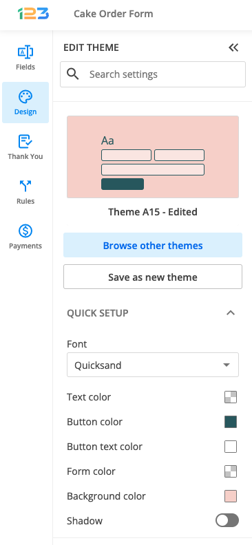
Quick setup
This section is used to make easy and quick changes to your form, being the most used theme settings options.
Here you can specify the font of your form & the text color that applies to your entire form (question text, answering options, instructions). The button color is used to change the color of the Submit button on the form, while Button text color sets its color. Background color is used to change the color of the form. The shadow switcher allows you to have a shadow to your form.
Layout
Layout section is divided into two: Form and Page. Let’s take them one by one.
In the Form subsection, you can modify how the form width is calculated (pixels or percentage) and set the form width accordingly. Also, if you are interested in changing the direction of writing on your form, you have the option to do so by changing the form direction from left to right to right to left. There are some additional settings related to the form, such as changing the padding for header, footer, left and right.
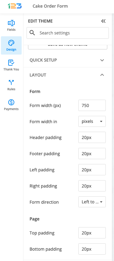
In the Page subsection, you can modify the top and bottom padding.
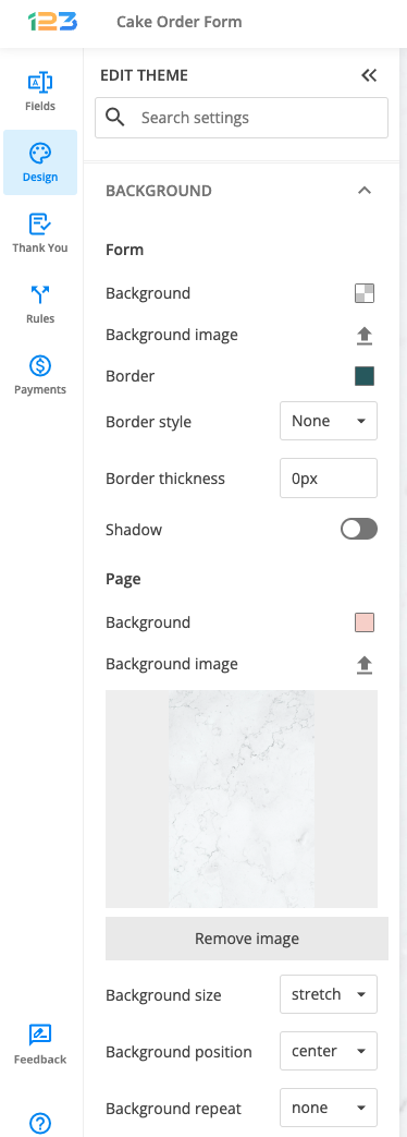
Background
Background section is divided into two subsections: Form and Page. From this section, you have the option of customizing both the background of your form and of the entire page, such as uploading a photo for background, changing the position of the background image and even adding a border to your form with multiple customizations.
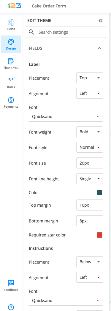
Fields
Fields section is divided into multiple subsections: Label, Instructions, Input, Field, Field Hover, Field Focus, Error, Choices
Label – from here you can change the question’s text placement (top, right, left), the alignment & the font. Additional design settings for labels are related to the font style and size, the color and the margin between question text and answer/choices. Also, if you are interested in changing the color of the asterisk when dealing with required fields, you can do that by using the color picker from Required star color.
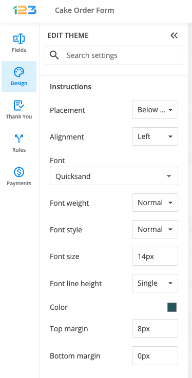
Instructions – all the design settings available for label/question text are also available for Instructions separately. You can design instructions and label totally different so that your respondents could easily read through the form and understand that they need to follow your instructions when filling up the form.
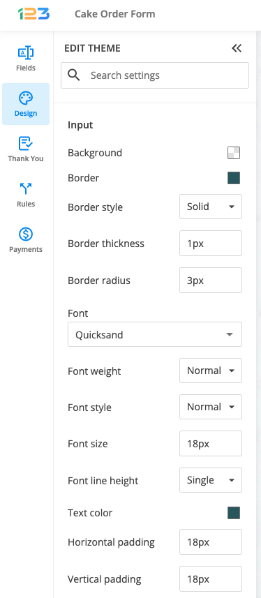
Input – these design settings are related to the input your respondents are providing when filling in your form. You can change the background color of the answering text boxed, the border and its style and also the font of your respondents’ input.
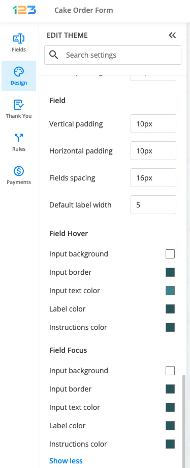
Field – In this section, you can increase or decrease the spacing between your form elements by changing the Vertical padding value. To have your form centered, increase the Horizontal padding value.
Field Hover & Field Focus – You are able to add different colors while focusing and hovering over a field.
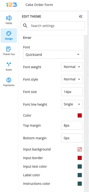
Error – If a field needs to meet certain criteria, an error message will be displayed. You change the design of the error text to match your whole form’s theme, by setting the font, font style, color and more.
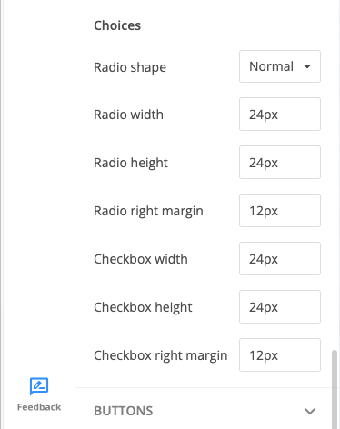
Choices – you can create your own custom radio buttons for Single choice fields and check-boxes for Multiple choice fields. Adjust their layout to be a perfect fit for your theme.
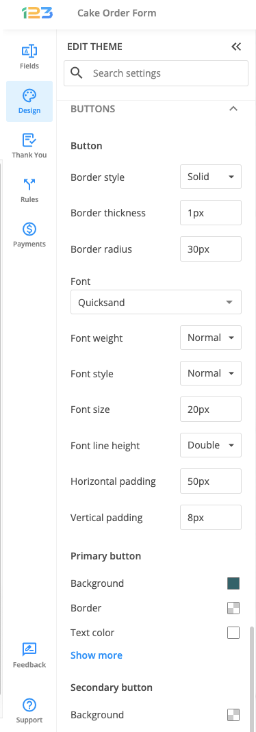
Buttons
Buttons section is divided into multiple subsections: Button, Primary button, Secondary button.
There are several buttons that can appear on your form: Submit, Calculate, Reset, Next, Preview, Previous, and Update. For any of them, you can set colors and change their format.
The Button settings will adjust the visual properties of all the buttons enabled on your form (border parameters, font options, and padding).
The Primary button options are referring to the Submit button.
The Secondary button section will change the design of all the remaining buttons.
4 comments
Leave a Reply
Similar Articles
Frequently Asked Questions
Here is a list of the most frequently asked questions. For more FAQs, please browse through the FAQs page.
HOW DO I ADD A COVER IMAGE WHEN SENDING THE FORM OR POSTING THE LINK.
Hi Francis! If you are referring to a logo, please check this article for instructions. If you need any assistance to set up your form, please contact us on live chat or at customercare@123formbuilder.com and we will be more than happy to help. Have a great day!
How do you incorporate a semi-transparent background? For example, I’d like to incorporate a transparent blue to my form’s background.
Hi Cyle! You can add the transparent background from the forms Design -> Form -> Background option. There you will find a color picker where you can select the desired shade of blue and below that, you can also set the transparency of that shade. If you already have the HTML code of your preferred color, you can add it in the text area of the color picker and the form will change accordingly. I hope this helps and if you need any assistance, we’re just an email or chat away so please don’t hesitate to reach out!