123FormBuilder Knowledge Base
Search our documentation platform for answers, service specifications and 3rd-party integrations.
Knowledge Base
Yes, you can limit the file upload size, although there is already a 150 MB limit cap. This means that form users cannot upload files bigger than 150 MB on each upload field.
To limit the file upload size, go to your Form Editor and click on the File upload field in your form. Select the Settings icon to open the Edit Field panel on the right side of the page. In the Max file size box, type your preferred maximum size (in KB). If you want to add a minimum size limit, type in the Min file size box. That’s it.
If you have the option to Allow multiple files enabled, then the limit is per file, and not per upload field.

Related articles
You can modify the format of your Phone number field to match your needs. After you have added the field to your form, in the left side panel, under the Validation section, you can find Number format.
By default, the standard format for Phone number field is set on 3-3-4, but you have plenty of options to choose from. The number format of 3-3-4 means that the field will accept only phone numbers that have the format of 3 digits – 3 digits – 4 digits (e.g: 123-456-7891).
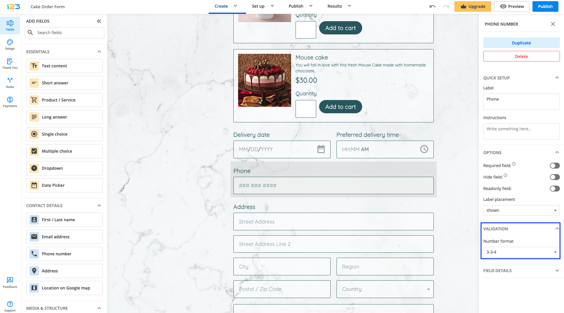
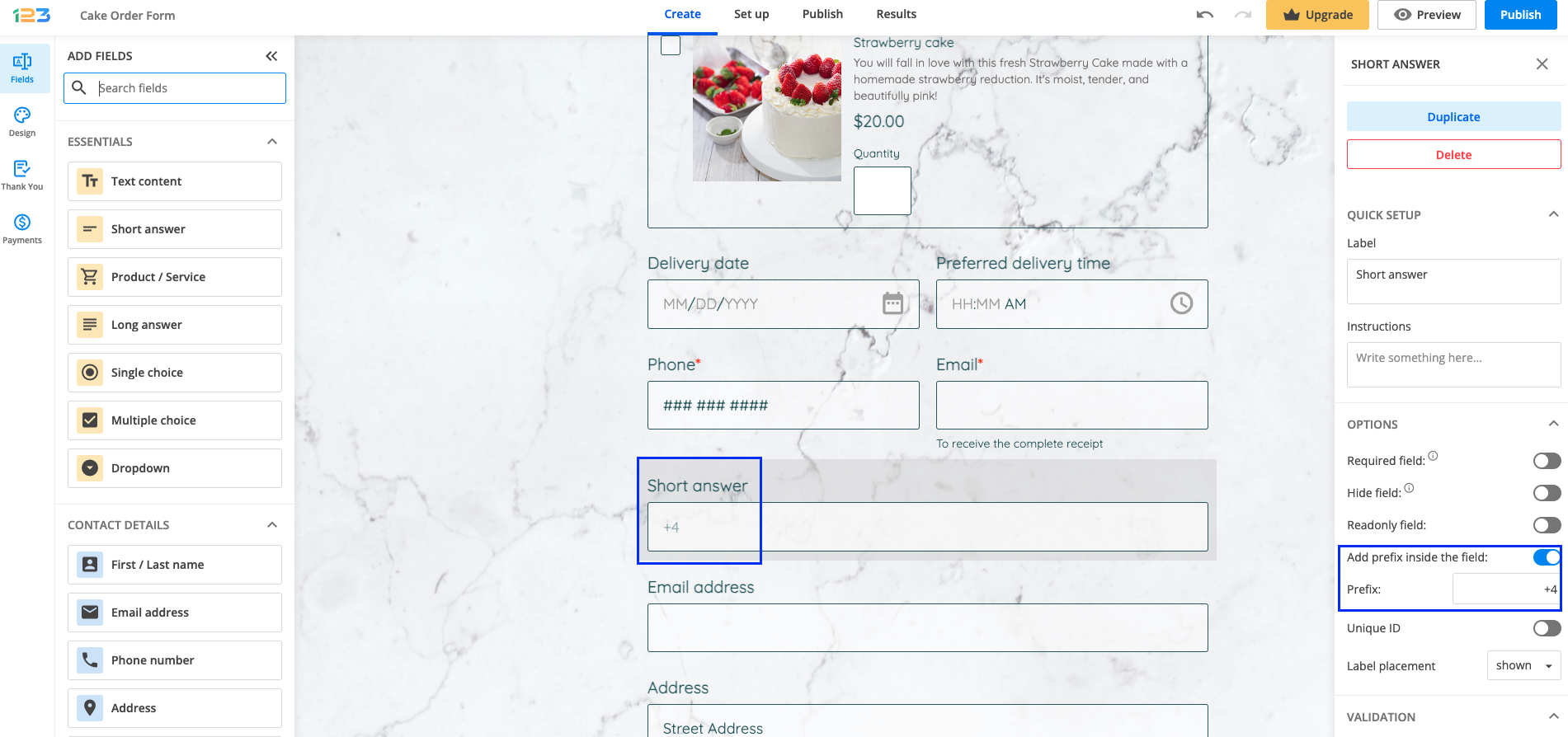
If by any chance you can not find your country’s standard format, you can use a Short answer field instead. This will not limit users to a specific format and you can also enable the Prefix option.
You can also set the field validation to regular expression where you can add the regex code to define your desired phone number format.
Related articles
Any field that you add to the form can be marked as required, meaning your respondents won’t be able to submit the form as long as they don’t complete the field.
Once a field has been added to the form, in the right side panel under the Options section, you can find the Required field option. By default, this is disabled, so you will have to tick this option if you want to make a field required.
Once a field has been marked as required or mandatory, a red asterisk will be placed near the field label so that respondents understand that they have to provide their input in order to submit the form.
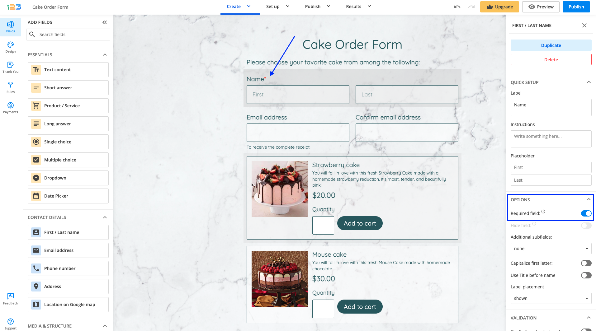
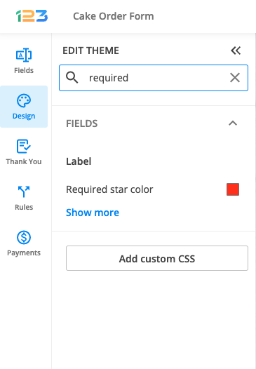
Tip: If you don’t like the way the red asterisk looks on your form, you can change the color by navigating to the Design section, searching for required, and selecting a different color. Alternatively, you can make the asterisk transparent, and mark the non-required questions as optional, by adding this piece of information to the label or field instructions.
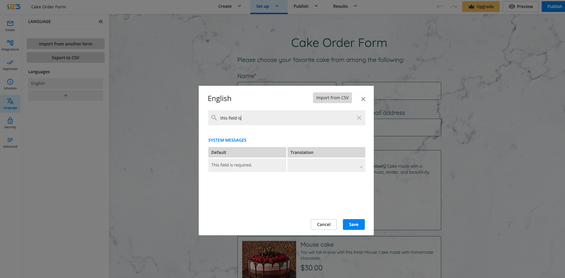
When users try to submit a form without filling out one or multiple required fields, the fields will be highlighted and an error message will be displayed on the form. If you want to edit this error message, you can do so by navigating to the More > Language section, clicking on Edit and searching for “This field is required” and adding an alternative message in the left column.
Related articles:
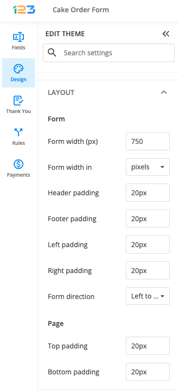
With our online form designer, you can customize every element of your web forms. If you want to resize your form, open the Form Editor and select the Design icon.
Afterward, search for Layout section, expand it and under Form subsection, you will find various options for design settings related to Form layout. Form width is by default set on 750 pixels.
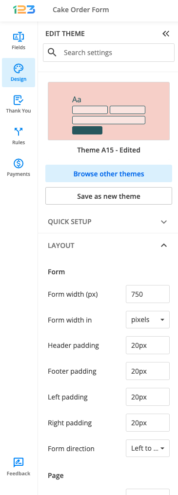
The form’s height depends on the number of form fields displayed on your form. However, you can change the Header and Footer padding values in the same section.
Create a compact form or resize multiple fields to reduce the size of your online form. The possibilities are endless with our form builder.
If you want to insert a hyperlink in your form, all you have to do is add an HTML block field. Once the field has been added to the form, in the left side panel, under the HTML content section, click on Edit text.
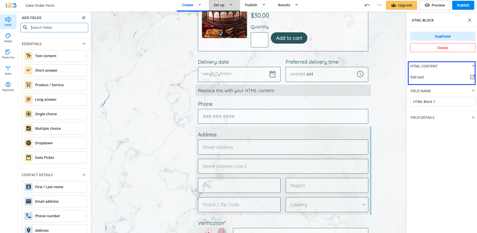
In the pop-up that opens, click on the + sign to open up a dropdown with several options, where Link is available.
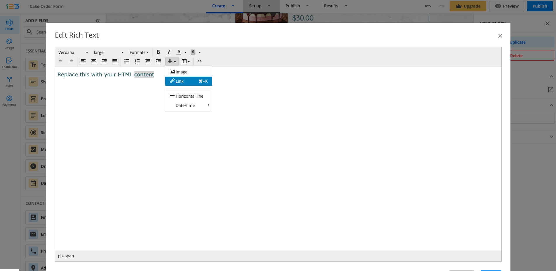
Now you are one step closer to adding a hyperlink to your form! You have to provide the URL, and the text you want to display for your respondents and you can choose if you want to open up the link in the same tab (None) or in a new tab (New page).

Tips: you can also add hyperlinks inside any field label. All you have to do is select the words you are interested in associating with your hyperlink and click on Add link. Don’t forget to add the full URL (including the https://www… part).

If you want your respondents to acknowledge that they have visited a link before submitting the form, you can also use Terms of service field.
Another way of redirecting respondents to a link after the form is submitted is by using Thank you page.
Related articles:
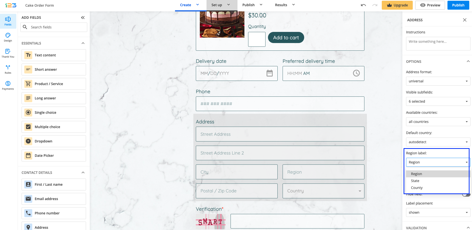
To have a State subfield instead of a Region one in your Address field, go to the Form Editor of your form builder account and under Options section, you will find Region label.
From there, you can select State in the Region/ State/County dropdown list.
Yes, you can use images as Single or Multiple choices to make your form look more dynamic. This feature is available starting from the Gold plan.
All you have to do is add a Single choice field and under the Edit choices section, for each choice you can find the option of uploading an image to be displayed as a choice.

Clicking the image icon will open a modal from where you can upload images from your device. To add an image for another choice, select the image icon next to the option and then click Browse to upload your image. Only .png, .jpeg, .gif, .bmp, .svg, or .webp formats are accepted, up to 1 MB per image.
Once you have uploaded all the files, do not forget to Save your changes. You can always come back to Edit your image, Replace it, or Delete it.

When you have added images as choices, the Layout type of your field will switch to the Card type. In the Layout section, you can also choose to remove the radio buttons from your choices by turning off the Show selector toggle.

Related articles
To delete a form field, access the form builder editor, click the form field, and hit the Delete button that appears on the right side panel. You’ll get a confirmation alert. Choose Yes to remove your field.
Another way of doing it is simply selecting the field you want to delete and hit the Delete button on your keyboard. Done!
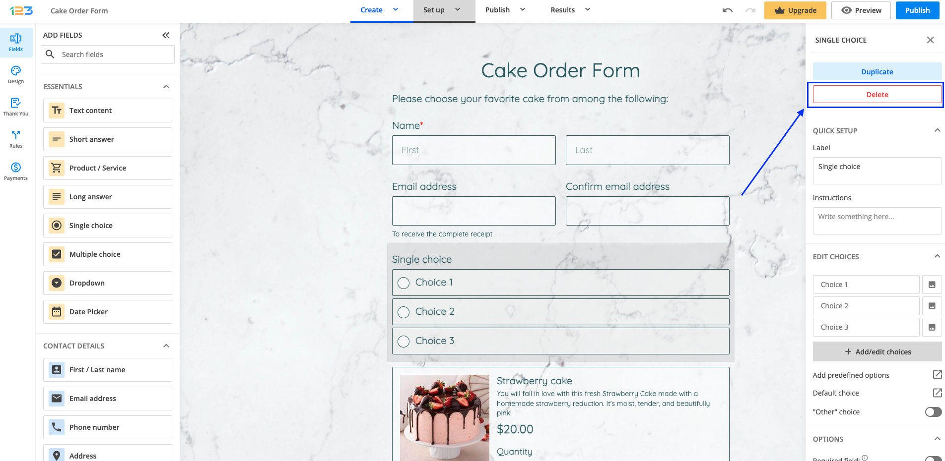
Important Note
All data submitted by users in this field will be deleted and can not be recovered.Multi-page forms are great to use when you need to collect a considerable amount of data from your respondents. They help form visitors feel less anxious about filling in a longer form.
How can I add a page break?
To make your form a multipage one, you will have to add a New page / Page break field where the page should end. The way it works is by splitting a long page into smaller sections that are easier to follow and feel less overwhelming.
The New Page / Page break field works like any other form field. You can grab it and drag it into the desired place, or click on it and add it at the end of the form to create a new blank page.

You can also create a new blank page by clicking the Add page button located at the end of your form.

Once you create a new page, you will notice a few changes on your form:
a) a page options bar is placed between two pages (a page option bar with fewer tools is also added to the top of your form)
The page options bar between two pages contains the following tools:
- a page number indicator for each section/page
- a button to add a new page to the form
- a button to merge the two pages
- navigation arrows for moving the pages up or down the form

b) your form will contain a pagination progress bar

c) a blue border on the left side highlights the page you are currently working on

How can I customize it?
To customize the form pages or sections further, click on the page number indicator. In the right-side panel, you will find different customizations that you can bring to your multipage form:
a) you can choose to display the progress bar as percentages (25%, 50%, 75%), steps (1, 2, 3 displayed as basic text), or page numbers (1/4, 2/4, 3/4). You can also opt to hide the progress bar altogether.
b) by default, Show page titles are enabled, but if you don’t want to have page titles, you can disable this option.
c) you can rename each page according to your needs.

Can I reorder form pages?
Yes, you can now easily reorder form pages in your multipage forms. With the new navigation arrows available on the options bar, you can move a page up or down within your form.
How can I remove a page break?
To remove a page break, go to the space between two pages, and locate the Merge pages button on the options bar. By clicking on it, the two pages will be merged into one.

With the form creator by 123FormBuilder, you have total control over the layout of your web forms and surveys.
You can specify your form’s width, choose whether it is displayed in one or multiple columns, and position labels and instructions. Customize your form layout any way you see fit with the various options that our platform provides.
If you want to change the form’s width, go to Design, expand Layout section and look for Form width. You can type in the desired pixels or you can change the setting from pixel to percentage.
Under Fields section, you can change the label placement – move it from Top to Right or Left. You can also change the text direction on your form for Hebrew reading users.
123FormBuilder uses the most common encoding set, UTF-8. Therefore, any special character added in your input fields will display without any problem.
The forms built with our platform also have a responsive design, meaning that they will display properly across any device.
If you’re looking to build beautiful forms, check out our Form Designer page.
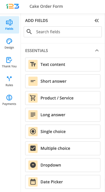
As essential fields, you can use Text content, Short answer, Long answer, Single choice, Multiple choice, and Dropdown.
Thanks to the awesome drag-and-drop form builder, you can easily add any field to your form. Drag fields from the panel on the left to your main view, to the place where you want them to be. You can reposition them afterward. You can also add fields by just clicking on them in the left panel. Each element comes with an Edit option that lets you control its appearance and behavior. In this article, we’ll cover all the essential fields available.
General Particularities
- Type in the Label of the field, the title you want your users to see.
- Set the label’s Visibility – shown, hidden, inside the field, removed
- When you edit the Label you can also choose the title’s style: normal, bold, or italic.
- Check the Required box if the field must be filled in (a red asterisk will indicate that the field is required).
- Click on Hide field if you don’t need to display it on the form.
- Add Instructions if you want to provide additional information regarding the text box; instructions will appear right below the field label.
- Default Value. Specifies the default value of the text field (e.g John Doe).
- Short text fields can show a Unique ID. The ID is automatically generated when the form’s page is refreshed.
- Match another field value. Match two input fields to force the user to type the same value in both.
- You can choose to make an input field Read-Only.
- On choice fields, you can enable the “Other” choice instead of the pre-established choices. Once clicked, it will open an input field.
- Limit the number of times a choice can be selected. Once the limit is reached, that particular option will be grayed out.
- Choice fields can be used for Quiz forms.
Text content
The Text content field is used to input a title or description for your respondents. This way, you can structure your form so that your respondents can easily navigate and provide you with the data you are looking for.
You can customize the text directly within your form main view, by double-clicking it to start editing. At the top of the form, you will find the editing menu bar which allows you to adjust the appearance and style of your content without leaving the field.
Simply select the text to make it bold, italic, or underlined. You can also change the text size and color, add URLs, adjust the transparency, create lists, and align the text as needed.
For other properties such as label placement, font, field name, and field ID, you’ll find them in the right-side panel.

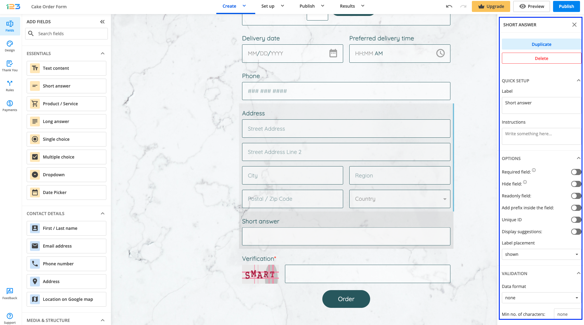
Short answer field
A Short answer field allows users to enter any characters. You can use this field type to collect simple text inputs.
You can make this field required, meaning that your respondents won’t be able to submit the form unless they provide their input. From Validation, choose the Data format you will accept for this field. For example: alpha numeric (letters and numbers), alpha numeric space (letters, numbers, and space tab), full name, or regular expression.
If you are interested in setting the length of your respondents’ answers, you can use Min no. of characters and Max no. of characters.
Providing additional information for your respondents can be made by using the Instructions field. If you are interested in making this field a read-only one, you can set this up as well.
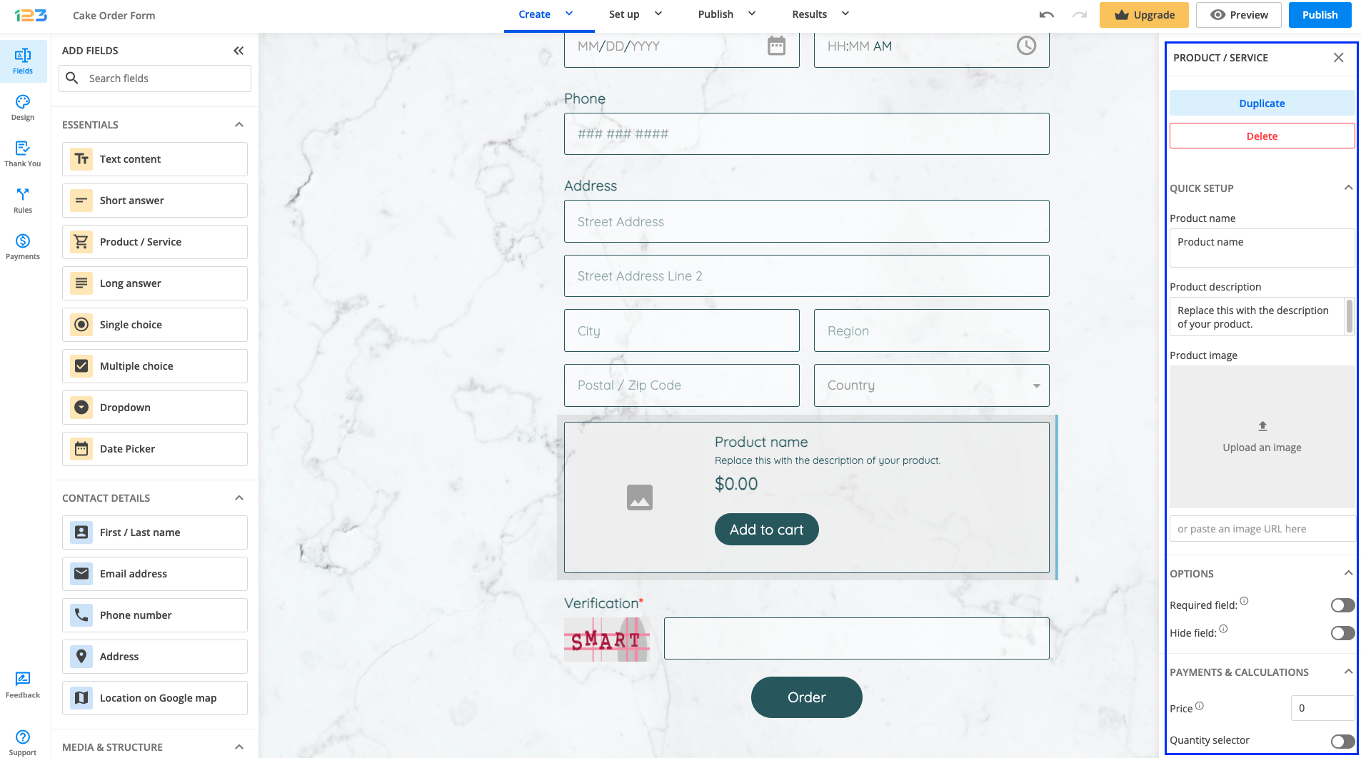
Product/Service Field
The Product/Service field is perfect if you are selling any type of products or services. You can upload an image of your product, mark it as required or hidden. As we are talking about products, you can display a price for it and a quantity selector – so that your respondents can type in how many items of that product they want to order.
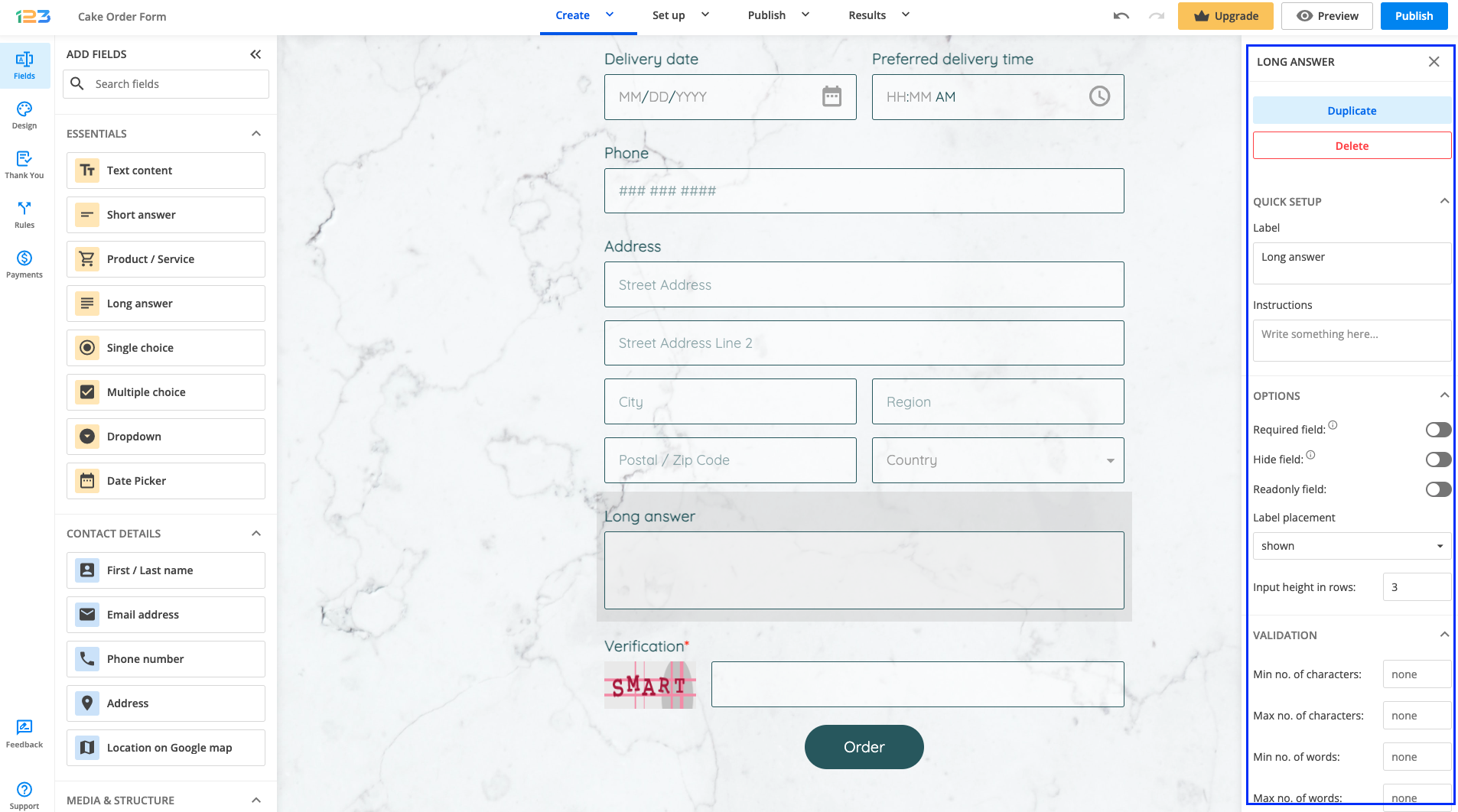
Long Answer Field
Long answer fields are similar to short answer ones, the difference being that they allow for more text input. For example, you may use Long answer fields for comments or suggestions. You can set the minimum and the maximum number of words allowed or increase the height of the field in rows. The field’s height will also increase automatically according to the size of the input typed in by your respondents.
Single Choice Field
The Single choice field allows users to choose only one item from a list of options. If you decide later that a different choice format would suit your needs better, you can easily switch between Single choice, Multiple choice, and Dropdown fields, from the dropdown menu on the right-side panel. Your existing options will automatically carry over to the new format, saving you time and effort.
By default, the choices are set to have a button-like design, but if you want to disable this, you can do so by turning off the Button-like choices toggle. From the No. of columns dropdown menu, you can choose to display your options in 1 to 4 columns.
If you want to make the form more visual for your respondents, you can upload an image for each choice.
You can select a default choice, randomize choices, or even bulk import choices of your liking. By enabling the Clearable option, you can offer your respondents the possibility of erasing the choice selection so they can select another option.
Another cool feature is the possibility of limiting the number of times a choice can be selected by enabling the Restrict choices option. The limitation can be Reset every day and you can also opt-in to Show the number of choices left.

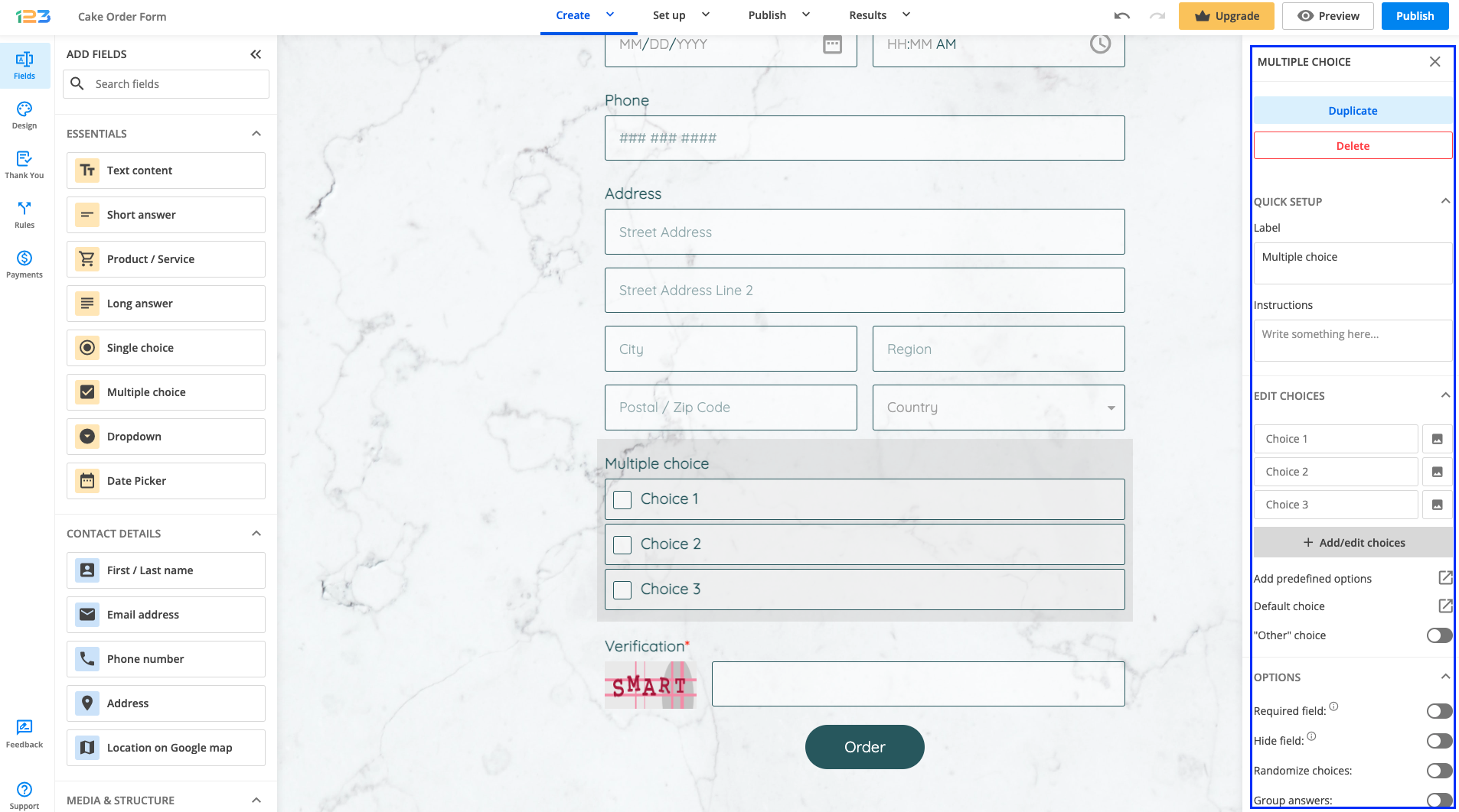
Multiple Choice Field
The Multiple choice field allows users to choose any number of items from a list of options. Besides all the settings already outlined for the Single choice field, the Multiple choice field offers the possibility of setting a minimum and a maximum number of choices to be chosen by your respondents.
You can choose to Group answers to receive the actual choice text instead of the Yes and No indicators.
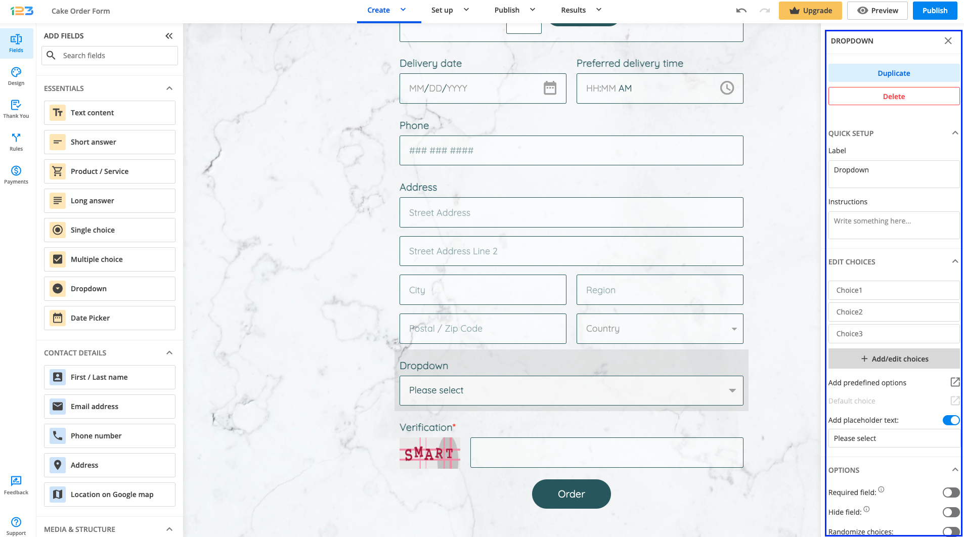
Dropdown Field
The Dropdown field provides a list of several options from which your visitor will have to select one. You can make the dropdown Searchable for your respondents, and you can also set a default choice.
Add a placeholder text that will show up on the first line. If you want to keep the first line blank, delete the Please select default message.
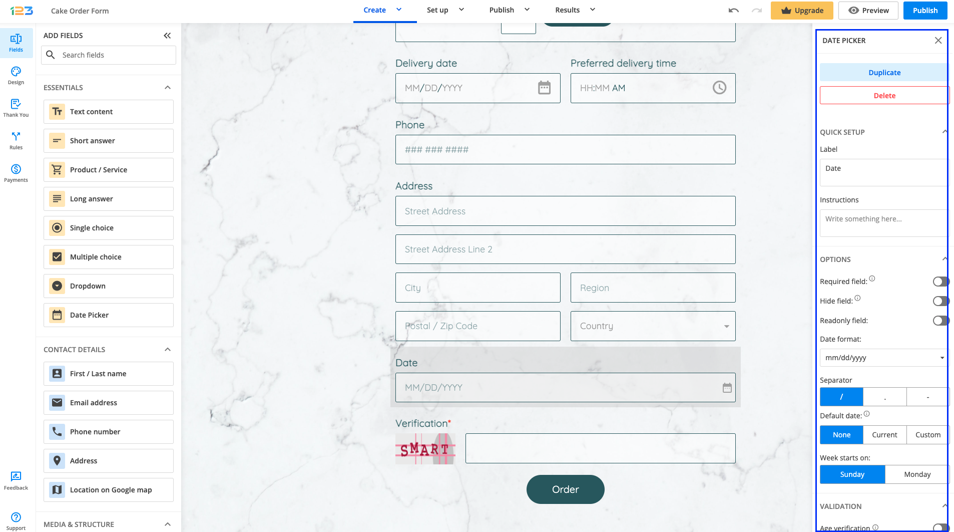
Date Picker Field
If you want your respondents to select a certain date, all you have to do is add a Date Picker field to your form. You can mark it as required, hidden, or readonly.
Other settings are related to the date format. By default, it is set on month/day/year, but you can change it according to your needs. You can choose the separator, set a default date and the day on which the week starts on.
The new aspect of this field is the age verification feature. You can set the minimum age and we will perform a check on the form once your respondents select their birthday date.
You can also disable days to be selected by your respondents or even set up a start & end date.
You can choose to publish the form as a Floating Button. In the form builder, open the Form Editor and go to Publish → Embed form → Floating button.
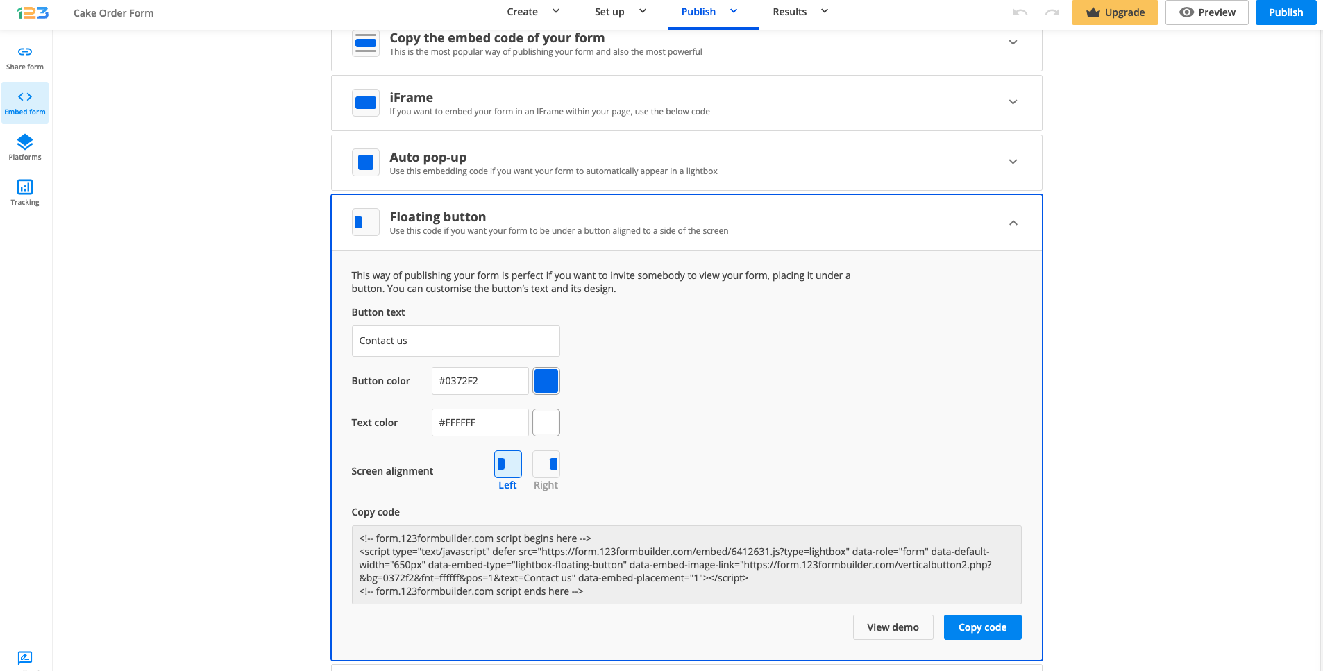
Afterward, you can customize your button by selecting the text you want to be displayed, the button color, the text color. Additionally, you can also choose the screen alignment – left or right. Copy the code that was generated and paste it on your website.
Most Popular
Frequently Asked Questions
Here is a list of the most frequently asked questions. For more FAQs, please browse through the FAQs page.