123FormBuilder Knowledge Base
Search our documentation platform for answers, service specifications and 3rd-party integrations.
Knowledge Base
The Fill Again feature is designed to make submitting multiple entries quicker and easier than ever before. Whether you’re managing surveys, event registrations, or feedback forms, this new option helps simplify the process for respondents who need to complete the same form multiple times.
To enable the Fill Again feature, select Thank You from the left-side panel in the Create tab within the form builder.

On the right-side panel, you’ll notice the Options section. Here you will find the Fill Again toggle. Once turned on, you can edit the Button text.

After your respondents submit the form and land on the Thank You page, they will now see the Fill Again button. By clicking it, they can immediately start a new submission from scratch without needing to navigate back to the initial form link.
The Fill Again button has the same color and text color as the Submit button. If you wish to change them, you can do so from Design → Quick Setup → Button color & Button text color.

Related articles
We are excited to announce the release of our revamped Thank You page, now available for all new forms created starting from May 23rd, 2024. We have provided more customization options, making it easier than ever to create a more personalized and engaging experience for your form respondents.
As before, start from the Create tab of our form builder and select Thank You from the left side panel. You’ll first notice a preview of the default Thank you message that now shows up when someone submits your form and a right-side panel with various options. Let’s dive into all the new settings.

Add media
The first thing that might draw your attention is the image. The Add media section on the right-side panel has the Image option selected by default, but you can also choose to display a Video instead. Just select the icon for the option you wish to use.

Adding an Image
To add an image from your device, hover over the image on the right-side panel and click Replace. The formats accepted are .png, .jpeg, .gif, and .webp.

Once you upload your file, it will open in a new Crop & edit image editor from where you can further customize it to best fit your Thank You page.

The options you can use to edit your image are:
- Crop: you can keep the Original aspect of the image or crop it to different ratios such as 16:9, 9:16, 1:1, or crop it into a Circle;
- Zoom: use the icons or slider to zoom the image in or out;
- Rotate: use the icons to rotate the image at 90 degrees or use the slider for in-between inclinations;
- Flip: flip the image horizontally or vertically.
You can also drag the image in the canvas if you need to change its positioning. When you are happy with your image, click on Save image to add it to your Thank You page.
The image can be resized in the main view as well. Simply hover over it and grab the handles at the margins to resize your image.
If you don’t want an image on your Thank You page, select the Delete icon on the right-side panel.

You can always come back and add an image by selecting Browse.

Adding a Video
If you want to show a video instead, select the Video icon in Add media. A new field will show up where you will need to add the Video link. You can add links from YouTube and Vimeo.

Customizing the text on the Thank You page
The new Thank You page contains a Title and Subtitle section that can be edited inline by clicking the text in the main view. Both sections provide the same text editor that appears at the top of the text and allows you to:
- Change the text size (Normal or different Heading sizes) and increase/decrease it further with the numeric font size option:

- Format your text to make it bold, italic, or underlined:

- Change the text color:

- Adjust the color transparency:

- Add URL to direct users to relevant content (your respondents will need to click the hyperlink to open the respective URL as they will not be redirected automatically):

- Add Numbered & Bullet Lists – Clicking the bullet list icon once adds a bullet point to the current line or selected text. On the second click, the bullet point is changed to a number. On the third click, the list is removed.

- Change the Alignment – by default, the text is center-aligned. Clicking on the alignment button will cycle through the available alignment options in the following order: left, justify, right, and then back to center.
- Add variables from your form for a personalized experience – select variables from a list of all input fields added to your form or from submission data (such as the Reference ID, Entry ID, Form Host, Referrer, and Language).

Be careful when you delete your form fields, as they will no longer appear on the Thank You page.
Redirect to URL
The first option on the right-side panel is Redirect to URL, a premium option that you can use starting from the Gold plan. If you have a lower plan, you will notice a premium icon that will help you upgrade your account on the spot to benefit from this feature.

Similar to the original Thank You page settings, you can still redirect your form respondents to a different website. Turn on the toggle to set up the redirect options.

Start by adding the URL where you want to redirect your users upon submission in the field that opens.
Next, you will find the Title field, where you can add a name or short description for your link. You can also choose where you would like the link to open: on the Same page or in a New tab.
Lastly, type in the Seconds until redirect. The default and minimum value is 5 seconds. Feel free to increase it if you have more information on your Thank You page. You can increase the redirect time up to 60 seconds. Alternatively, you can disable the Show ‘Thank you” Page toggle for the redirect to happen right after the form is submitted.
Additional options
There are 4 more options that you can enable for your new Thank You page: Go to URL, Fill again, Download PDF, and Submission Summary. All of them are premium features included in the Gold plan and higher. You will find them in the Options section at the bottom of the right-side panel.

Go to URL
If you wish for your respondents to access a link at their own pace, enable the Go to URL toggle. Once enabled you can customize the Button text and add the Button URL.

Fill again
A new feature introduced with this update is Fill again. With this option enabled, users can reload the form and make a new submission. Here you can also customize the Button text.

Download PDF
Another new option is that you can now provide a PDF document that your users can download after they submit the form. Turn on the Download PDF toggle and click on Browse to upload your PDF file (the maximum allowed size is 5MB).

The Download PDF button will show up on the Thank You page only after you upload the PDF. You can also Replace the PDF or select the Delete icon if you wish to remove it.

Submission Summary
The Submission Summary feature allows users to easily download their form submission in PDF format directly from the Thank you page. With this option enabled, a link will appear on the Thank you page, enabling users to generate a PDF containing the form layout with their submitted information.

The color of the Go to URL, Fill again, Download PDF buttons, and the Submission Summary text are the same as the Submit button. You can change the color from Design → Quick Setup → Button color.

New PayPal Standard integration
For existing setups, if the below requested additional information is not provided, your integration with PayPal Standard will break and you won’t be able to collect payments through your form.
With our old PayPal Standard integration, the only information you needed to provide in order to enable this payment integration was your Email address and Language.
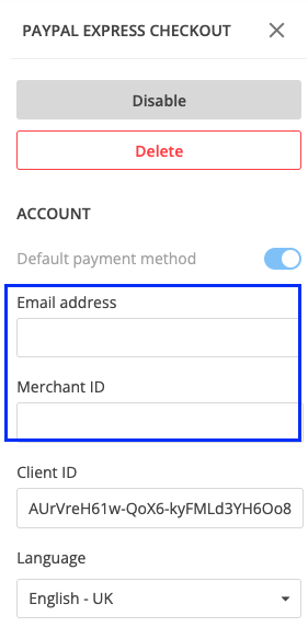
With our new PayPal Standard integration, we are requested to have in its setup some additional information – Merchant ID. Without this information, any PayPal Standard integration that is already enabled would break.

Note: if you have a PayPal Standard integration enabled on your form that does not have Merchant ID, your payment integration will break and you will no longer be able to collect payments. It is mandatory for you to provide this information in order to make sure your form works flawlessly.
Where to find Merchant ID
According to PayPal’s documentation, all you have to do is to log in to your PayPal account and go to Account settings.
Under Business profile, click on Business information. You’ll find your ID next to PayPal Merchant ID. Copy this value and paste it into your 123FormBuilder’s form, under the Merchant ID field in your PayPal Standard settings.
New PayPal Checkout integration
For existing setups, if the below requested additional information is not provided, your integration with PayPal Checkout will break and you won’t be able to collect payments through your form.
With our old PayPal Checkout integration, the only information you needed to provide in order to enable this payment integration was Client ID and Language.
With our new PayPal Checkout integration, we are requested to have in its setup some additional information, Merchant ID and Email address. Without these 2 pieces of information, any PayPal Checkout integration that is already enabled would break.
Note: if you have a PayPal Checkout integration enabled on your form that does not have these 2 pieces of information (Merchant ID and Email address), your payment integration will break and you will no longer be able to collect payments. It is mandatory for you to provide this information in order to make sure your form works flawlessly.
Where to find Merchant ID
According to PayPal’s documentation, all you have to do is to log in to your PayPal account and go to Account settings.
Under Business profile, click on Business information. You’ll find your ID next to PayPal Merchant ID. Copy this value and paste it into your 123FormBuilder’s form, under the Merchant ID field in your PayPal Checkout settings.
When creating a new form, you can easily name your form and choose a folder where to place it. Let’s go through an example together.
After clicking on the New form button in My forms, you’ll have to choose how you want to create a new form: from scratch or from a template.
Let’s say we are creating the form from scratch. When entering the Editor, a modal will be displayed with the default form name and a default location.

You can edit the form name and choose a location for the form. By default, the form will be placed in My Forms (if this is where you’ve started the creation of the new form) or in the folder from where you’ve clicked on the New form button.
When clicking on the Location dropdown, you can select from your existing folders, with indentation visible so you can easily understand the relationship between folders.

Related articles
In order to create a better communication between 123FormBuilder and yourself, we’ve created a new section, called What’s new.
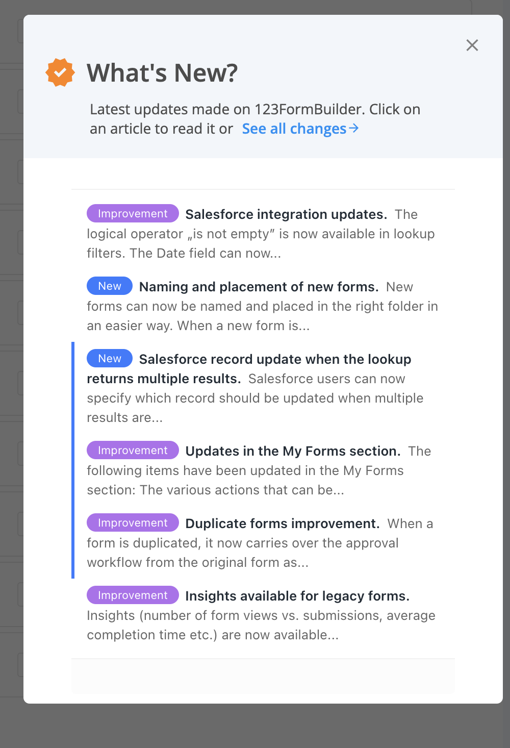
You can find it in My Forms, right below your pricing limits. When clicking on What’s new, a modal opens up on the right side of the page with the last 6 new updates on 123FormBuilder.

If you want to check more details about an update, you can simply click on its title and the full information will be displayed.
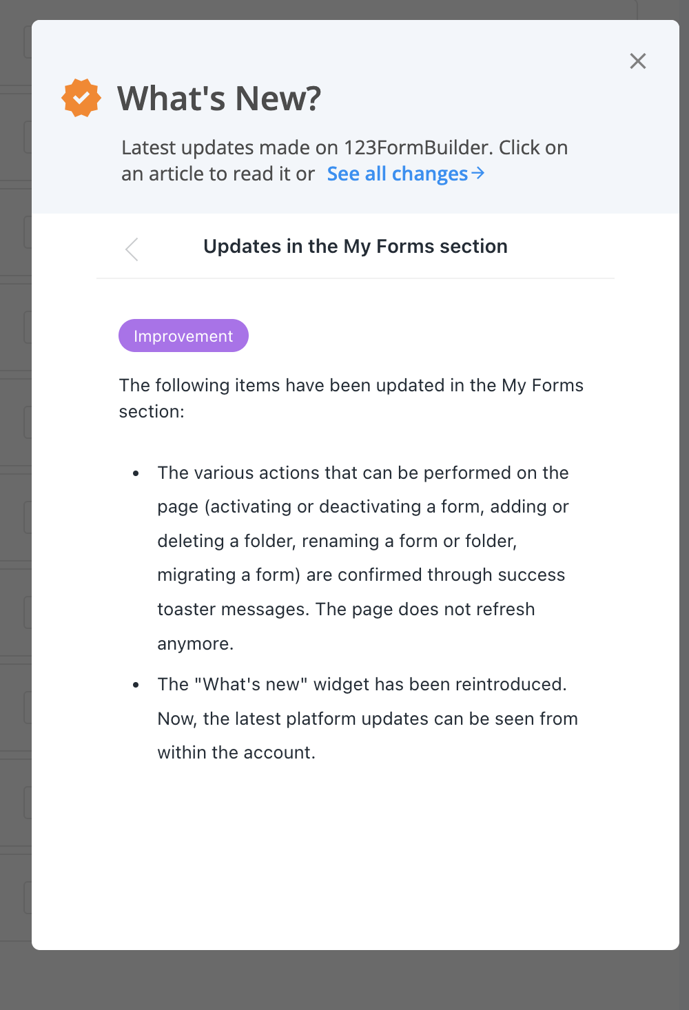
If you are interested in finding out more about the latest updates, all you have to do is click on See all changes and you will be redirected to our Change log where you can check all the latest releases.
Related articles
Before talking about marking a folder as a favorite, we need to first tackle how you can create your first folder.

Create a folder
You can create a folder by clicking on the New folder button at the top, in My Forms.

Once you click on the New folder button, a modal appears asking you to provide the Folder name. You can also customize the Folder color and Folder icon. Now you have the first folder created!

When the folder is empty, you will see a message indicating that no forms have been created yet. However, you can easily create a new form by clicking on the Create Form button.

When creating a second folder, you will have the option of also selecting the Location – My forms being the root folder containing everything. You can change it to any other existing folder, thus creating a subfolder.

Mark a folder as Favorite
Now that you have folders and you’ve created numerous forms, it might be cumbersome to constantly navigate to the folder you are interested in.
You can mark a folder as a favorite from the left side panel by navigating to the folder you are interested in. When hovering over it, a star icon will display, along with a tooltip, Mark as favorite.

You can also mark a folder as a favorite by selecting it in the left side panel. On the main view, right next to the folder title, you’ll notice the star icon.

Once a folder is marked as a favorite, there will be 2 changes that will take place. The star icon is colored and on the left side panel, you’ll notice that a new category is created: Favourites.

Under Favourites, we will display all the folders that you have marked as favorites so you can easily reach them at the click of a button.
Note for users that have subusers
Remove a folder from Favourites
Whenever you want to, you can remove a folder from your favorites by simply clicking on the star icon, either from the left side panel or the main view.

Related articles
Legacy Google Sheets integration
The Google Sheets integration allows you to send form submissions to spreadsheets. All submissions for one form will appear in the same spreadsheet.
Before integrating with Google Sheets there are a few things that you should be aware of:
- Do not delete any spreadsheet columns generated by your form fields. You can delete fields from your form but not their correspondent spreadsheet column in Google Sheets.
- Make test submissions after applying changes, to update on both sides.
- Selecting a group of cells and sorting/filtering data will break the integration.
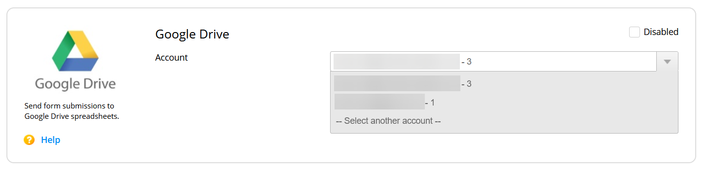
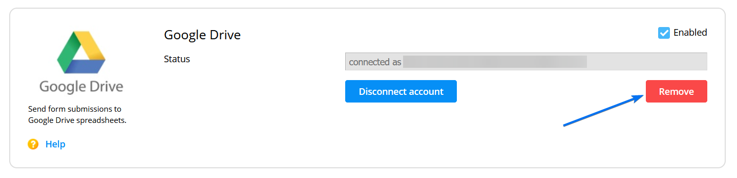
You’ll find the Google Sheets integration in the Integrations section of your form. Add the application and hit the Connect button. You’ll be redirected to a separate page to add your Google account credentials (if not logged in).
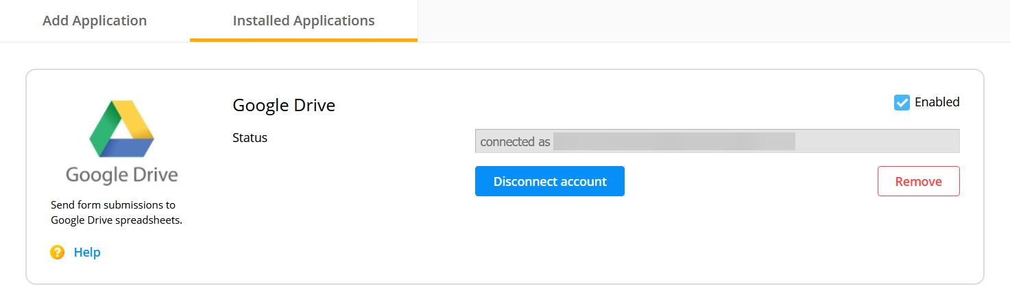
When you check your Google Sheets account after submissions were made, you will see that you’ve got a new spreadsheet with the name of your form showing each submission’s input in one row. The form data is not sent immediately but after one to five minutes.
The counter displayed next to the name of the Google account specifies the number of times a new token has been created. A new token is created each time you choose the Connect another account option within the dropdown and type in a Gmail address that you already used.
Our integration works very well with event registration forms and online surveys when you need to share form entries quickly with other interested parties.
Important Notes
To change both the label names and the order of the columns in your spreadsheet, you’ll need to follow these steps:- 1. First, change the label names and submit your form.
- 2. Reorder the columns in your spreadsheet and submit the form after you are done.
If the integration is not working correctly, click on the Remove button and add Google Sheets again. A new spreadsheet will be created. The connection with the old spreadsheet can not be restored.
When sharing your link with anyone via social media platforms, your link has behind it some metadata information. This includes an image associated with the link, a title or a description. Also, this meta image is also displayed in My Forms, for each one of your forms in order for you to easily identify the form you are interested in.
The default meta image & meta description can be customised in order for you to catch your respondents interest and collect more submissions easier.
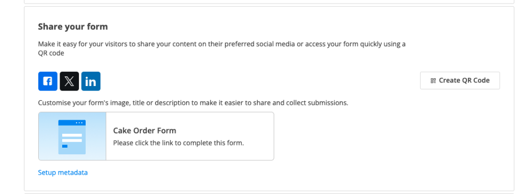
By default, the metadata of your form has a generic photo, the title of the form and a default description. You can customise all that by clicking on Setup metadata from Publish – Share form section.
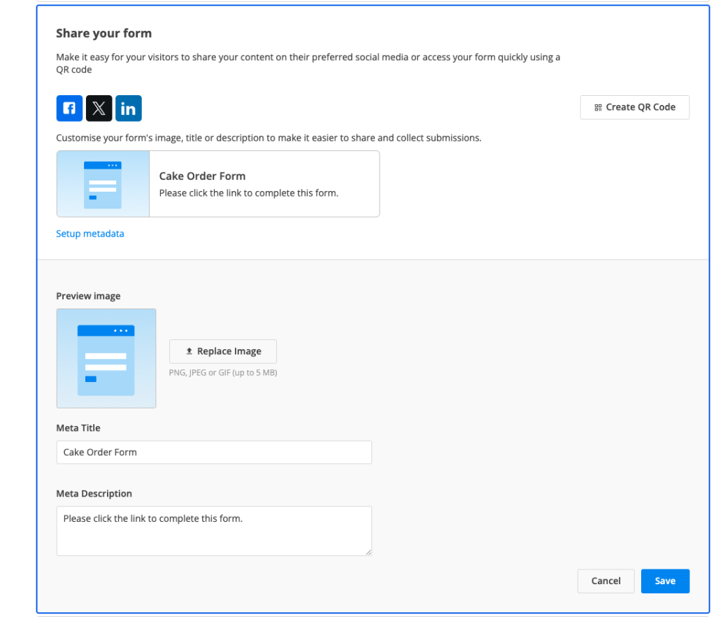
You can replace the image with anything you’d like. The file has to be PNG, JPEG or GIF and up to 5 MB. The Meta Title is by default your form name, but you can change it according to your needs. Last but not least, the Meta Description can also be customised.
Once you’ve made all the necessary changes, click Save. All your changes will be updated directly in Publish section so you could see what your respondents see when you share the link with them.
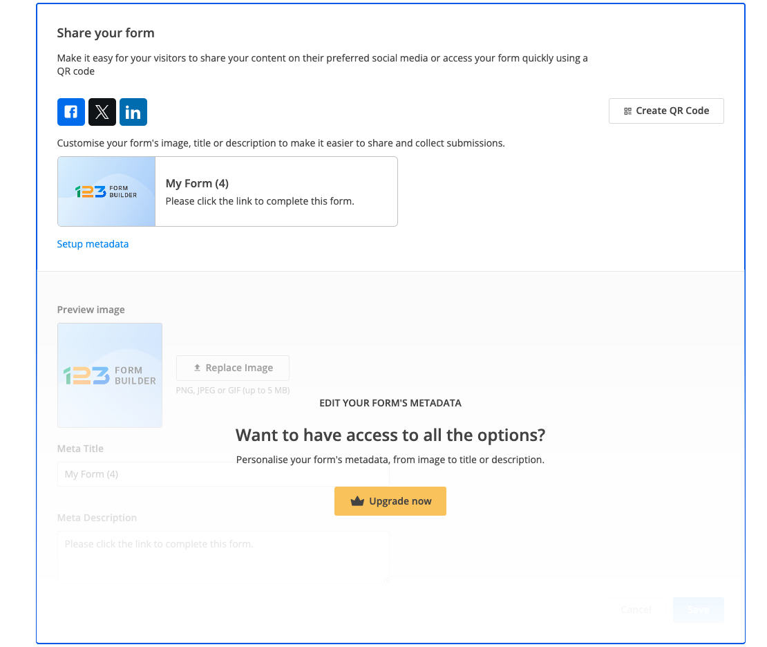
Note: setup metadata is available only for paying users. As a free users, you benefit of the default settings. If you want to change any of the metadata, all you need to do is click on Upgrade button and change your plan to a paying one.
Related articles
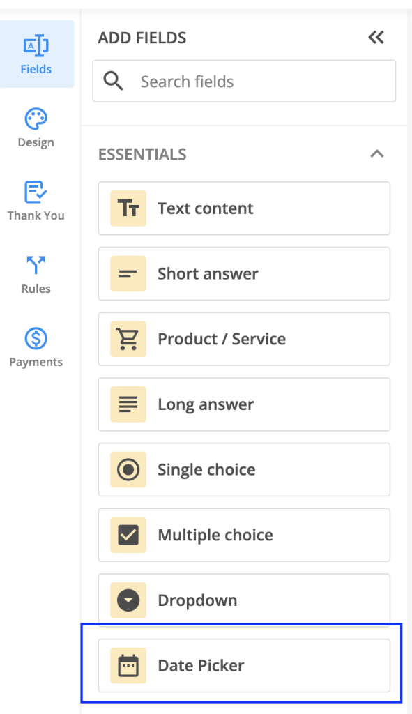
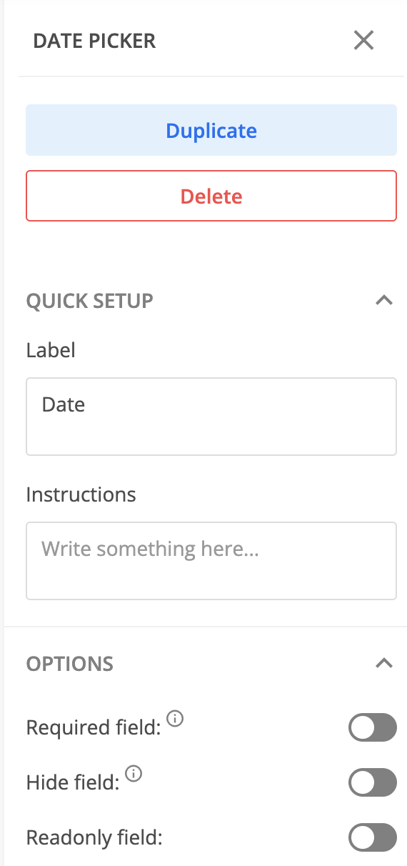
The new Date picker field can be found under the Essentials category. Its role is to help you gather date information from your respondents.
Setup
Once you’ve added the Date picker field to your form, you will notice a sidebar menu with 3 options: Settings, Duplicate, and Delete. Click on Settings to open up the right-side panel with all the settings available for the Date picker field.

Let’s take them one by one.
You can provide a label and instructions, as for any other field. Using the toggles, you can mark the Date picker field as required, hidden, or readonly, depending on your needs.
By default, the date format is set to mm/dd/yyyy, which means respondents need to provide their input in this order: month, day, and year. You can choose to change this to either dd/mm/yyyy or yyyy/mm/dd.
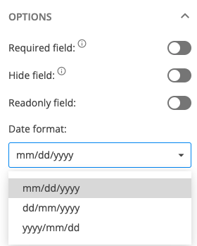
You can also choose the separator used to display the date. By default, we have set it up to /, but you can change it to . or –

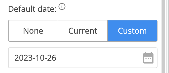
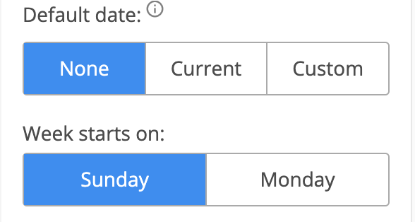
Another aspect that can be customized is the Default date. By default, it is set to None, but you can change it to Current or Custom. When current is selected, the date picker will automatically display the current date your respondent accessed the form.
By choosing custom, you can select which date should be displayed on the form instead.
You can bring some customization to the calendar itself by choosing on which day of the week the calendar should start – Sunday or Monday.
Validation
Under the Validation section, you can find three options for validation: Age verification, Disable days, and Start & End date.
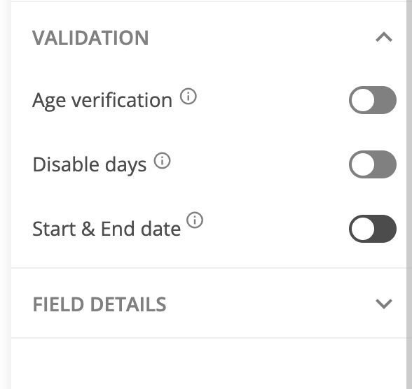
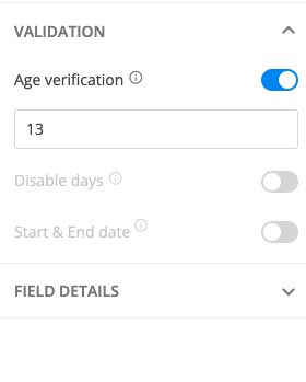
Age verification – let’s say you are interested in receiving submissions only from respondents who are over 13 years old. In this case, all you have to do is to enable Age verification and write down the minimum age threshold.
Note: When Age verification is enabled, you can not use Disable days and Start & End date options as they are not compatible.
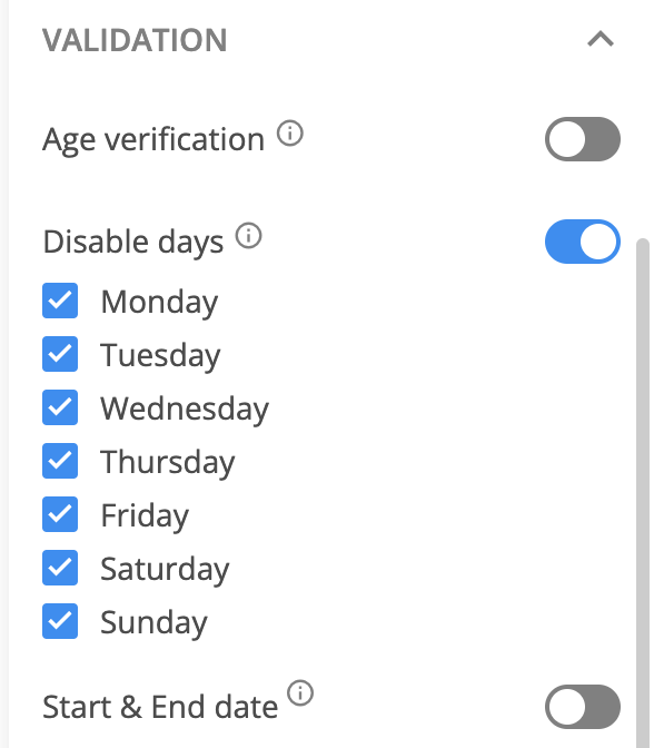
Disable days – if you want to prevent respondents from selecting a certain day of the week, then all you have to do is to enable Disable days and select the days you are interested in disabling.
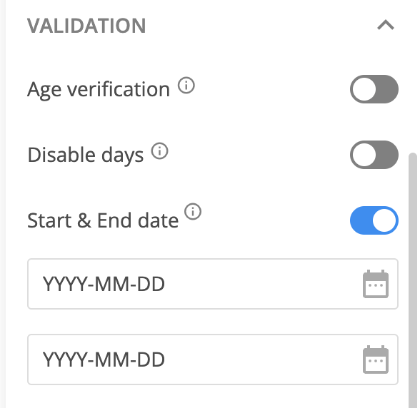
Start & End date – if you are interested in allowing your respondents to select dates between a certain timeframe, then you have to enable Start & End date and select the dates.
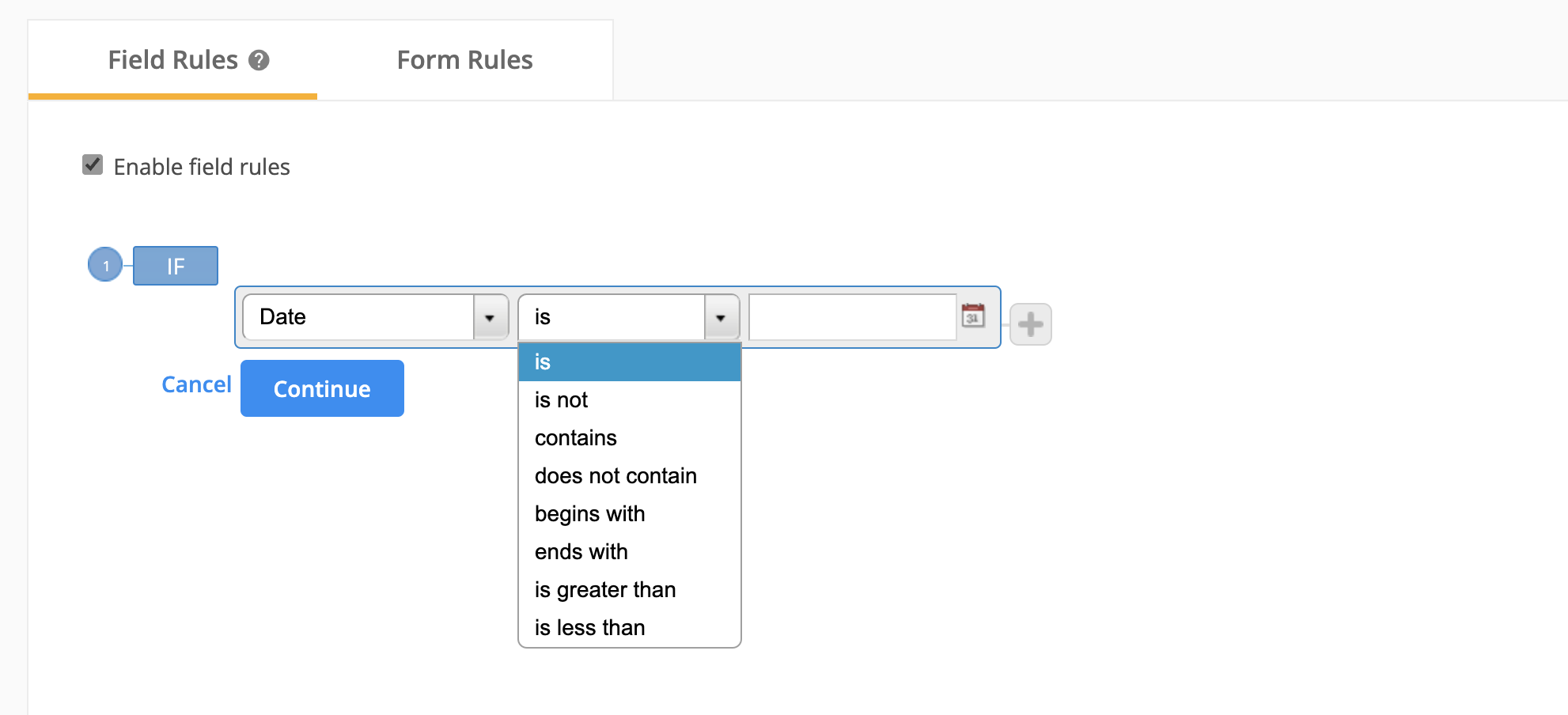
Rules
You can set up field rules with the new Date picker field. After selecting the field, you have to check the logic operators (you can see them all in the below screenshot).
Then, by clicking on the calendar icon, you can select the exact date you are interested in.
Note: if you go with manually typing the date in Rules, then please follow the ISO format to collect data: YYYY-MM-DD. If you go with any other format, the rule will not work.
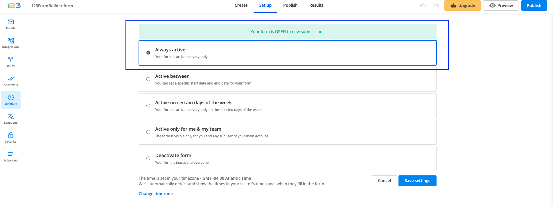
You can easily set up your form status by using our brand new section, Schedule. The Schedule section can be found under Set up.

Currently, we are offering 6 different settings for your form status:
1. Always active
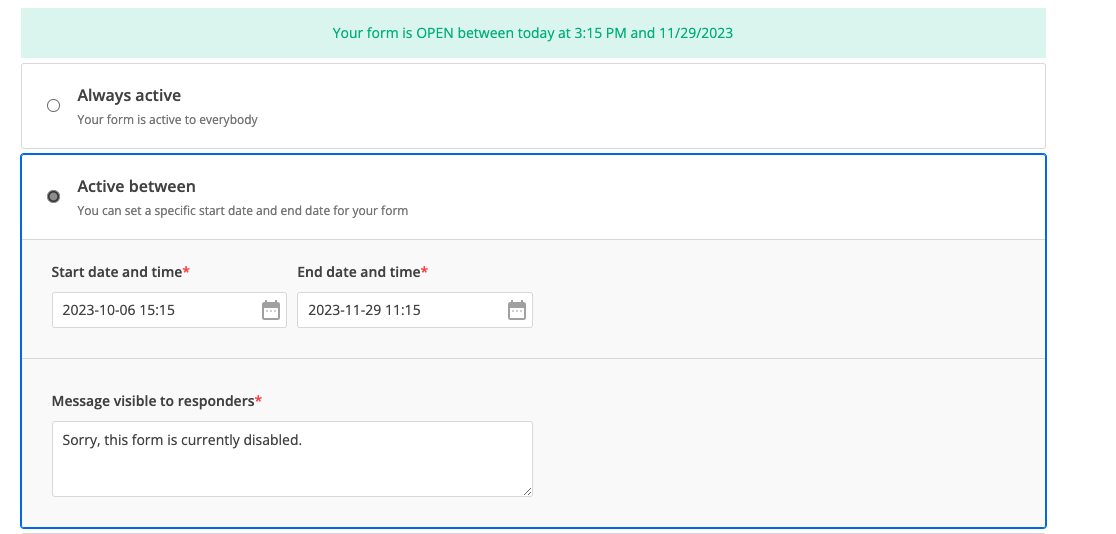
2. Active between → you can set a specific start date and end date for your form.
3. Active on certain days of the week → you can set up your form to be active only on the days of the week specified by you.
4. Active only for me & my team → if you have subusers, you can set the form to be active only for you and all subusers of your account.
5. Deactivate form on submission limit → you can set to receive a certain amount of submissions per form/year/month/week/day/hour, and once the limit is reached, the form becomes inactive.
6. Deactivate form → you can set your form to be inactive for everyone.
You can set up a specific start date & end date for your form directly from Schedule section. Schedule section can be found under Set up section.
By default, your form is set up to be always active. Always active option is selected and an informative banner is also shown so that you could easily scan the info: Your form is OPEN to new submissions.
If you want your form to be active between certain dates, you can do this by simply selecting Active between.
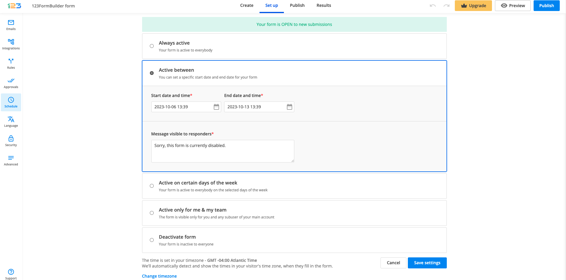
By choosing Active between, you can choose both the start date & time and the end date & time.
By default, the start date is today’s date and your current time. If you want to change this, click on the calendar icon.
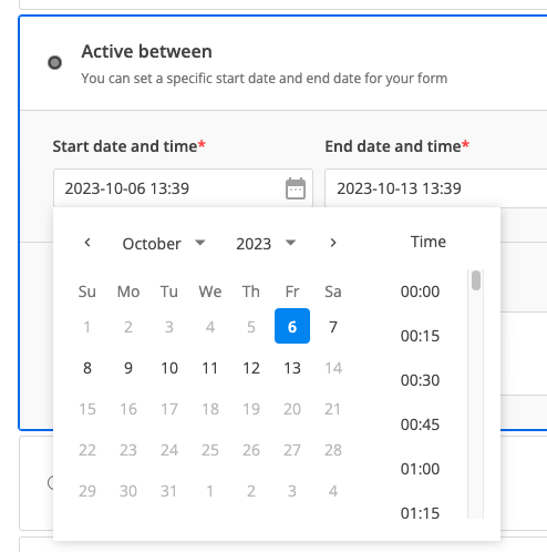
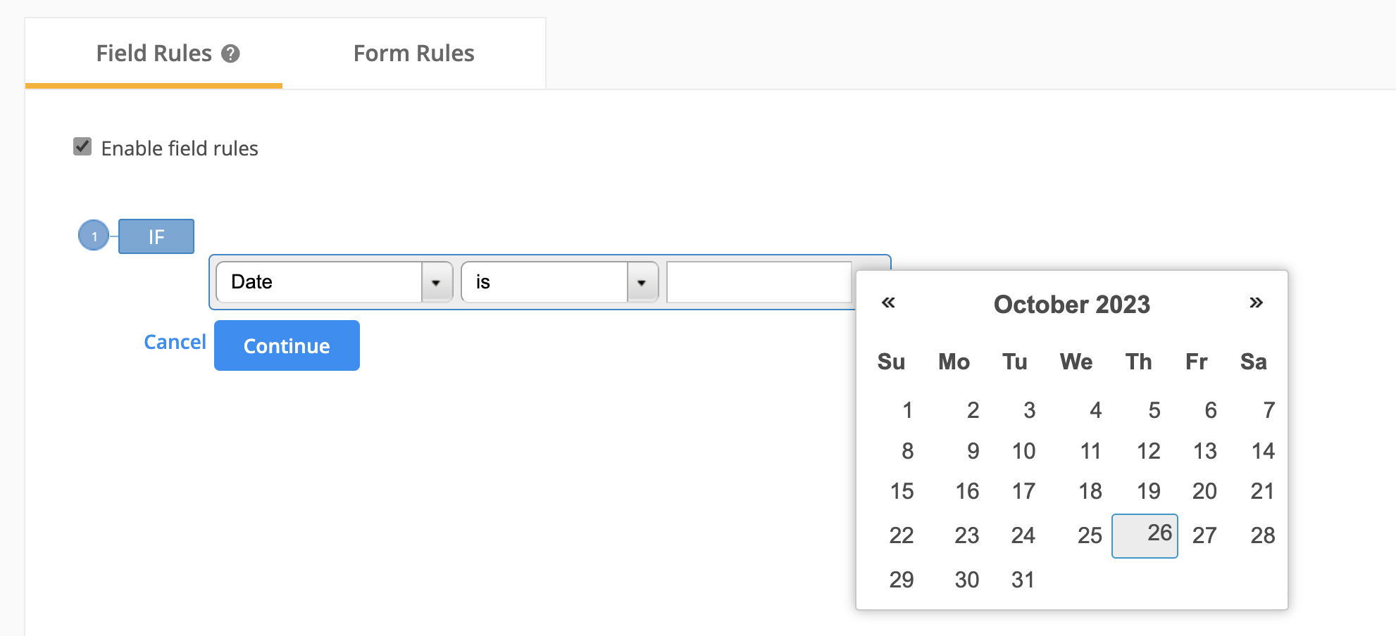
Navigating the calendar
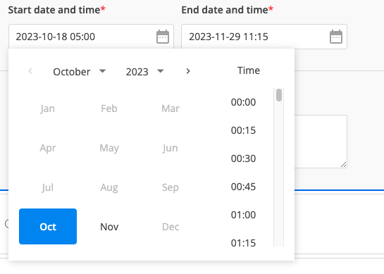
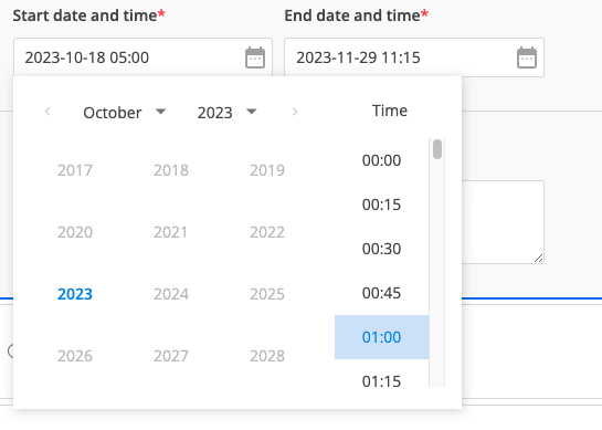
Once you’ve opened the calendar, you will notice that you have access to modifying the day, month, year and time.
The day can be modified by simply clicking on the day that you are interested in.
Note: You need to pay attention to the end date, as the start date needs to be before the end date – this is why in the above example you see the dates after 13th of October greyed out.
The month can be modified by clicking on the month dropdown arrow.
The year can be modified by clicking on the year dropdown arrow.
The time can be selected by scrolling up and down and finding the one that fits your needs. You can also change the time by directly writing the time in the input box.
Message visible to responders
By default, the message visible to responders is set as below:
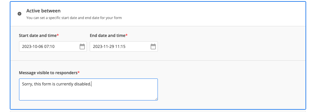
If respondents access your form during the inactivity period, they will see a page with the message provided in Schedule section.

Once you update the text in Schedule section and save the changes, it will be automatically updated for respondents as well.
Save changes
After you have made all the necessary settings, do not forget to click on Save settings button. After the settings have been saved, the top informative banner will be updated so you could easily scan the form status.
Related articles
Most Popular
Frequently Asked Questions
Here is a list of the most frequently asked questions. For more FAQs, please browse through the FAQs page.