123FormBuilder Knowledge Base
Search our documentation platform for answers, service specifications and 3rd-party integrations.
Improving mobile design for your forms with CSS
123FormBuilder forms work great on all mobile devices and tablets and offer a user-friendly experience on any device.
Our forms are by default mobile responsive, however, you can tweak your existing web forms design with our CSS form generator. In this article, we will show you a step-by-step guide on how to accomplish that.
Form Images
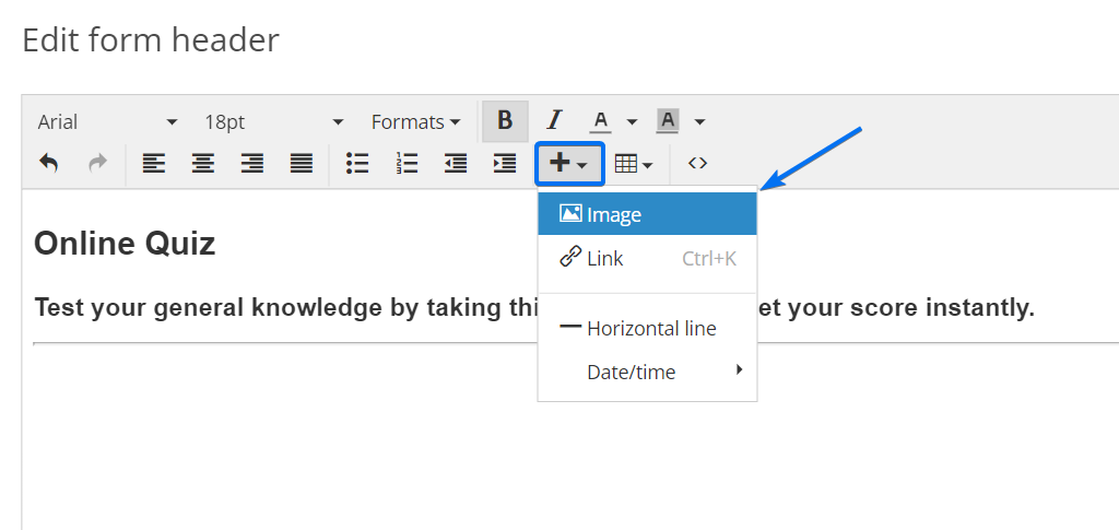
When you insert an image in the Form Header or HTML blocks you will need to specify the best settings to ensure that it will be mobile responsive. In the editing mode of your HTML field click the plus sign and select Image.
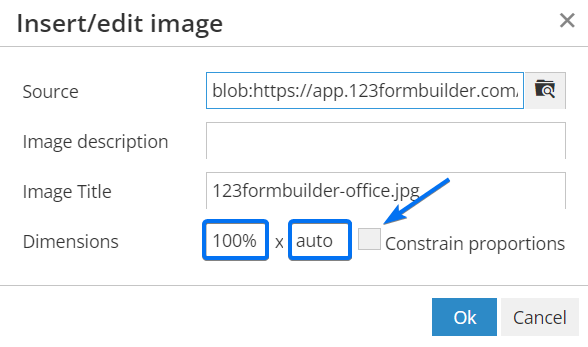
After you upload the image, in the Dimensions section, type 100% in the first box (width) and auto in the second one (height). Disable the Constrain proportions option to maintain the original width and height dimensions.
Video
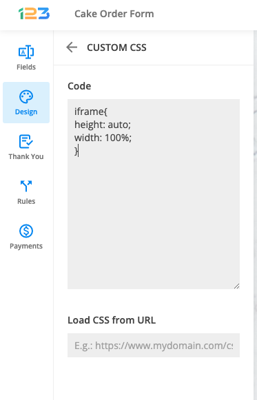
When you add an iframe to display a video you can use a custom CSS code to make it work perfectly for mobile devices. The CSS will be placed in the Design → Add Custom CSS section. This method applies to all iframes. Simply copy-paste the code from below:
iframe{
height: auto;
width: 100%;
}
Font Size
Font size may seem like a small thing, but it is an important element, especially for mobile readers. You can use the following CSS and adjust the number of pixels (12).
@media only screen and (max-width: 550px) {
#form *{
    font-size: 12px!important;
    }
}
Submit Button
Enlarge the submit button to have better visibility. The CSS code from below will make the submit button wider.
@media only screen and (max-width: 550px){
#form button[data-role] {
padding: 0px 33%;
  }
}
Decrease the percentage number if you want the submit button to be more narrow or increase the number (33%) to make it wider.
To make the font size of the submit button smaller simply adjust the number of pixels.
@media only screen and (max-width: 550px){
#form button[data-role] {
font-size:12px;
  }
}
That’s it! Now your forms are fully mobile responsive and form visitors will have the best user experience with these design tips.
Similar Articles
Frequently Asked Questions
Here is a list of the most frequently asked questions. For more FAQs, please browse through the FAQs page.