123FormBuilder Knowledge Base
Search our documentation platform for answers, service specifications and 3rd-party integrations.
Knowledge Base
In this article, you’ll learn how to customize the progress bar of your form using our online form builder.
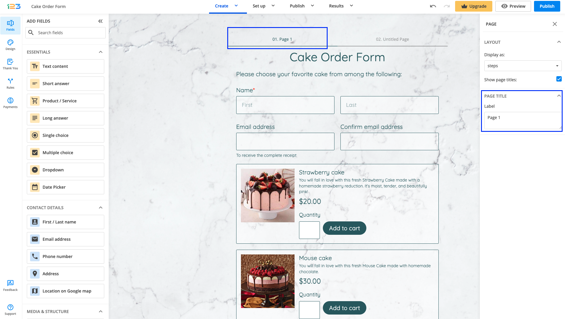
Once you have created a multipage form by adding New page/Page break, you will have by default a progress bar placed at the top of the page.
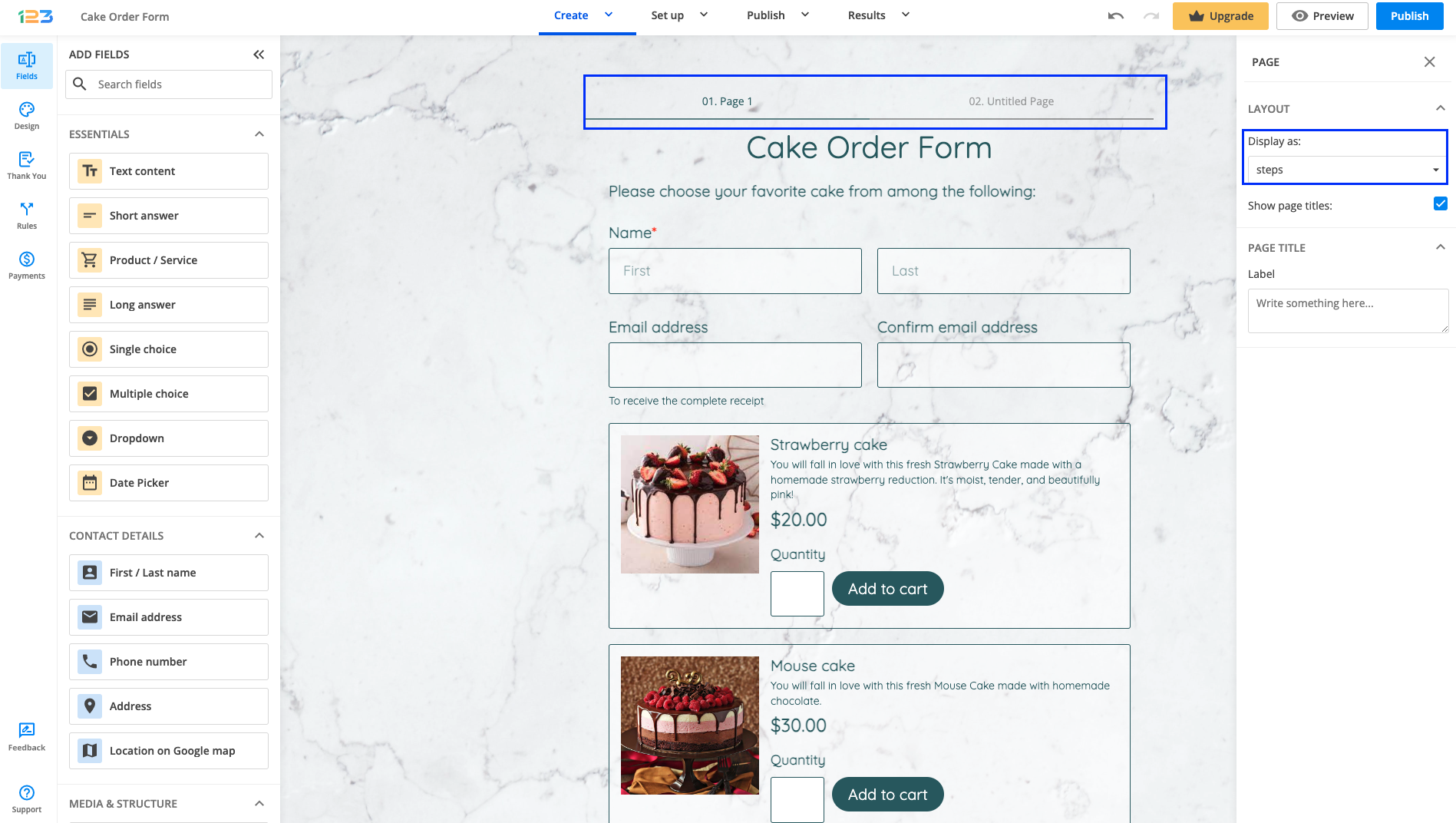
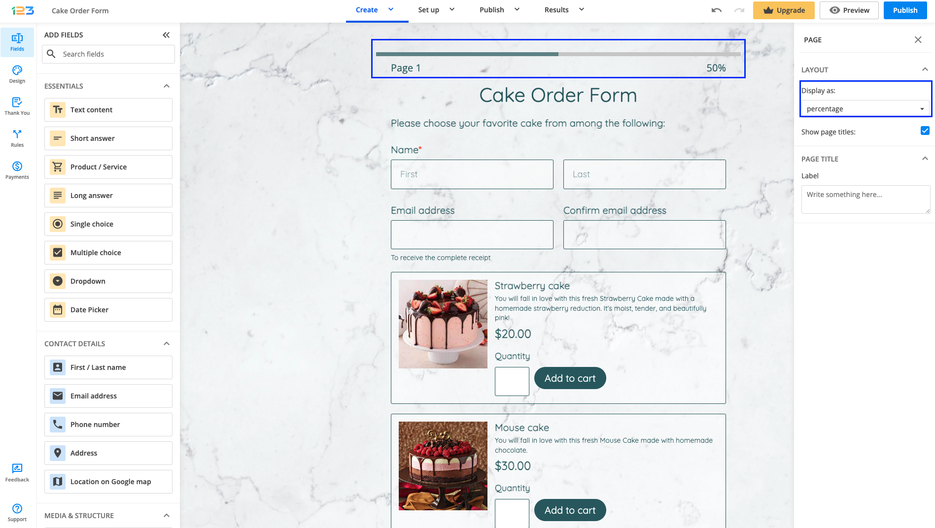
You can display the progress bar different ways. To check out different options, you have to click on the progress bar placed at the top of the page. The options can be found under Layout, Display as:
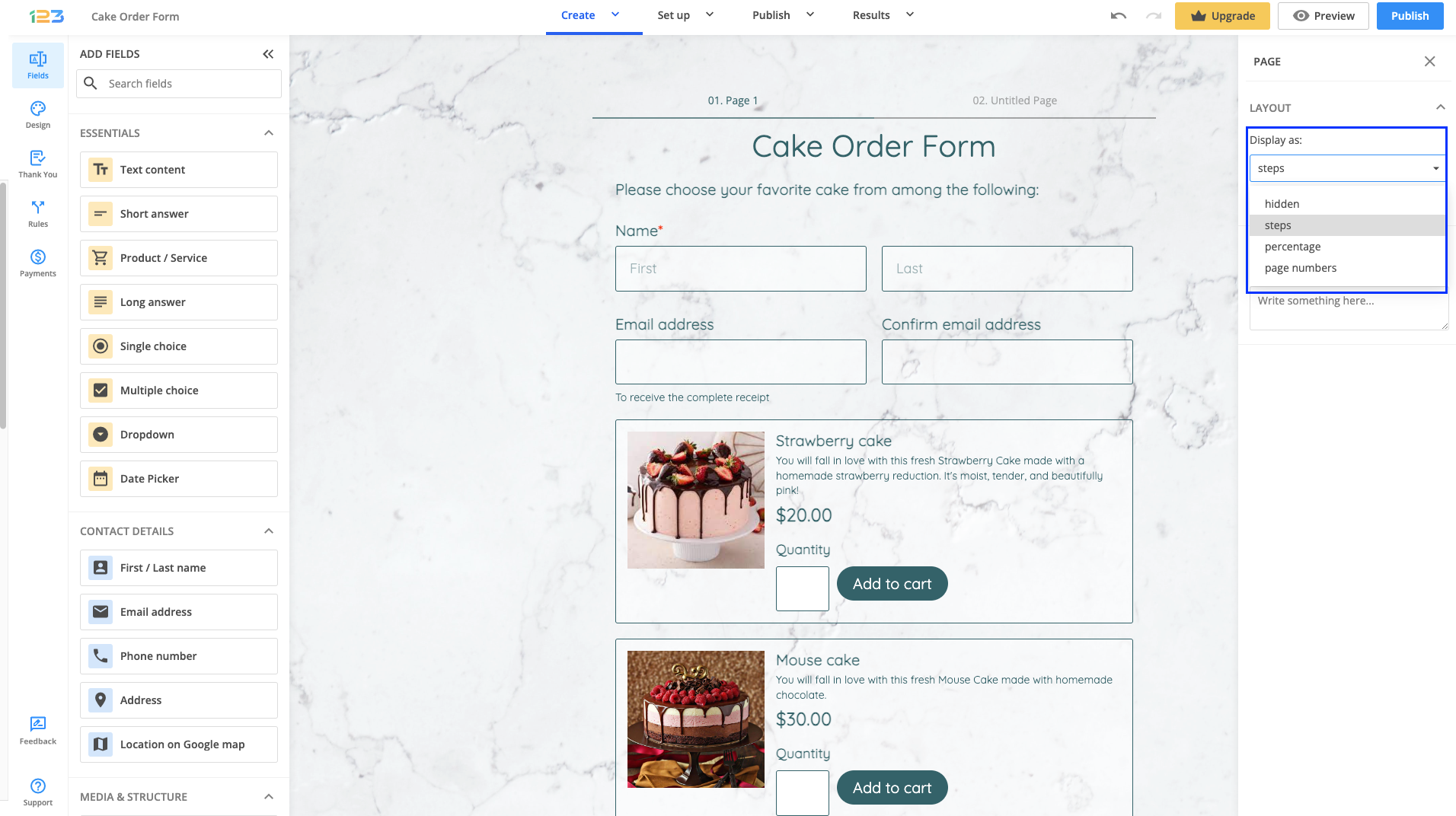
a) Hidden: you can choose to hide the progress bar
b) Steps: this is set by default
c) Percentage: this shows the percentage of completion on the form
d) Page numbers
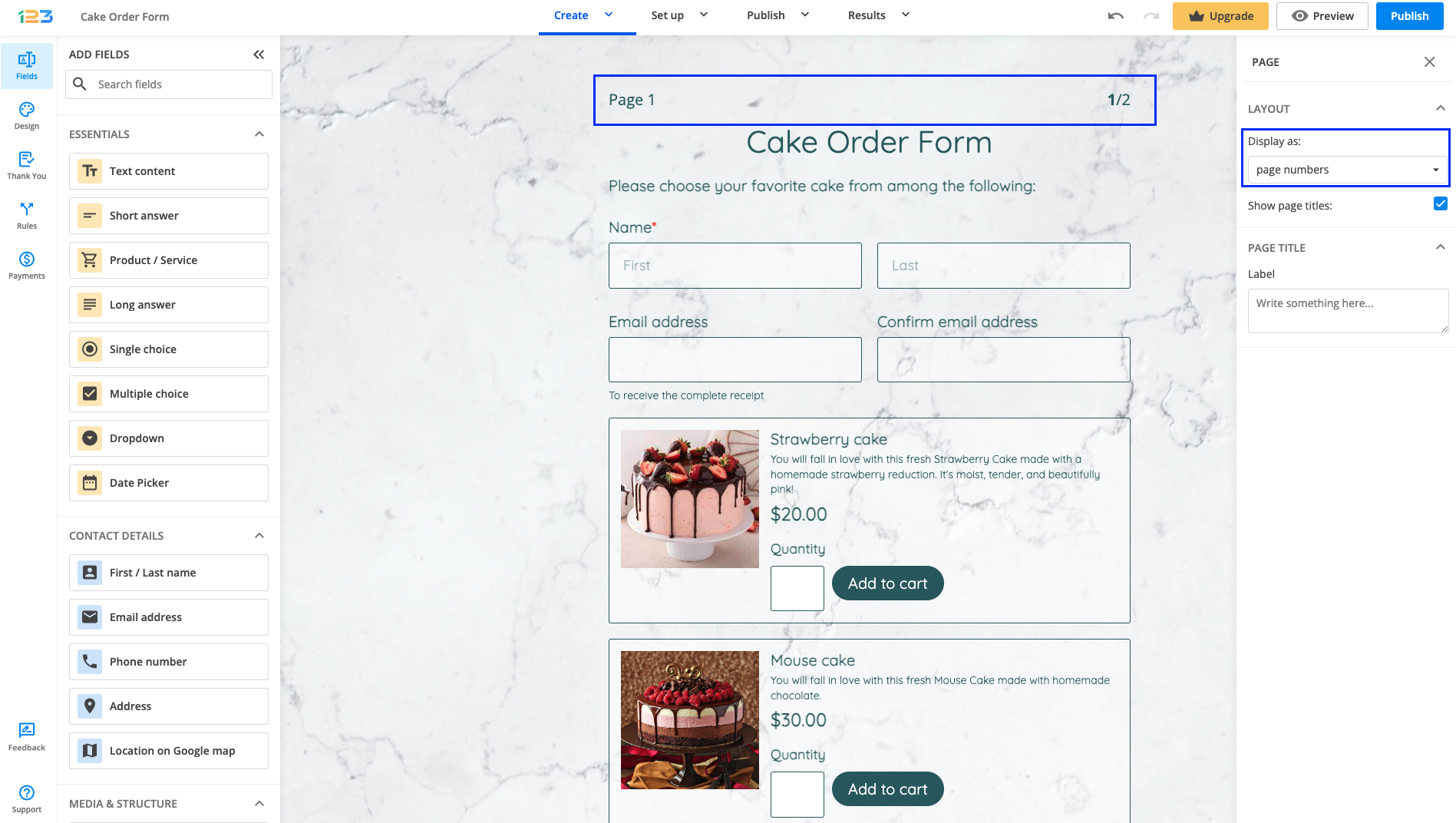
In order to change each page’s title, you will have to navigate to each page and edit Page title.
Extra customizations
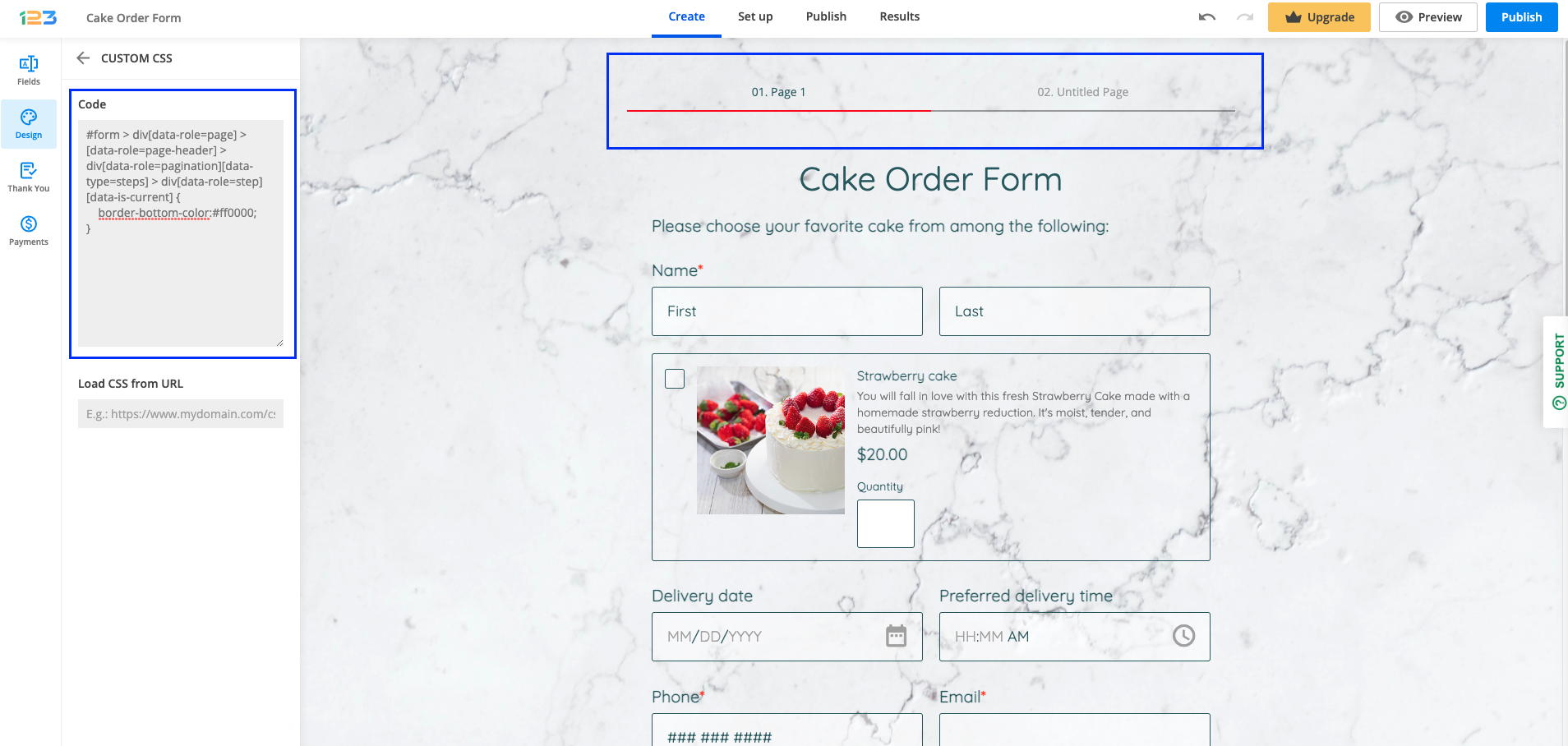
If you want to bring extra customizations to the progress bar, you can always use custom CSS. . Learn in this article how to add custom CSS to your form.
Here you can find some examples:
1. Changing the bottom line color
#form > div[data-role=page] > [data-role=page-header] > div[data-role=pagination][data-type=steps] > div[data-role=step][data-is-current] {
    border-bottom-color:#ff0000;
}
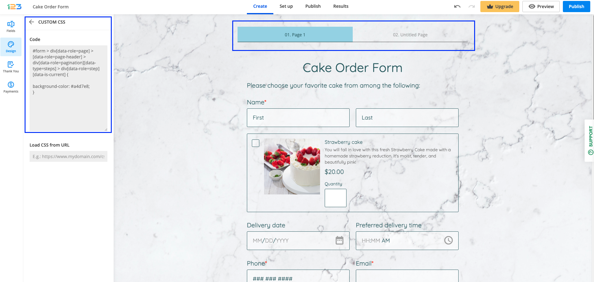
2. Changing the background color
#form > div[data-role=page] > [data-role=page-header] > div[data-role=pagination][data-type=steps] > div[data-role=step][data-is-current] {

background-color: #a4d7e8;
}
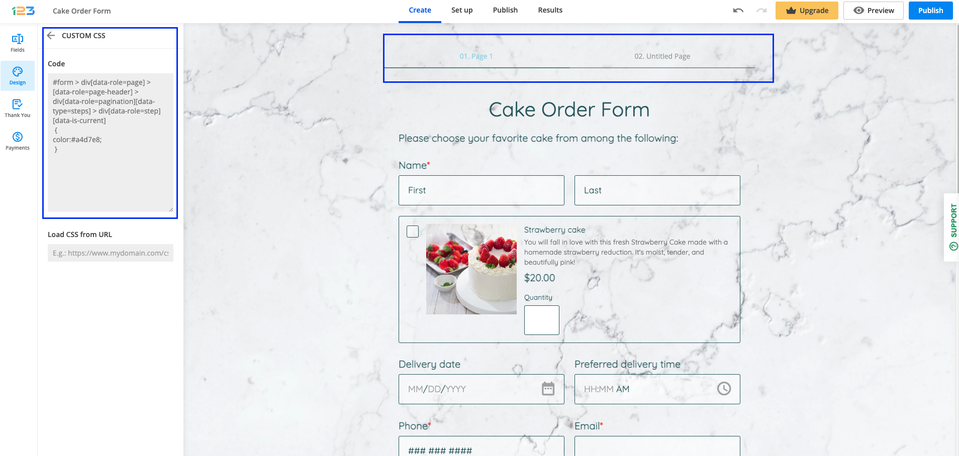
3. Changing the text color
#form > div[data-role=page] > [data-role=page-header] > div[data-role=pagination][data-type=steps] > div[data-role=step][data-is-current]
 {
color:#a4d7e8;
 }
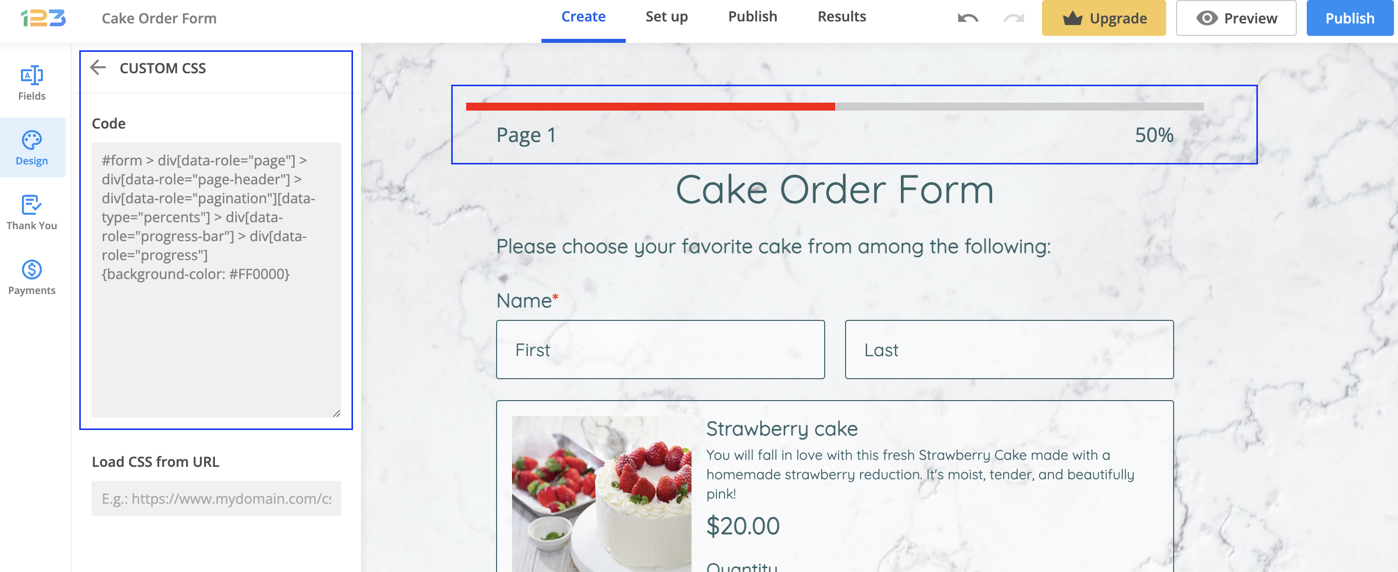
4. Changing the progress bar colour
#form > div[data-role="page"] > div[data-role="page-header"] > div[data-role="pagination"][data-type="percents"] > div[data-role="progress-bar"] > div[data-role="progress"]
{background-color: #FF0000}
To learn more on multi-page forms you can also check out our tutorial here:
Related articles
One way of making your form more user-friendly is to divide the form in several sections giving it more structure and making it easier for respondents to fill in.
Divider field
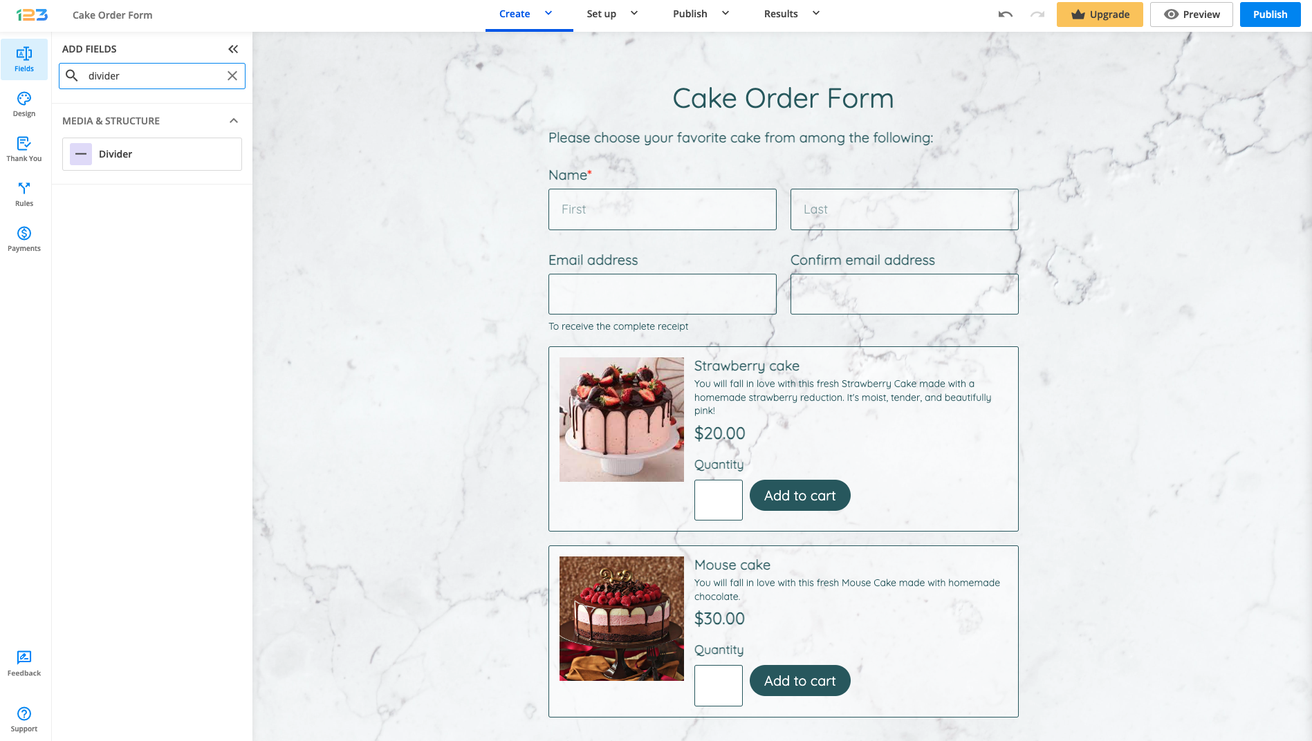
The easiest way of adding a divider/separator on your form is to search for Divider field.
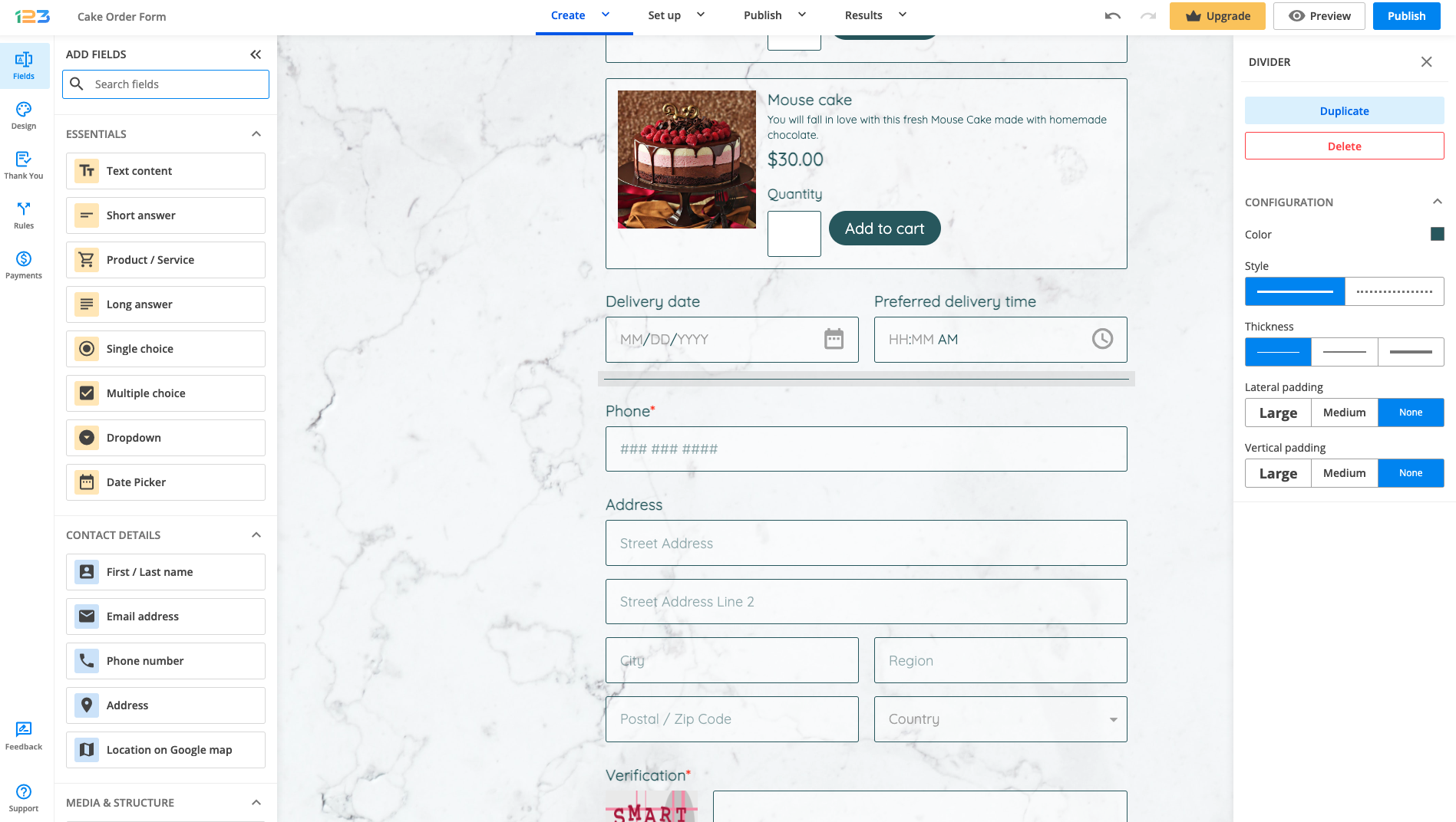
Once added on the form, to the right side you will see all the settings you can apply to the divider field. You can change the style (continuous line or dotted line), choose the thickness and select the padding that suits your form.
HTML block field
Before we have created the Divider field, the old way of adding a divider/separator was by using the HTML block field.
In order to add a separator on your form, you will have to add a HTML block on the form. Once added, go to HTML CONTENT and select Edit text.
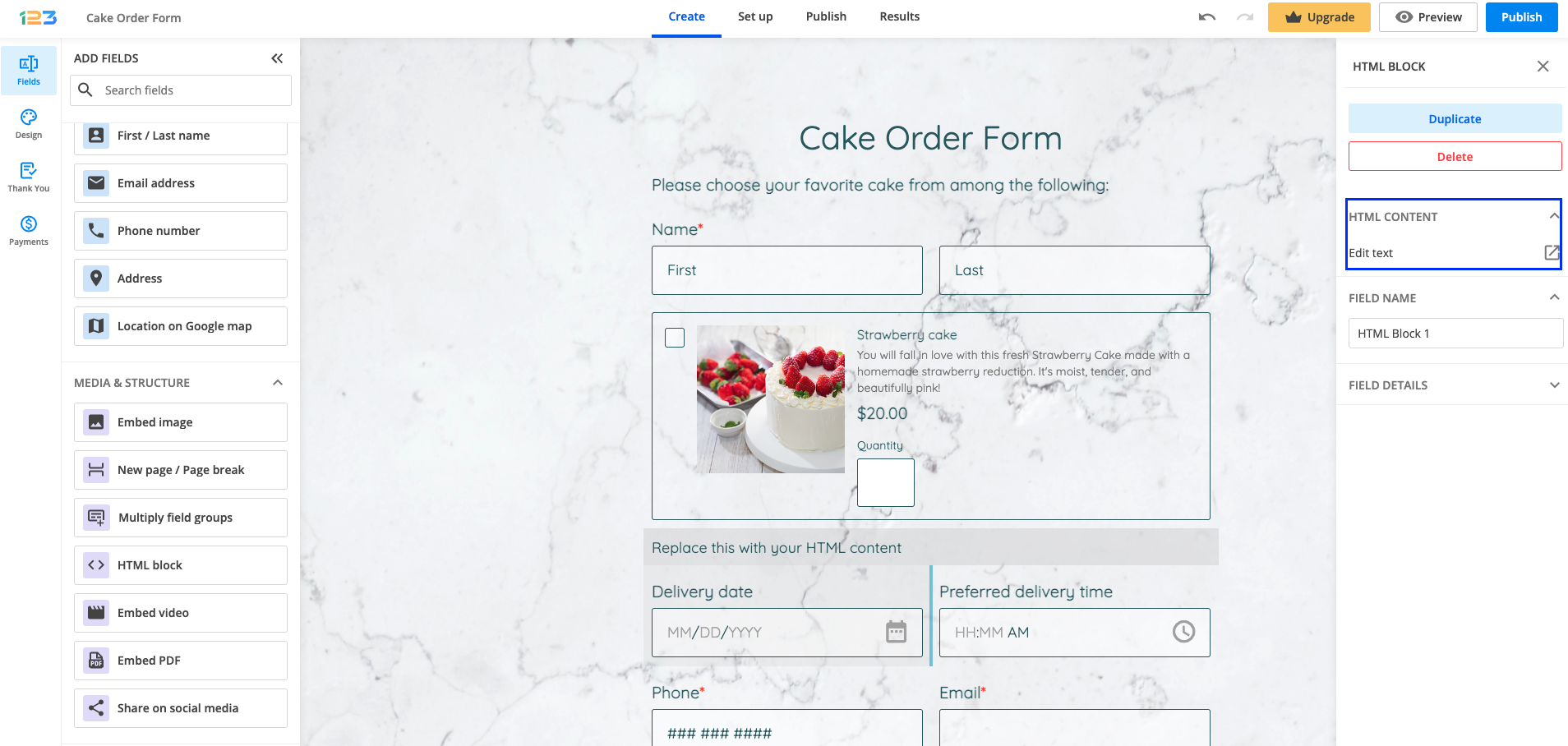
You can remove or replace the default text. By clicking the + sign, you will find several options. By clicking on Horizontal line, a separator will be added under your text in HTML block.
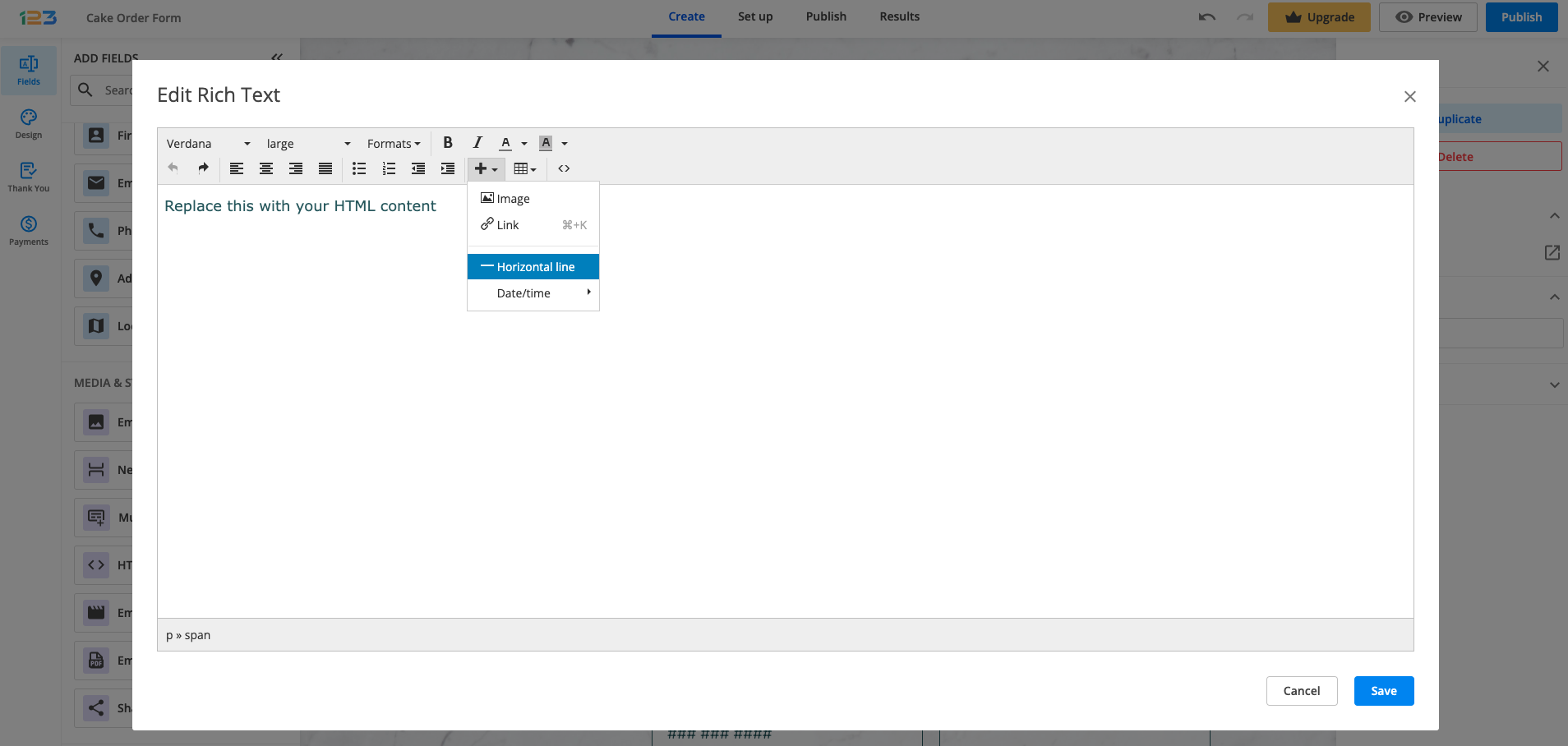
Click the Save button and there you go, you’ve just created a section in your form! Do not forget, for longer forms it is recommended to add New page/Page break.
For complex forms, take a few moments to analyze the structure of the form. Headings should be short and on point. Improve readability and comprehension by using white space in your form’s design.
Form users will identify the main points of each section more easily and focus on the key concepts of the form.
If you need to collect a considerable amount of data from your form visitors, you might also consider creating a multi-page form.
Related articles
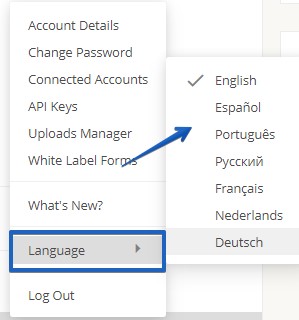
Our form builder platform is available in the following languages:
- English
- Spanish
- Portuguese
- Russian
- French
- Dutch
- German
First, sign in and then click on your username. From the dropdown list click Language and choose your preferred language.
The changes will apply as soon as you select it. Now all your new forms will be created with the new language. Keep in mind this will not influence old forms, only the new ones created.
If your language is not listed, rest assured that we continue to work on supporting more languages for our platform.
The single-page form is great, however, for longer forms, it’s best to create multi-page forms. Divide your forms into sections and this way users will not be intimidated by endless forms.
Having a multipage form is recommended for longer forms so that your respondents could stay focused and fill it in. However, if you decide to remove the multiple pages, here is how you can do it.
Removing a page
In the Editor, if you hover over the space between two pages, you will notice that a button appears with Merge pages. Click on the button and voila! Your pages have been merged and now you have a one single page form.
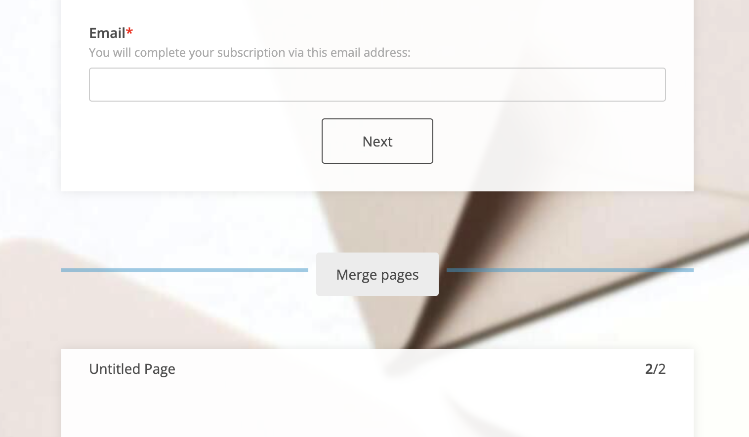
If you combine them by mistake, add a new page break field in the same place.
Related articles
If you want to help your respondents in filling out the form, you can make their job easier by adding a custom prefix in a field. This feature works only with Short answer field, Number field and Formula field.
Let’s take Number as an example. Select the field and in the left side panel, under Options section, you will find Add prefix inside the field. Once this is clicked, an additional text box appears where you can type in what prefix you want to be shown in the field. By default, it will be USD, but you can change it as you want.
Just keep in mind that the maximum length is 4 characters. It can be a combination of letters, digits, and special characters.
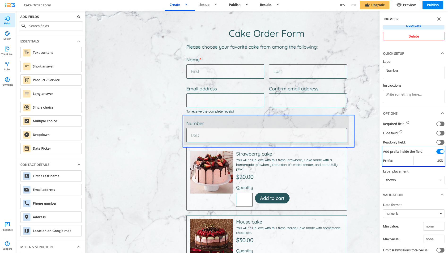
Each prefix is applied to a single field and influences only that field. In the Submissions Table, the prefix will be displayed in the label.
Related articles
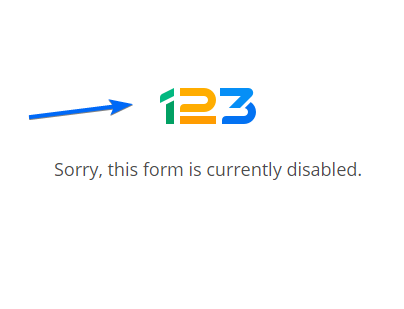
When you enable certain settings on your form, it returns an error message that displays an image. In this article we will illustrate how to replace this image with custom CSS:

This image appears when you have enabled certain options such as country filter, IP limitations, accessibility of the form.
First, access your form builder account, select the form, and go to the Design section. Next, click on the Add custom CSS button. Here you can create and place all your CSS codes to stylize the form.
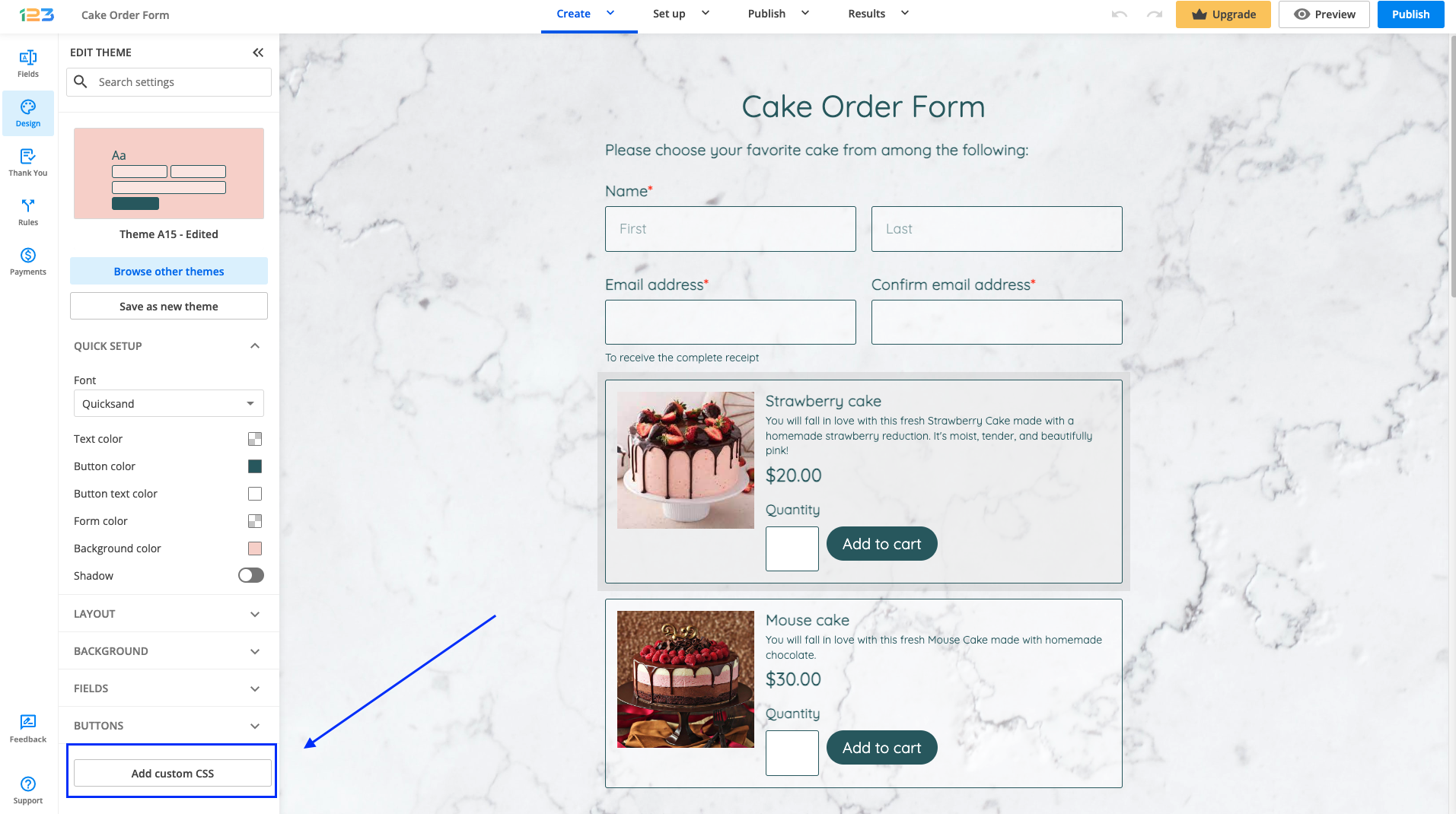
Here is the CSS code you need to use:
#error-img
{
content: url(https://cdn-main.123contactform.com/images3/logos/123-36px.png)!important;
}
Replace the URL with your own hosted image link and you’re done!
The interest in Americans with Disabilities Act (ADA) Standards for Accessible Design increased in the last few years. More and more companies are looking to have accessible websites for individuals with various disabilities or impairments.
123FormBuilder accommodates those who have hearing impairments or learning, cognitive, and other disabilities. Therefore, we developed accessible forms that are easy to use and navigate.
How to enable accessibility features on your form?
Open your web form, go to Set up -> Advanced, and switch to the Form tab.
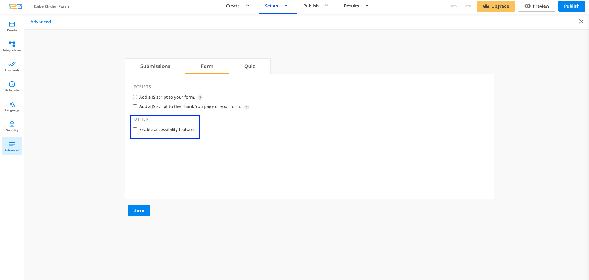
In the Other subsection, you will find the option to Enable accessibility features.
It is important to mention that the Autofocus option from the forms Publish -> Embed form section conflicts with the accessibility feature. The first one highlights the first input field. If your form has text above the first field, people with visual impairments will not be able to read it.
How users interact with the form
Users need the NVDA tool installed on their devices. Our forms are ADA compliant only with Mozilla Firefox. By pressing Tab on their keyboard they will navigate through each form element.
Here are some suggestions to make your forms more accessible:
- Keep the form organized.
- Avoid multi-page forms.
- Add alt text to your images.
- Avoid placing the label inside the field. It’s not recommended to use our Name and Address fields. Add Short text fields or Long text fields instead. Long text fields can assist users with limited dexterity.
- Embed videos should have captions.
- Choose the best contrast colors.
- Adopt a simple design.
- Improve readability and comprehension by using white space and heading fields.
- Screen readers will check the headings in the order of their size, not in the order they have been placed on the form. Therefore, make sure to use the appropriate headings in the appropriate order.
Error prevention (for legal and financial forms)
On forms used for legal commitments or financial transactions, for the forms to be ADA compliant, you must ensure that the user can review and reverse their submissions.
Here are a few ways that can help you do so:
1. Allow respondents to edit delivered submissions at a later time. You can enable this feature from the forms Set up -> Advanced -> Submissions tab.
With this feature enabled, users will receive a link via email which they can use to make changes to the data they have submitted.
2. Allow respondents to preview the submission summary before sending the form. This feature can be found in the same section mentioned above.
3. Add a checkbox before the Submit button. Users will need to select the checkbox to confirm that they have reviewed their input and agree to the legal commitment or transaction that is about to take place.
You can use the Terms of Service field with an agreement text such as “I confirm that the input is correct and I am ready to submit”.
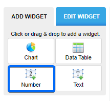
When you first access the Reports section for a form in our form builder, you see the default report, that contains all form fields, shown in pie charts, in the order that they appear in your form. However, there are four types of reports that you can create:
- Chart
- Data Table
- Number
- Text
In this article, you will learn how to use the Number widget. This report type allows you to create various functions between the numeric inputs from your submissions section. For example the average age of your form users, how much money you have received through the whole form, the number of people registering to an event, etc.
To get started, click on the New Report button and name your report. Next, choose the Number widget.
Once clicked, you will see the report’s options in the left-side panel.
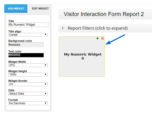
You will notice that there are several options available for customizing your reports. We will focus more on what you can calculate. Keep in mind that you can use this widget only with Number fields.
Field Inputs
Navigate to Data and choose the Field option. Next, select your number field.
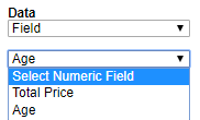
In the next step choose the function you need in the report:
- Count
- Max – show the maximum number
- Min – show the minimum number
- Sum – total the numeric inputs
- Avg – calculate the average number
- Median – compute the middle number of a set of data
- Std – measure how spread out numbers are
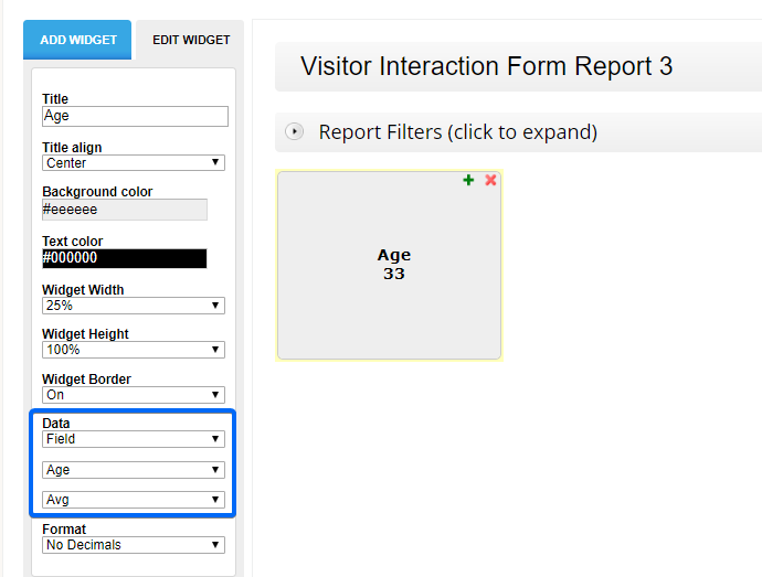
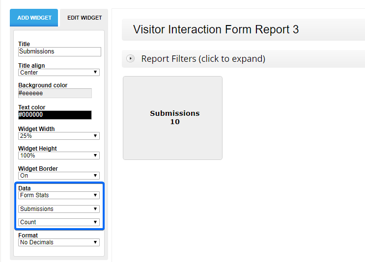
In the example below, we calculated the average age of form users.
Form Stats
Navigate to Data and choose the Form Stats option. In the next step select Submissions from the dropdown list. This will count how many entry submissions you currently have collected.
Related articles
A Likert scale field is a rating system used in survey forms that aim to measure people’s attitudes, opinions, or impressions. Form users are asked to rate your statements thus helping you to analyze data and create statistics. This rating service is more useful than a simple Yes/No question.
Looking for a rating system that fits your form building needs? Then use our Likert scale creator.
Likert scales
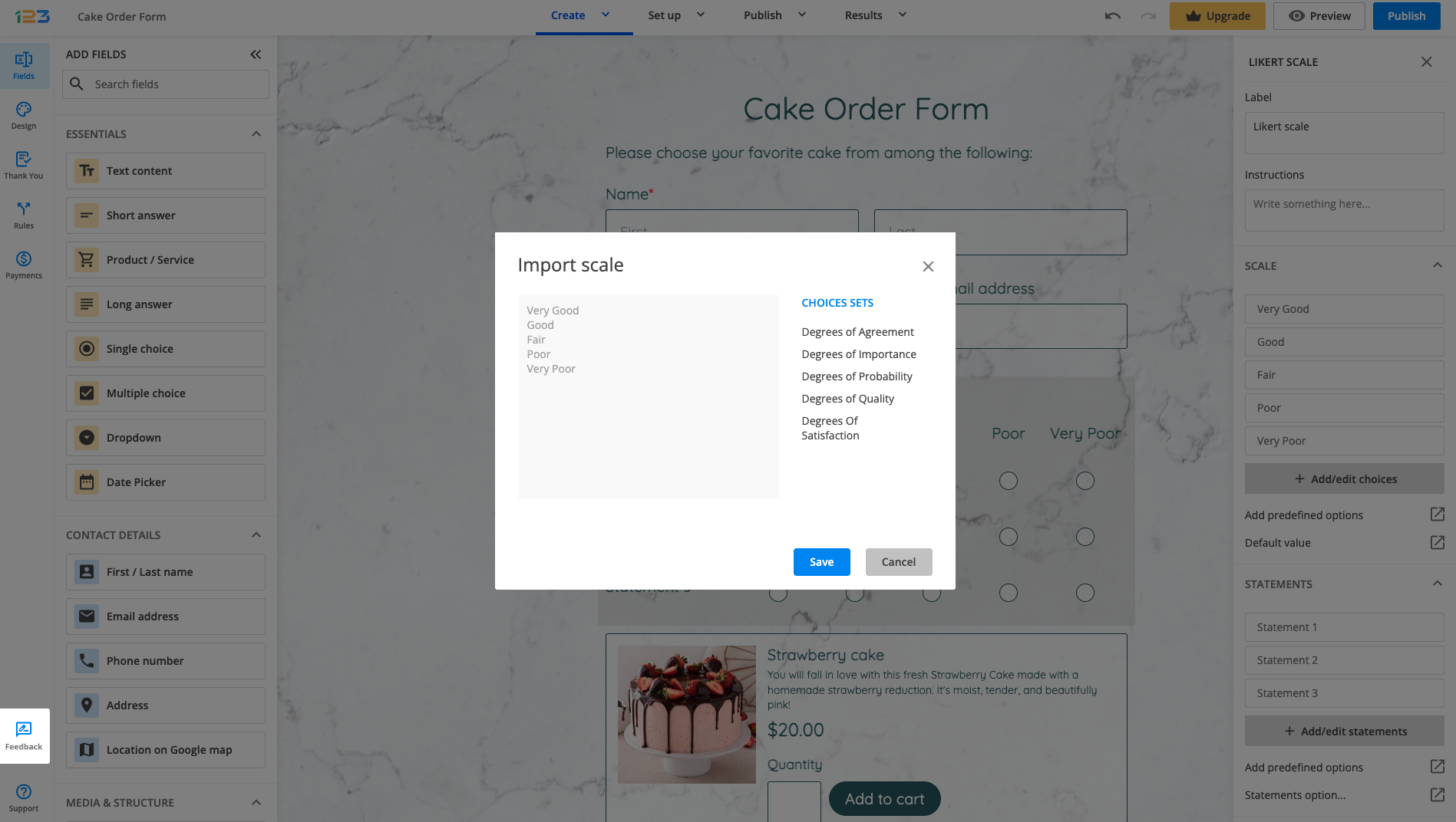
In our form builder, in the Scale section of your field, you can measure the frequency, quality, importance, level of satisfaction of certain statements, and many others. In the left side panel you will find Add predefined options. Here we listed sets of choices that you can choose from:
- Degrees of Agreement
- Degrees of Importance
- Degrees of Probability
- Degrees of Quality
- Degrees Of Satisfaction
You can opt to add your own choices. There is no limit, however, most of the time only between 5 or 7 response options are used.
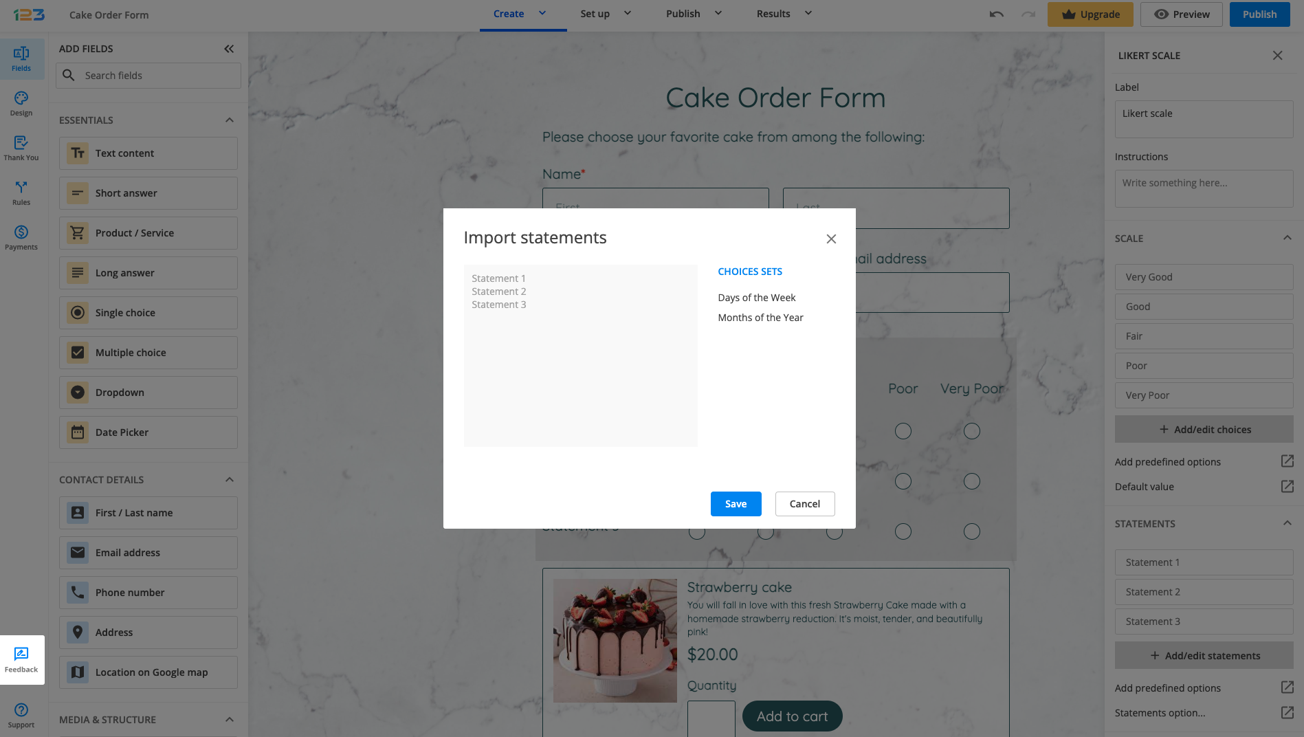
Likert statements
Here you type the topics that will be measured using the scale. Find out the respondent’s option of the quality and efficiency of your products/services. Receive feedback regarding areas that can improve your business.
In the left side panel, under Statements section, you can find each default statement that can be renamed or you can choose to Add predefined options:
- days of the week
- months of the years
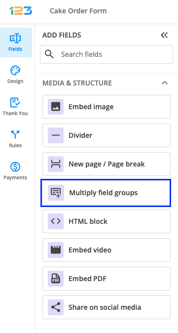
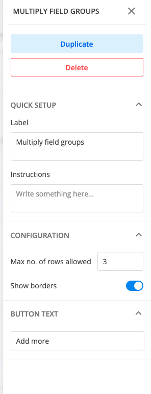
Multiply field groups field is used to group a set of fields that repeats as needed, allowing respondents to input multiple instances. Respondents will be able to click on a button to generate an additional set of those grouped fields.
You can find this field under the Media & Structure section.
Once you have added it to your form, it will look like below. Now what you have to do is to add the fields that you want to be part of this field group, one by one, by dragging and dropping them within the container.
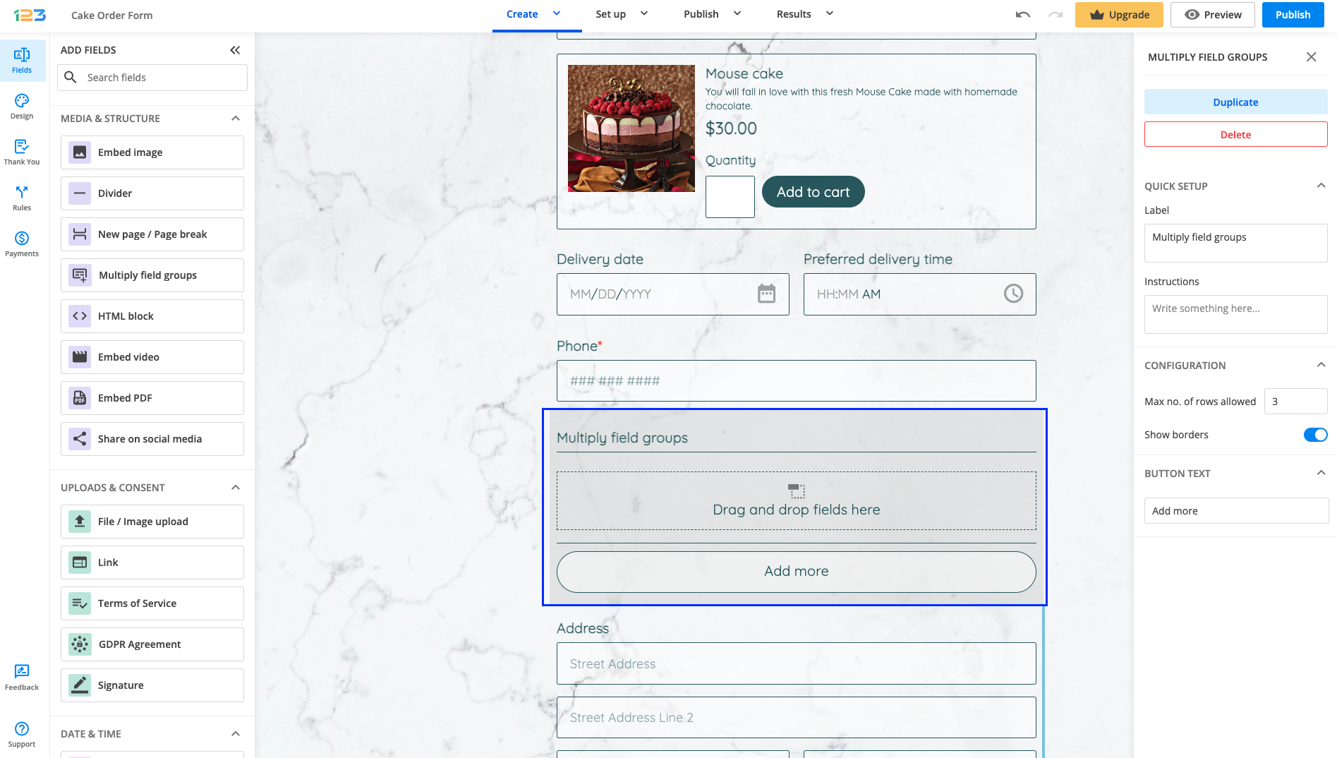
In the right side panel, you can customize the Multiply field groups field.
You can set the maximum number of rows allowed, meaning how many times should the group of fields repeat itself when respondents click on the Add more button. Show borders is enabled by default, but if you don’t want to have the fields separated by a divider you can untick this option.
The button text can also be changed → you can rename it as you wish to be more suggestive for your respondents.
When used in Rules, please make sure to select the Multiply field group element as well as all the fields included in it. Otherwise, your rule will not work as expected.
The following fields can not be added in a Multiply field groups field:
– File/Image upload
– Embed video
– Share on social media
– Embed PDF
– Embed image
– Location on Google Maps.
Related articles
This integration has been deprecated.
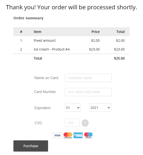
The 123FormBuilder – Worldpay integration allows you to accept payments directly on your online order form, without redirecting away from the page. Users will enter their payment details in the same tab on the Thank You Page and credit card fields will be just regular fields in your form.
To enable the Worldpay integration, follow the simple steps below:
1. Navigate to your Form Editor and E-Commerce section. From the list choose Worldpay.
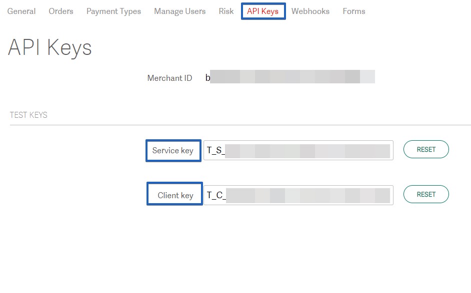
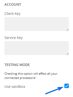
2. You will be asked to provide your Worldpay account credentials.
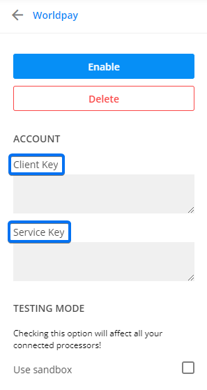
To retrieve the Client Key and Service Key, log in to your Worldpay account. Then, go to the Settings → API Keys section.
Finally, click the Enable button to finish connecting Worldpay to your form. After sending the submission, the user will see the following checkout page:
To test the integration, enable payments in sandbox mode, and you are done. You can start testing your 123FormBuilder – Worldpay payment processor and simulate a transaction.
Your form submissions are stored on our form builder servers and are available to you in the Submissions section. You are able to import submissions on your form from an external CSV file or use the CSV file exported from another form.
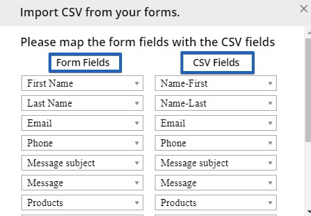
Before starting, it is important that the columns of your CSV file are named the same as your form fields. Also, the field types from your file (e.g numeric, alpha, alphanumeric) that you choose should be the same as your form fields. Matching different types of fields will not import the data.
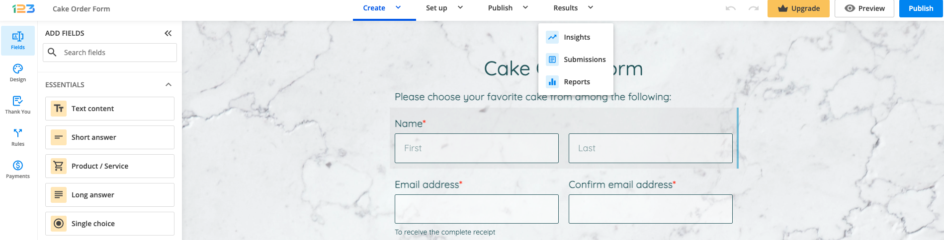
In order to do this, click on Results and navigate to Submissions tab.
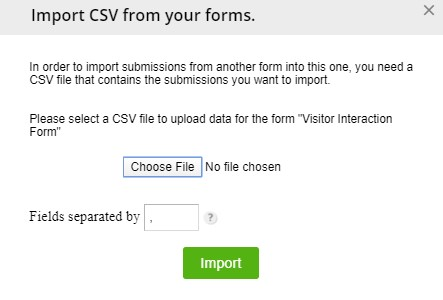
In order to import submissions on your form, click on Import button.
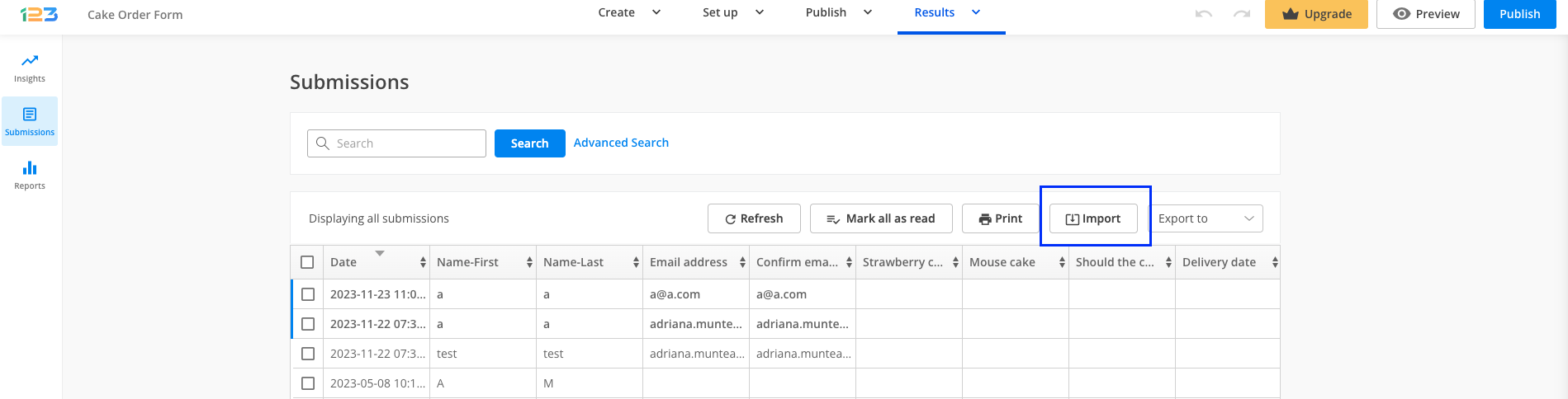
In the lightbox that appears, click on Choose File and select a CSV file to upload data for the form. Hit Import.
Map the form fields on the right side with your CSV fields on the left side. Once you finished mapping them click Ready and you’re done.
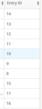
Importing form submission will disorganize the Entry ID numeration. To keep track of your submissions, enable the Reference ID option.
Related articles
- How to export form submissions to excel?
- How to export all of my submissions to CSV?
- Fixing CSV export in Microsoft Excel
Most Popular
Frequently Asked Questions
Here is a list of the most frequently asked questions. For more FAQs, please browse through the FAQs page.